Thanks for the comments everyone!
ofnuts wrote:
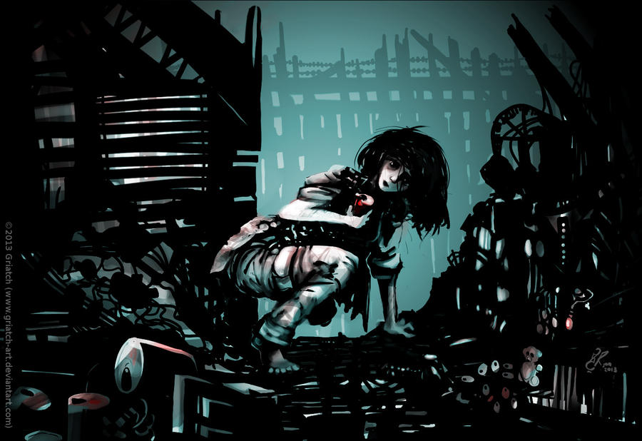
OK, from worst to best:
- the right arm looks bent and too thin
- the composition is a bit centered
- the eye is attracted to the teddy-bear on the right and then to the reddish object that hangs above it on the right.
- one eventually wonders why, being lit from the top left, she isn't casting any shadow and why everything around her (except the can in the front and the teddy bear) remains dark. But this is my engineer's eye. The director of some film noir would ask the lighting crew to achieve this.
- once you notice the missing leg, the stump, and you connect this to your previous work, you wonder where the crutches are.
- the background in bluish light (moonlight?) is plain gorgeous.
Thanks for the good points! I'll respond to each in turn:
- I made the fold in the arm slightly less visible, I think it might have made the arm look thinner than it was. Take a look!
- The reason most art books suggests using e.g. the rule-of-third for composition is because it creates a more harmonic balance in the image. I aimed for anything but harmony here; the more claustrophobic and uneasy, the better.

- The teddy bear and the locket are part of the concept for this image, I'm glad they show (this is actually for a challenge on DA which includes using an "Empty can", "A teddy bear" and "A locket" as part of the image. I should maybe have put it in the caption here on GC too.
- I didn't want to add too many highlights around her since it detracted too much from her. But I enhanced the shadows a bit as well as added a few more highlights now, hopefully a little clearer (although I didn't really aim for a fully realistic lighting here anyway).
- Correct, no crutches here, this is actually a long time before she gets her crutches.
- Glad you like the background! It's probably a bit sad when the 2-minute-to-do background is deemed to be the best part of the image though.

Quote:
Lovely work again and like the colours of the piece.
Thanks, I was actually reluctant to add any colour at all to this; in the end it's only three colours total.
Quote:
griatch: i agree with ofnuts about the right arm, and i wondered about the teddy bear and the red thing too - do they have a role in the story? otherwise they seem to demand a little too much attention. but i think the centered layout is good, it works well in this picture.
Yes, as mentioned above, the teddy bear and the locket (and the empty cans) are part of the challenge this image was inspired for. More info's in the caption on DA.
.
Griatch