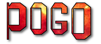
It's kind of a long story. I'm happy you like my signature. I saw this font on a poster and searched for a font like it. I subscribe to a fonts newsgroup in the Annex Cafe and posted it there hoping someone would recognize the font. Someone in the ng said it was probably done that way manually rather than a font like that existing. This is the image I put up in the newsgroup.

I played with Gimp's text tool and worked until I came up with a similar style. I learned a bit about the Text tool while I was at it.
I used Times New Roman font (really, it's a very nice font even though it seemed that every word processor used it as the default font and I got tired of it in documents). Try making something with it with the font enlarged quite a bit. The serifs are very gracefully made.
This is my first experiment doing it. Instead of using the underline in the text editor, I used the Paths tool to make the underline and stroked it.

I started by making the font with all caps, selected the letters, two different sets, one at a time, except for the O's and shrank them a little and underlined them in the text editor. After getting them re-sized and underlined, I selected the smaller letters with the Rectangle Select tool, cut and pasted them to new layers. Had to do it for both sets of small caps and merged the two layers. Then I positioned them higher by using the up arrow key with the Move Tool.
I really love the way I can manipulate text with the new text editor.
After it was all done in black, I did alpha to selection and shrank the selection by 2 and filled with the pattern. I put the rainy bg in it because it rains here on the coast a lot.

Hope this all makes sense. I really didn't expect to make such a long post but it does take some doing. It's not hard to do, just has a lot of steps.
_________________


 This has been quite an adventure for me trying to make myself clear and explain what I was looking for.
 (this font aligns to bottom)


 Video from :