This filter can be used to create custom font layers from custom path layers i.e. paths like ‘A char’.
The update adds an option to keep or remove character paths after creating a set of character layers.
A pdf version of this tutorial:
Attachment:
Some resources to use after reading the tutorial:
Attachment:
 Resources-v02.zip [47.99 KiB]
Downloaded 545 times
Resources-v02.zip [47.99 KiB]
Downloaded 545 times
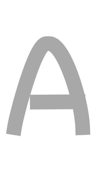
A character without the wobble factor might look like this:
And with wobble it might look like this:
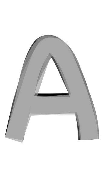
The filter super-imposes a number of slightly different layers over each other – adding interest to the character edges.
It works by taking the character path and, using Tim’s Wobble3d filter, it makes a new, different path to create a layer from (the number of path/layers used is set in the filter dialog).
You can add colour directly (taken from a gradient is the easy option) or work with shades of grey and apply colour later with other custom font tools.
Download the zipped resource folder and extract the two py files: Save these files to your user plug-ins folder. Save the xcf custom path files to a folder of your choice.
Start up up Gimp and open the character path file.
Call up Custom Font Wobbler:
Filters>>Custom Fonts>>Constructing Tools>>Custom Font Path Wobbler v0.2 Tabbed…The dialog option tabs:
 The wobble options
The first three options are used when calling Tim’s Wobble filter. The first option affects the amount of random change applied to the character paths: Values over 0.5 can have a profound effect on the shapes of the character paths.
The single path characters below have a wobble factor of 0.125, 0.5 and 1.5 applied.
 Stroke Path Method:
Line or brush
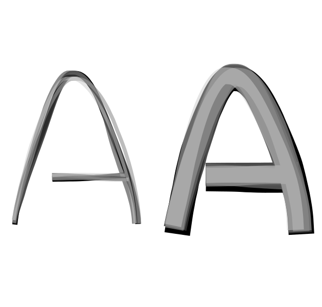
Stroke Width:Interesting effects can be produced with both small and larger values when ‘stroke with line’ is used. Larger values usually produce better results when ‘Stroke with brush’ is used.
Below: 5 strokes with path widths of 10 and 50
 Reduce stroke width:
By default the plug-in will stroke the paths in the same path width but this option allows you stroke the character in progressively smaller widths.
 Number of paths to create:
The more paths you use the more time the filter will take. Values between 3 and 5 seem to produce reasonable results.
Below: 10 paths using a gradient called Caribbean Blues
 Path Style Options:
Below: Join style option using bevel and then round

Be aware that butt end caps seem to produce large artefacts with closed path characters e.g. letter O.
Brush specific options:Stroking the path with a brush always uses the currently selected brush. If you choose to use a greyscale brush then you can paint with the currently selected colour option.
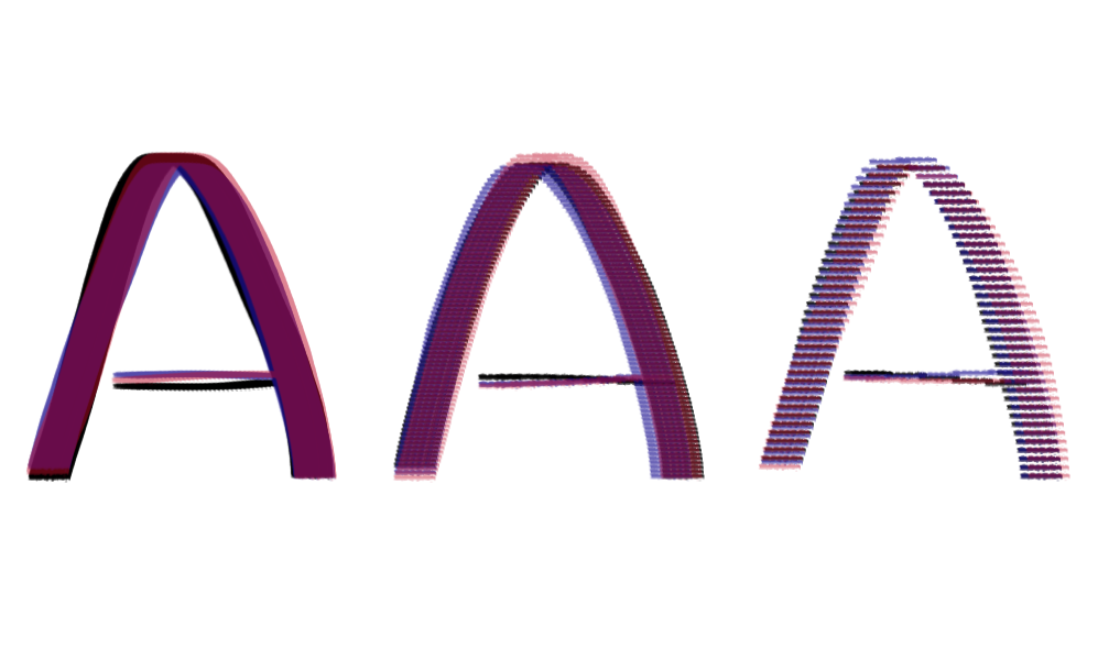
Brush spacing:This is a convenient way to access the brush spacing option displayed with the paintbrush tools. The size of the path/stroke width also modifies the effect of brush spacing to a certain extent.
Smaller values place brush strokes closer together.
Below: Brush spacing set to 10, 40 and 80
 Brush options:
There are currently two options available; to track direction and to use a random angle with the brush.
Below: Options not used, track direction and random angle
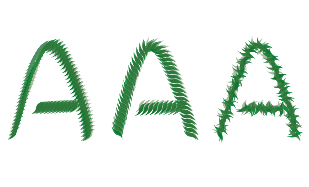
The same options can be used with animated (pipe) brushes.
 Colour Options:
If you want to stroke a single path use the foreground or background colour options to accurately select a single colour. The gradient option is more suited to working with multiple paths.
Gradient Options:Ordered gradient options seem to produce better results when used with a colours with shades that change gradually. There are also options for using a limited range of the gradient colours.
Below: Ordered gradient full range, first half and second half

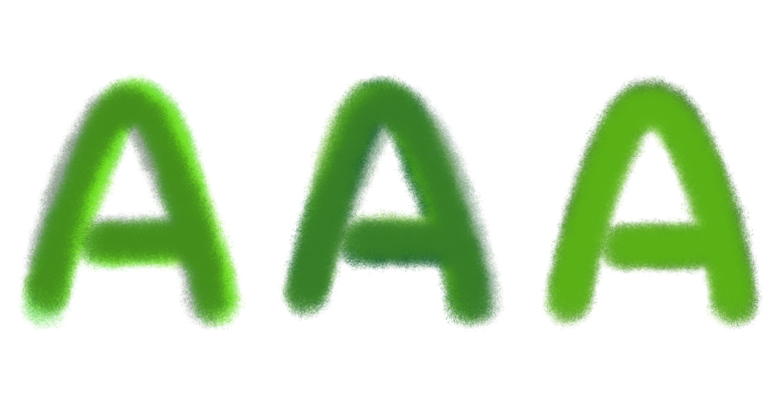
The random gradient option can produce interesting results with non-linear gradients.
Below: Random gradient options from the same gradient
 Opacity Options:
The default setting is to apply lower opacity layers over higher opacity layers but you can reverse this or apply opacity randomly.
Below: Black-white gradient with opacity options decreasing, increasing and random.

The greyscale images can be made more interesting by then applying colour with other custom font tools.
Below an image from Unsplash applied using Grainmerge mode.

The final set of options deal with setting values for the margins, the width of the space character, for turning off the wobble (should you wish to) and for removing the character paths from the image.
So there you have it - plenty to play with to add depth and texture to custom font characters; all thanks to Tim’s wobble3D plug-in; he's a bit of a Gimp hero really.
Below: A 3D version...

Below: A shine version...

The filter can also be used when adding highlights to custom fonts. Create a set of characters using the colours option and a gradient of light to dark greys. Then use the custom fonts highlights plug-in to add the actual highlights.

Play more - have fun!
 Login
Login Register
 Tweets
 FAQ
FAQ Advanced Search