It is currently Sun Sep 06, 2026 12:11 pm


All times are UTC - 5 hours [ DST ]


Post new topic Reply to topic  [ 15 posts ] 
Author Message
 Post subject: 'INTENSITY' Logo design
PostPosted: Sat Apr 06, 2013 9:32 pm  (#1) 
Offline
Administrator
User avatar

Joined: Aug 10, 2012
Posts: 14193
Location: Native to NYC living in Arizona, Gimp 2.8 - 3.0, Win 11 PC.
Here are just a few of the many logos I created for a friend of mine. He uses the word 'intensity' as a logo for his music.
The bottom/last image is the one that he ultimately chose to use as his logo.

Image
Image
Image
Image
Image

_________________
Image
"A wise man learns more from a foolish question than a fool can learn from a wise answer"
Image


Share on Facebook Share on Twitter Share on Orkut Share on Digg Share on MySpace Share on Delicious Share on Technorati
Top
 Post subject: Re: 'INTENSITY' Logo design
PostPosted: Sat Apr 06, 2013 10:20 pm  (#2) 
Offline
GimpChat Member
User avatar

Joined: Aug 30, 2012
Posts: 2174
All really good Wallace, Can't of been an easy choice.

_________________
Image


Top
 Post subject: Re: 'INTENSITY' Logo design
PostPosted: Sat Apr 06, 2013 11:18 pm  (#3) 
Offline
GimpChat Member
User avatar

Joined: Jun 25, 2011
Posts: 914
Location: Mount Olive, North Carolina
A good selection, there :)

I like the second one, or the last one best. I think I might like #2 just a bit more, though.


Top
 Post subject: Re: 'INTENSITY' Logo design
PostPosted: Sat Apr 06, 2013 11:22 pm  (#4) 
Offline
Administrator
User avatar

Joined: Aug 10, 2012
Posts: 14193
Location: Native to NYC living in Arizona, Gimp 2.8 - 3.0, Win 11 PC.
merrak wrote:
A good selection, there :)

I like the second one, or the last one best. I think I might like #2 just a bit more, though.


@merrak,

Yeah...
Although the images I posted of the logo are merely the tip of the iceberg of what was provided to choose from, I would have gone with that one as well. :hehe

_________________
Image
"A wise man learns more from a foolish question than a fool can learn from a wise answer"
Image


Top
 Post subject: Re: 'INTENSITY' Logo design
PostPosted: Sun Apr 07, 2013 12:09 am  (#5) 
Offline
Global Moderator
User avatar

Joined: May 16, 2010
Posts: 16169
Those are all really nice.I bet it was hard to choose the logo they would use.

_________________
Image


Top
 Post subject: Re: 'INTENSITY' Logo design
PostPosted: Sun Apr 07, 2013 12:17 am  (#6) 
Offline
Administrator
User avatar

Joined: Aug 10, 2012
Posts: 14193
Location: Native to NYC living in Arizona, Gimp 2.8 - 3.0, Win 11 PC.
Rod wrote:
Those are all really nice.I bet it was hard to choose the logo they would use.


Thanks Rod, and you would think that would be the case, but the decision was made rather quickly.

Go figure... :hehe

_________________
Image
"A wise man learns more from a foolish question than a fool can learn from a wise answer"
Image


Top
 Post subject: Re: 'INTENSITY' Logo design
PostPosted: Sun Apr 07, 2013 2:26 am  (#7) 
Offline
GimpChat Member
User avatar

Joined: Aug 16, 2012
Posts: 4271
Location: Göteborg, Sweden
wallace: wow, impressive logo work! i think the two metallic grey and red ones would be the predictable choices of most of the mae music makers i know,though, so maybe it's not surprising he could decide so quickly.

_________________


Top
 Post subject: Re: 'INTENSITY' Logo design
PostPosted: Sun Apr 07, 2013 2:39 am  (#8) 
Offline
GimpChat Member
User avatar

Joined: Jul 17, 2012
Posts: 2769
well what can i say, this is just another proof that Wallace cant do anything bad, can he ?

everything he does looks so perfect :bigthup


Top
 Post subject: Re: 'INTENSITY' Logo design
PostPosted: Sun Apr 07, 2013 3:48 am  (#9) 
Offline
GimpChat Member
User avatar

Joined: Apr 07, 2010
Posts: 14182
I like the second one the best, but the top one is so very interesting with the little gray things sticking out.

_________________
Image


Top
 Post subject: Re: 'INTENSITY' Logo design
PostPosted: Sun Apr 07, 2013 4:55 am  (#10) 
Offline
GimpChat Member

Joined: Dec 27, 2012
Posts: 393
Location: England
I would've opted for the last one as it is the most dramatic of the group, they're all good though.

_________________
Image

DeviantArt gallery


Top
 Post subject: Re: 'INTENSITY' Logo design
PostPosted: Sun Apr 07, 2013 5:28 am  (#11) 
Offline
Script Coder
User avatar

Joined: Oct 25, 2010
Posts: 4812
The first one is a really fun idea but it lacks a background.

Strange fact of the day: when you have your mouse over it, the "magnifying glass" pointer looks like a screw with a Phillips head:
Attachment:
ScrewingGlass.png
ScrewingGlass.png [ 5.62 KiB | Viewed 1787 times ]

_________________
Image


Top
 Post subject: Re: 'INTENSITY' Logo design
PostPosted: Sun Apr 07, 2013 10:02 am  (#12) 
Offline
Administrator
User avatar

Joined: Aug 10, 2012
Posts: 14193
Location: Native to NYC living in Arizona, Gimp 2.8 - 3.0, Win 11 PC.
Esper wrote:
well what can i say, this is just another proof that Wallace cant do anything bad, can he ?

everything he does looks so perfect :bigthup


@ESP,

Thanks a lot, you saying this really means a lot to me knowing how hard you work at creating your text based effects. ;)

_________________
Image
"A wise man learns more from a foolish question than a fool can learn from a wise answer"
Image


Top
 Post subject: Re: 'INTENSITY' Logo design
PostPosted: Sun Apr 07, 2013 10:38 am  (#13) 
Offline
Administrator
User avatar

Joined: Aug 10, 2012
Posts: 14193
Location: Native to NYC living in Arizona, Gimp 2.8 - 3.0, Win 11 PC.
ofnuts wrote:
The first one is a really fun idea but it lacks a background.

Strange fact of the day: when you have your mouse over it, the "magnifying glass" pointer looks like a screw with a Phillips head:
Attachment:
ScrewingGlass.png


That's an interesting mouse pointer. :hehe

I guess I could have added a wood texture as a background, but I wasn't asked to provide a background for any of the text images.

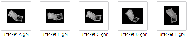
I did create a set of 'Custom Bracket Brushes'...

Custom Bracket Brushes

Image

And thanks to 'Sagethumbs', I now have viewable thumbnails of all the .gbr files on my Windows XP machine. :clap

_________________
Image
"A wise man learns more from a foolish question than a fool can learn from a wise answer"
Image


Top
 Post subject: Re: 'INTENSITY' Logo design
PostPosted: Sun Apr 07, 2013 10:42 am  (#14) 
Offline
Administrator
User avatar

Joined: Aug 10, 2012
Posts: 14193
Location: Native to NYC living in Arizona, Gimp 2.8 - 3.0, Win 11 PC.
molly wrote:
I like the second one the best, but the top one is so very interesting with the little gray things sticking out.


@Molly,

Those, 'little gray things' your referring to are the custom bracket brushes I made for the image.
View this post... viewtopic.php?f=11&t=6886&start=10#p86821

_________________
Image
"A wise man learns more from a foolish question than a fool can learn from a wise answer"
Image


Top
 Post subject: Re: 'INTENSITY' Logo design
PostPosted: Sun Apr 07, 2013 10:45 am  (#15) 
Offline
Administrator
User avatar

Joined: Aug 10, 2012
Posts: 14193
Location: Native to NYC living in Arizona, Gimp 2.8 - 3.0, Win 11 PC.
Thank you to everyone that commented and enjoyed these text images. :)

_________________
Image
"A wise man learns more from a foolish question than a fool can learn from a wise answer"
Image


Top
Post new topic Reply to topic  [ 15 posts ] 

All times are UTC - 5 hours [ DST ]


* Login  


Powered by phpBB3 © phpBB Group