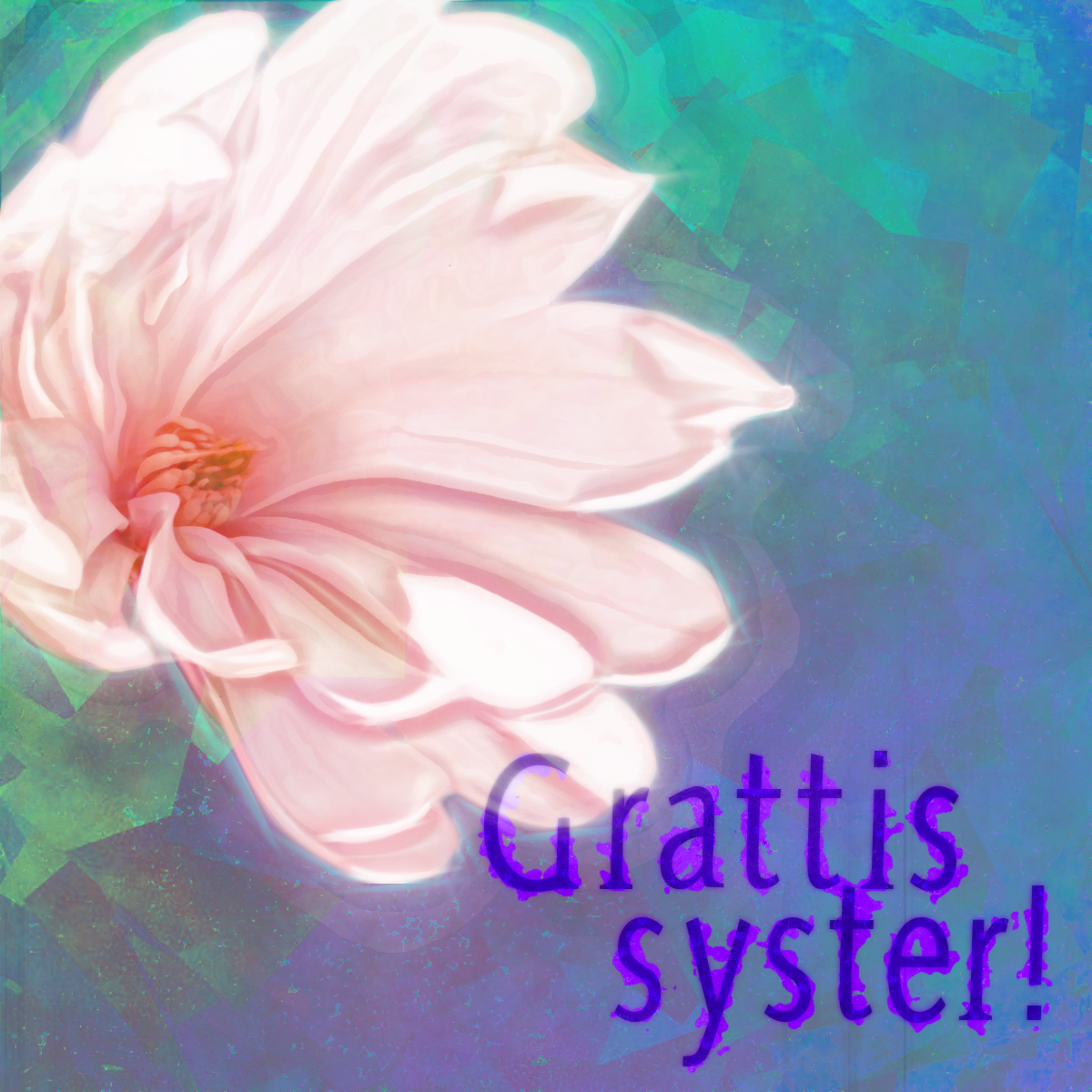
ludde: hehe, do you often get those songs mixed up in real life? thanks for comments, i'm glad you like the flower. i agree about the text, less said about it the better.
sallyanne: thank you

! i don't worry about printing colours for this particular card - my sister and her family are in italy on holiday, so i had to send it by email this time around. otherwise it's my experience that colours usually look a lot darker and duller when you print than on the screen and i try to bear that in mind when i make cards. not easy though!
issabella: thank you! i applied a whole load of filters on it - some only on the magnolia, some only on the background - and used many different layer modes. to get the background, for example, i added a plasma cloud with a g'mic water effect, a plain colour layer in a turquoise shade, a random colour elipse layer and a plasma cloud layer i ran through the g'mic cubist filter. i set some of the layers to colour mode, one to overlay and one to lighten only, then i pulled down the opacity on the textured layers til i had just enough texture. so, lots of work as you can see
. glad you thought the result was worth it!
i made an update. borrowed erisian's laptop and tried to get the same colours and contrast levels that my original had, viewed on my screen. with my screen it looks a bit weird, but hopefully it looks better on other computers now! my main worry was that text - the grungy texture i tried to put on it was practically invisible and the purple was going far too much towards the red end.
 Login
Login Register
 Tweets
 FAQ
FAQ Advanced Search