It is currently Wed Sep 02, 2026 7:20 pm


All times are UTC - 5 hours [ DST ]


Post new topic Reply to topic  [ 3 posts ] 
Author Message
 Post subject: 1 day of leaning gimp
PostPosted: Mon Jun 20, 2011 8:34 pm  (#1) 
Offline
New Member

Joined: Jun 18, 2011
Posts: 3
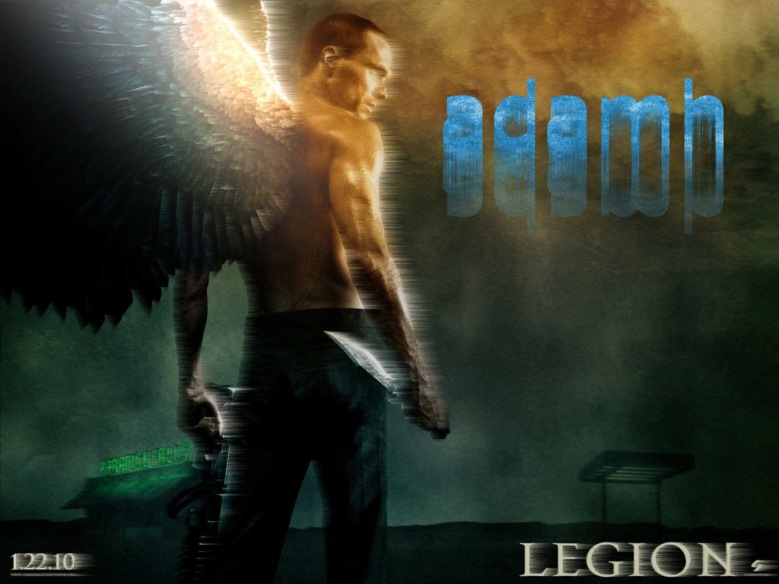
I have created a couple pictures, but this picture is the one i would like to discuss.

Any idea how to make it look nicer? Also any idea to make the text look nicer to go with the picture?

Image


Share on Facebook Share on Twitter Share on Orkut Share on Digg Share on MySpace Share on Delicious Share on Technorati
Top
 Post subject: Re: 1 day of leaning gimp
PostPosted: Mon Jun 20, 2011 11:45 pm  (#2) 
Offline
Retired Staff
User avatar

Joined: May 22, 2008
Posts: 6946
Location: Somewhere in GIMP
Isn't it fun seeing what you can do? Pretty cool. :hehe

_________________
Image
World War IV will be fought with sticks and stones. - Albert Einstein


Top
 Post subject: Re: 1 day of leaning gimp
PostPosted: Tue Jun 21, 2011 8:26 am  (#3) 
Offline
GimpChat Member

Joined: Mar 08, 2011
Posts: 155
Cool effect, nice job!

Some suggestions I would offer (since you're asking):

The wind (?) effect along his arm has a pretty abrupt cutoff. Maybe use a motion blur to stretch it out and soften it up a little.

As for the text, the effect is nice, but the color is wrong. You'd want to pick colors that go with the image, so a dark green or brownish-orange. Setting a text layer to overlay will also help text fit in better, or some other layer mode.


Top
Post new topic Reply to topic  [ 3 posts ] 

All times are UTC - 5 hours [ DST ]


cron

* Login  


Powered by phpBB3 © phpBB Group