It is currently Mon Sep 07, 2026 3:55 pm


All times are UTC - 5 hours [ DST ]


Post new topic Reply to topic  [ 5 posts ] 
Author Message
 Post subject: abc: a
PostPosted: Mon Feb 18, 2013 6:12 am  (#1) 
Offline
GimpChat Member
User avatar

Joined: Aug 16, 2012
Posts: 4271
Location: Göteborg, Sweden
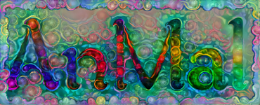
no work today. this means some time for beading and some time for finishing my second alphabet letter. here's "a for art nouveau". art nouveau (or jugend, as i'm used to calling it. swedes tradtitionally stole most of their art terms from the germans) is a style that has it all, in my opinion: high degree of decorativism, flat surfaces, strong contours, lots of extremes and no fear of overdoing things - too much is never enough :). i wish i could say i had designed that lovely whiplash curve all on my own, from scratch, but i've never managed to create a believable art nouveau curve with the path tool on my own. i started out with a picture of victor hortas famous entrance hall and took what i needed from those curves and edited and adapted it til i had something i liked.
Image

_________________


Share on Facebook Share on Twitter Share on Orkut Share on Digg Share on MySpace Share on Delicious Share on Technorati
Top
 Post subject: Re: abc: a
PostPosted: Mon Feb 18, 2013 9:23 am  (#2) 
Offline
GimpChat Member
User avatar

Joined: Jul 17, 2012
Posts: 2769
nice job AnMal !

all the elements work great

did you make the letter A yourself too ?


Top
 Post subject: Re: abc: a
PostPosted: Mon Feb 18, 2013 11:11 am  (#3) 
Offline
GimpChat Member
User avatar

Joined: Sep 22, 2012
Posts: 2089
Location: US
AnMal wrote:
no work today. this means some time for beading and some time for finishing my second alphabet letter. here's "a for art nouveau". art nouveau (or jugend, as i'm used to calling it. swedes tradtitionally stole most of their art terms from the germans) is a style that has it all, in my opinion: high degree of decorativism, flat surfaces, strong contours, lots of extremes and no fear of overdoing things - too much is never enough :). i wish i could say i had designed that lovely whiplash curve all on my own, from scratch, but i've never managed to create a believable art nouveau curve with the path tool on my own. i started out with a picture of victor hortas famous entrance hall and took what i needed from those curves and edited and adapted it til i had something i liked.
Image


It is looking pretty good, AnMal!
I tried to create my own glyphs a while ago, it wasn't an easy task.
I didn't use gimp for that, it was a standalone software called FontForge.
It's not perfect like some proprietary software, but still better than raster editors.
Is this a long term project or you're going to create just some alphabetic characters, not the whole alphabet?


Top
 Post subject: Re: abc: a
PostPosted: Mon Feb 18, 2013 1:06 pm  (#4) 
Offline
GimpChat Member
User avatar

Joined: Aug 30, 2012
Posts: 2174
AnMal - Very nice colours work well together and like the design.

_________________
Image


Top
 Post subject: Re: abc: a
PostPosted: Mon Feb 18, 2013 4:26 pm  (#5) 
Offline
GimpChat Member
User avatar

Joined: Aug 16, 2012
Posts: 4271
Location: Göteborg, Sweden
thanks, brothers! just so no one thinks i'm better than i really am, though: i don't make the letters, they're all taken from fonts. when i say "my" alphabet i mean it's built around things that inspire me personally.

k1tesseraena: you mustn't think i can create letters out of thin air - i can barely write legibly with pen and paper, i'd never be able to make well shaped letters in gimp!
to answer your question: i want to make the who0le alphabet but knowing myself i suspect i will run out of patience after the most important letters :). but i'm currently working on b and i have ideas for three more letters, so hopefully i'll get at least a decent bunch finished before i give up.

_________________


Top
Post new topic Reply to topic  [ 5 posts ] 

All times are UTC - 5 hours [ DST ]


* Login  


Powered by phpBB3 © phpBB Group