It is currently Tue Jun 09, 2026 10:51 am


All times are UTC - 5 hours [ DST ]


Post new topic Reply to topic  [ 18 posts ] 
Author Message
 Post subject: the "shine" text
PostPosted: Sun Apr 07, 2013 2:22 pm  (#1) 
Offline
GimpChat Member
User avatar

Joined: Aug 16, 2012
Posts: 4271
Location: Göteborg, Sweden
... from gimp science labs. i think my result sort of went its own sweet ways but the general technique is the same as in the blog walkthrough.
Image

_________________


Share on Facebook Share on Twitter Share on Orkut Share on Digg Share on MySpace Share on Delicious Share on Technorati
Top
 Post subject: Re: the "shine" text
PostPosted: Sun Apr 07, 2013 3:11 pm  (#2) 
Offline
Administrator
User avatar

Joined: Aug 10, 2012
Posts: 14014
Location: Native to NYC living in Arizona, Gimp 2.8 - 3.0, Win 11 PC.
AnMal wrote:
... from gimp science labs. i think my result sort of went its own sweet ways but the general technique is the same as in the blog walkthrough.
Image


@AnMal,

:bigthup

_________________
Image
"A wise man learns more from a foolish question than a fool can learn from a wise answer"
Image


Top
 Post subject: Re: the "shine" text
PostPosted: Sun Apr 07, 2013 3:18 pm  (#3) 
Offline
GimpChat Member
User avatar

Joined: Apr 07, 2010
Posts: 14182
Very nice AnMal, love the shiny background.

_________________
Image


Top
 Post subject: Re: the "shine" text
PostPosted: Sun Apr 07, 2013 3:37 pm  (#4) 
Offline
GimpChat Member
User avatar

Joined: Aug 28, 2012
Posts: 3060
Location: Idk where I am.
Forever a pink fluffy girl! :hi5

I like the text. :mrgreen:

_________________
Image
Reality is a lovely place...But I wouldn't wanna live there.


Top
 Post subject: Re: the "shine" text
PostPosted: Sun Apr 07, 2013 5:16 pm  (#5) 
Offline
GimpChat Member

Joined: Mar 04, 2013
Posts: 105
That looks great, AnMal. I don't know which I like better - the text or the background. They are both excellent. :clap

I am off to GSL now to try my hand at this effect.


Top
 Post subject: Re: the "shine" text
PostPosted: Sun Apr 07, 2013 6:18 pm  (#6) 
Offline
GimpChat Member
User avatar

Joined: Aug 16, 2012
Posts: 4271
Location: Göteborg, Sweden
wallace: thank you for the thumbs up :).
molly: thank you, sister! i couldn't resist a little bit of glitter...
mokonafan: :hi5 go pink fluffies! :mrgreen: thank you.
jas45: thank you - will be very interesting to see your take on this, you come up with some really cool results!

_________________


Top
 Post subject: Re: the "shine" text
PostPosted: Mon Apr 08, 2013 12:46 am  (#7) 
Offline
GimpChat Member

Joined: Mar 04, 2013
Posts: 105
I really like this effect. I will probably work some more with it tomorrow, but this was just an attempt to reproduce the tutorial. Thanks Esper :tyspin


Image


Top
 Post subject: Re: the "shine" text
PostPosted: Mon Apr 08, 2013 12:50 am  (#8) 
Offline
Retired Staff
User avatar

Joined: May 22, 2008
Posts: 6946
Location: Somewhere in GIMP
Gotta love that shiny pink text, AnMal. Nice job. :yes

_________________
Image
World War IV will be fought with sticks and stones. - Albert Einstein


Top
 Post subject: Re: the "shine" text
PostPosted: Mon Apr 08, 2013 5:21 am  (#9) 
Offline
GimpChat Member
User avatar

Joined: Mar 23, 2012
Posts: 7388
Location: Göteborg at last!
I loooove that glittery background!


Top
 Post subject: Re: the "shine" text
PostPosted: Mon Apr 08, 2013 7:55 am  (#10) 
Offline
GimpChat Member
User avatar

Joined: Jul 17, 2012
Posts: 2769
AnMal, thank you for doing my tutorial !! <3

it seems to me there are at some places a bit too many highlights
depending on where you look it looks really great, and when you look at other places it looks too much

in the original tutorial the shrink bevel was the highlights only and the shadows opacity turned down to zero, dont know if that was clear
i see the same with Jas45's version

really like the glitter but i like the light one better than the dark glitter

i must say, after re-doing the tutorial myself, its not my best effort

Jas45: nice one you gave it a go !

the trick for getting the bevels where you want them is you need to have an appropiate basetext for layerx to work with
that may not be clear from the walkthru
the highlight was applied to the basetext shrinked by 5, so you need to create a layer for that (you can turn it off) and then apply the bevel, so that its more inside the text

a big thank you to both of you for your support !!


Top
 Post subject: Re: the "shine" text
PostPosted: Mon Apr 08, 2013 12:02 pm  (#11) 
Offline
GimpChat Member
User avatar

Joined: Aug 16, 2012
Posts: 4271
Location: Göteborg, Sweden
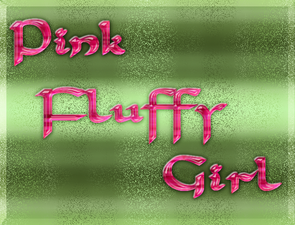
jas45: nice job! i think the "satin" effect in yours is really beautiful.
O: thank you :)! shiny and pink, two really great things for a text (or actually just about anything) to be...
erisian: thank you! glitter is an important part of life for many of us pink fluffy girls, you know :).
esper: i think that was because of the font. with your font and the size you use a shrink by 5 gave "the right" kind of highlight, with mine it didn't. no matter how much i shrinked mine with i would get those big highlighted spots here and there, that's what makes it look too much in your eyes, i think.. but i am happy with it this way and not complaining about the walkthrough, i think it was crystal clear :). and i didn't use those shadows at all, i deleted the shadow layers so it must be something else you see if you see shadows - very confusing. Image 
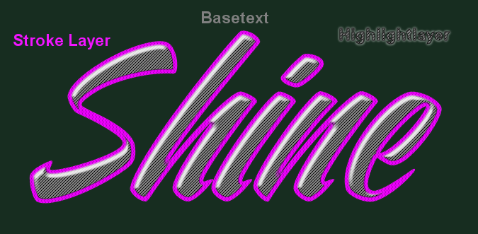
yeah, i agree that the light glitter is nicer looking than the dark - i was tired of just making glitters, so i wanted to make the glitters go in a pattern and it only almost worked :).

_________________


Top
 Post subject: Re: the "shine" text
PostPosted: Mon Apr 08, 2013 3:30 pm  (#12) 
Offline
GimpChat Member

Joined: Mar 04, 2013
Posts: 105
Esper: Thanks for the information. I thought about explaining why I omitted that step when I uploaded the result, but it was late last night and I was tired. I tried to make up for the ommission with a thin outer stroke, but now that I see it on GC, I should have turned the opacity down even more.

On the Ventography font there is a very thin area, and I was trying not to make it any thiner on this try. I have not had any Gimp time today, but tonight I will try again with another font and put that bevel step in.

Thanks again for your help and advice.

Image

AnMal: Thanks.


Top
 Post subject: Re: the "shine" text
PostPosted: Mon Apr 08, 2013 9:14 pm  (#13) 
Offline
GimpChat Member

Joined: Mar 04, 2013
Posts: 105
Esper:

I just wanted to be sure I understood everything you said earlier before I go on. Does this look right or am I still missing something? Since I changed fonts, it's not quite as easy for me to be sure it is identical to yours.

Thanks.

Image


Top
 Post subject: Re: the "shine" text
PostPosted: Mon Apr 08, 2013 9:50 pm  (#14) 
Offline
GimpChat Member
User avatar

Joined: Jul 17, 2012
Posts: 2769
not really
you want the highlight more inside the text

layerfx does not work with selections, so you actually need three layers

one for the basetext
one for the highlight (basetext-selection shrinked by 5 and filled on a new layer)
and one for the stroke (alpha select basetext duplicate, shrink by 5, cut)

you can turn off these layers after applying layerfx, or even apply it on the turned off layer

Image

Image

EDIT:
a clarification for the word 'Stroke'
on my blog i call a stroked path 'Stroke' and cutting or masking the inside of a text 'Border'
but this is just something i made up to show the difference
in PS layer styles there is only one type of 'Stroke'


Last edited by Esper on Mon Apr 08, 2013 11:18 pm, edited 1 time in total.

Top
 Post subject: Re: the "shine" text
PostPosted: Mon Apr 08, 2013 11:04 pm  (#15) 
Offline
GimpChat Member

Joined: Mar 04, 2013
Posts: 105
Thanks. Now I think I (finally) understand.


Top
 Post subject: Re: the "shine" text
PostPosted: Mon Apr 08, 2013 11:20 pm  (#16) 
Offline
GimpChat Member
User avatar

Joined: Jul 17, 2012
Posts: 2769
im sorry Jas45 for being so unclear

i never really intended to make a tutorial for this picture, it was just something i came up with when i tried to imitate a PS tutorial
but then people asked for it and i made the walkthru

the effect really is a hybrid between xgeous plastic text technique and the ombre effect


Top
 Post subject: Re: the "shine" text
PostPosted: Tue Apr 09, 2013 12:40 am  (#17) 
Offline
GimpChat Member

Joined: Mar 04, 2013
Posts: 105
Esper, you were not unclear... I was just a bad follower on this tutorial.

Here is my latest submission. My only doubt (assuming that I finally got the correct result) is whether you leave the shadow layer visible in the 'Stroke' group? I turned it off here, because it seems to match your image best.

Sure hope this is right. :)

Thanks for your patience.

Image


Top
 Post subject: Re: the "shine" text
PostPosted: Tue Apr 09, 2013 12:59 am  (#18) 
Offline
GimpChat Member
User avatar

Joined: Jul 17, 2012
Posts: 2769
the stroke in my version has shadow and highlight, but both white
you can see it in the screenshot for the bevel


Top
Post new topic Reply to topic  [ 18 posts ] 

All times are UTC - 5 hours [ DST ]


* Login  


Powered by phpBB3 © phpBB Group