Golden Bagpipes Logo
Fri May 10, 2013 1:35 pm
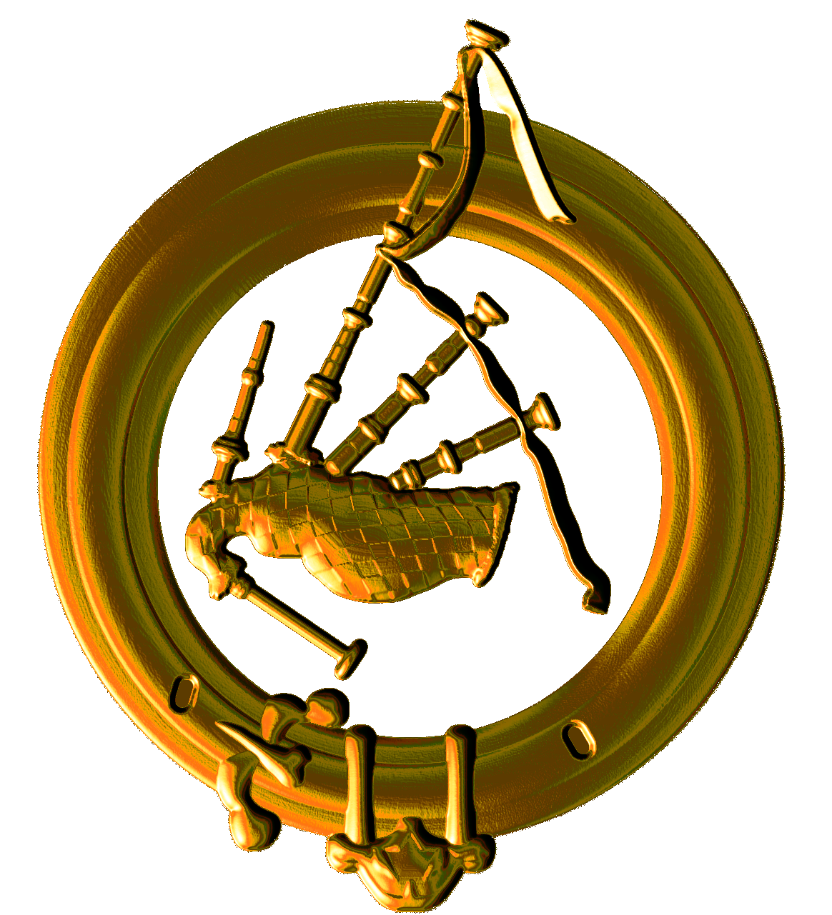
Here's a project I made today. It's all done in GIMP as a height map and then made to look like a medallion by doing an emboss filter and curves with a colorize version. Not easy to explain.
Alan
Alan
Re: Golden Bagpipes Logo
Fri May 10, 2013 1:39 pm
However you did it, it is quite nice.
Re: Golden Bagpipes Logo
Fri May 10, 2013 1:43 pm
(old joke)
What is the definition of a Scottish Gentleman?
One who knows how to play the pipes
--
--
but does not
What is the definition of a Scottish Gentleman?
One who knows how to play the pipes
--
--
but does not
Re: Golden Bagpipes Logo
Fri May 10, 2013 2:09 pm
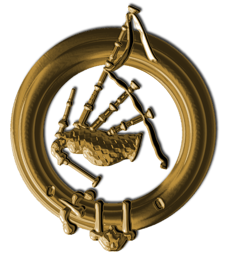
Actually blurring a little then unsharp masking and then random up and down curves and then colorize gives a bit more shinyness to the gold. Plus a little drop shadowing.
Alan
Alan
Re: Golden Bagpipes Logo
Fri May 10, 2013 2:50 pm
Fantastic !
what is the stuff that is attached to the ring at the bottom ?
what is the stuff that is attached to the ring at the bottom ?
Re: Golden Bagpipes Logo
Fri May 10, 2013 3:20 pm
Esper wrote:Fantastic !
what is the stuff that is attached to the ring at the bottom ?
It's a traditional tool much used by Scots men: a thistle thorn extractor, which is very useful when you wander in the glens with nothing under your kilt.
Re: Golden Bagpipes Logo
Fri May 10, 2013 3:22 pm
lol  woo hoo
Re: Golden Bagpipes Logo
Fri May 10, 2013 5:34 pm
Esper wrote:Fantastic !
what is the stuff that is attached to the ring at the bottom ?
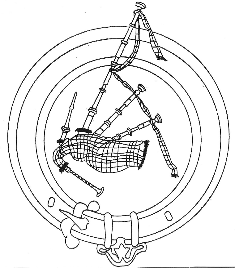
I made the height map image for someone else but don't know what that stuff is. This is the image I used as reference.
Re: Golden Bagpipes Logo
Sat May 11, 2013 6:29 am
Unbelievably gorgeous work PegLeg!
Re: Golden Bagpipes Logo
Sat May 11, 2013 6:32 am
pegleg44: wow, that's great work! especially the one with the colours modified, really looks like gold. the ring around the bagpipes looks like it's a dress belt, the kind worn with a tartan - some of the details esper wondered about are the belt loops and the clasp, but i don't know about the ornament at the bottom center.
Re: Golden Bagpipes Logo
Sat May 11, 2013 7:01 am
Great work PegLeg, this certainly doesn't look easy to do  The modified one is the best one, it really has that gold effect!
Re: Golden Bagpipes Logo
Sat May 11, 2013 11:24 am
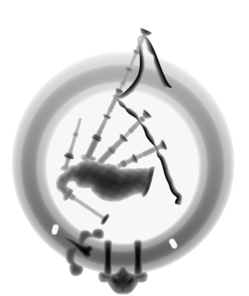
Yes this type of stuff is hard to do. I've been playing around with techniques for creating these types of images for a couple of years now. Here's what the height map looks like. This image is then embossed, blurred, sharpened, curved and then colorized to get that gold look to it.
There's many different techniques that need to be used to do something like this. When your working with different layers of grey blends you can make them blend together by setting the layer mode to Darken Only.
Alan
There's many different techniques that need to be used to do something like this. When your working with different layers of grey blends you can make them blend together by setting the layer mode to Darken Only.
Alan
Re: Golden Bagpipes Logo
Sat May 11, 2013 11:48 am
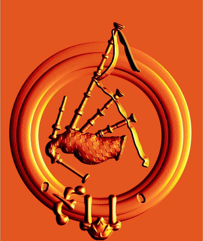
If you take a height map and emboss it you could then change the color map by going to [Color] [Map] [Color Map] to give it any gradient you want like this one Incandescent. Of coarse you must have the gradient that you want to use selected in the gradient toolbox.
Alan
Alan
Re: Golden Bagpipes Logo
Sat May 11, 2013 12:27 pm
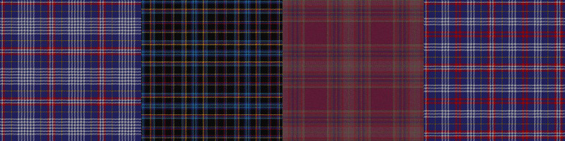
I think the logo needs a nice tartan texture background.
Re: Golden Bagpipes Logo
Sat May 11, 2013 1:39 pm
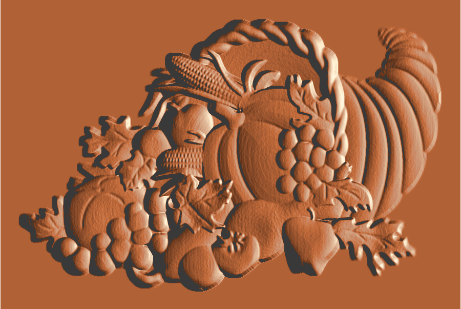
Here's a cornucopia I had made a few days ago.
Re: Golden Bagpipes Logo
Sat May 11, 2013 3:25 pm
I love that one the best so far, I wouldn't mind knowing how you did that. It is so soft looking and no hard edges. Looks like the whole thing was made with a chisel.
Re: Golden Bagpipes Logo
Sat May 11, 2013 4:55 pm
molly wrote:I wouldn't mind knowing how you did that.
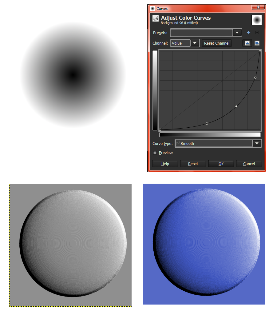
Well molly, you have to draw greyscale gradients that are rounded to get a good rounded emboss. Here is an easy way to explain getting roundness.
Start off drawing an radial gradient. Then use the Curves dialog box to round it up. Then emboss it. Then colorize it.
Alan
Re: Golden Bagpipes Logo
Sat May 11, 2013 5:52 pm
Thank you Alan, I am going to have to give this a try.