Thanks for the comments! I'm glad this style seems to have worked, despite (or maybe because of) being a quickie.
Oregonian wrote:
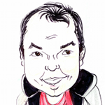
I almost feel like I know your lady. She shows up in your art work a lot and she has a warm, familiar feel to her.
I love the shadowing on it, very nicely done.
I didn't aim for this to be any of my usual cast but I guess the feel of her nevertheless turned out somewhat familiar.

lylejk wrote:
You ought to quit Astronomy and start making buckoo bucks with your art Griatch because you would. Very much like this graphic novel feel to this result.
It -is- sort of comic-y isn't it.
I don't think I'd quit my day job just yet though.

2-ton wrote:
love this style and you do it very well
AnMal wrote:
griatch: mycket vackert! this is a style i've always loved and i agree with everyone else that you do it very well. fantastic work on the shading and i love the feeling in the picture.
kimppi wrote:
I like this style! You have preserved your normal style's vividity in this more crisp rendering style! This kind of style can be too clinical, but no sign of that here!
It's certainly true that hard blacks can tend to be a bit harsh to the eye. I rarely find it "clinical" myself though, rather I can find it somewhat messy if the white areas are not left large enough. The most difficult part of this style is really the negative areas (the white's) and knowing what the heck to leave out.
Erisian wrote:
Beautiful work. I like the style too. I think the angle of the mouth and nose need adjusting a little though.
Thanks for the pointer! I did a slight shift of her nostril (take a look). But otherwise I think the shadowing is easily confusing the eye here, it makes it look like the nose is more turned to the left than it is. it's the problem of chooseing to only use one level of gray shading; one really needs many more to correctly represent the three-dimensional form of the nose ridge from this angle.
.
Griatch
 Login
 Register
 Tweets
 FAQ
 Advanced Search