It is currently Thu Sep 17, 2026 1:29 am


All times are UTC - 5 hours [ DST ]


Post new topic Reply to topic  [ 24 posts ]  Go to page 1, 2  Next
Author Message
 Post subject: what do you think of this tracklist artwork ?
PostPosted: Sun Aug 18, 2013 2:21 pm  (#1) 
Offline
GimpChat Member
User avatar

Joined: Jul 17, 2012
Posts: 2769
so on my music board there is a guy called Dj Extreme
he posts free mixes for everybody to download

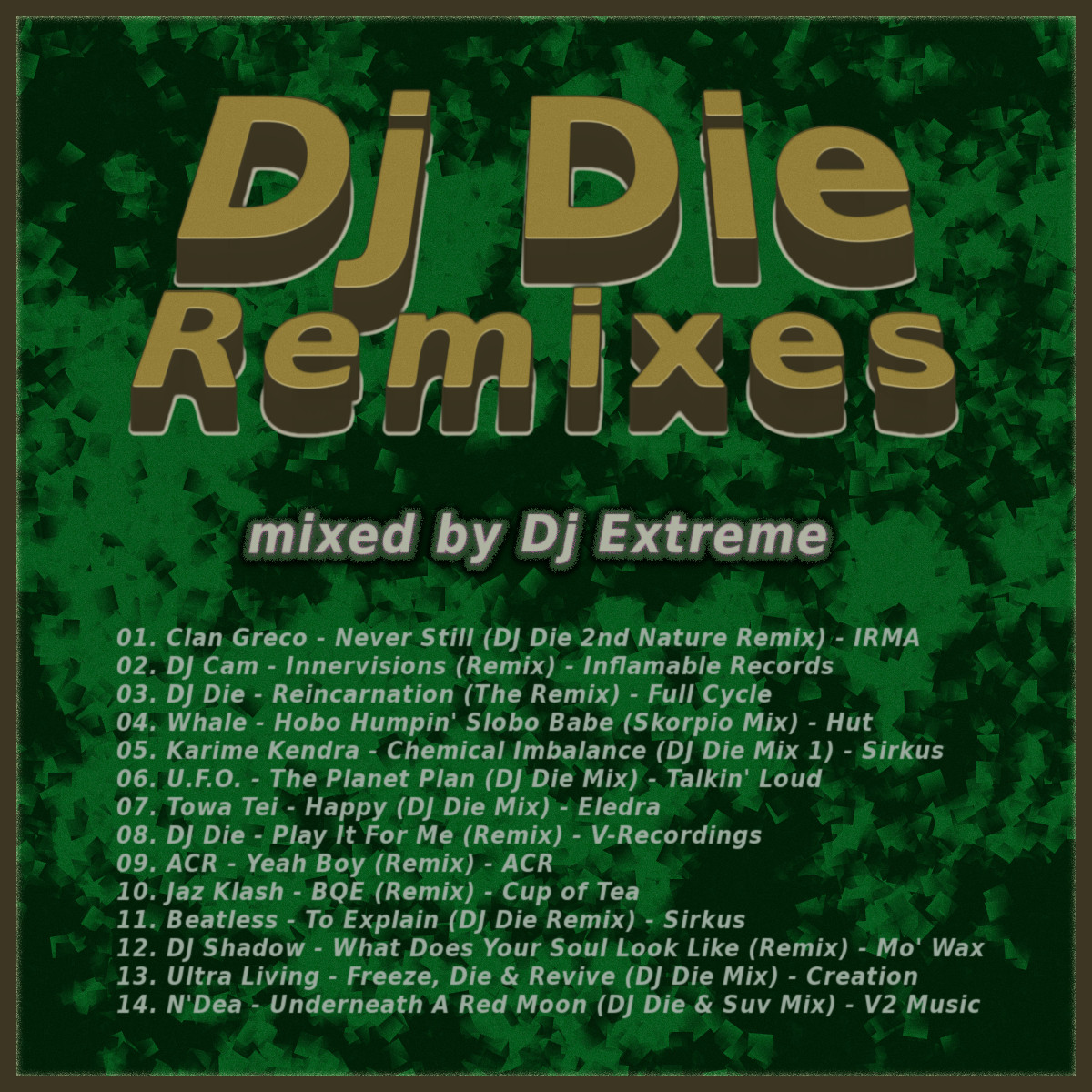
i think hes a nice guy and i wanted to trwat one of his mixes with some tracklist artwork

heres what i came up with - was quite difficult for me to get right and i dont want to spent another couples of hours on this
it was supposed to be quick and simple, lol

any kind of input very much appreciated
oh btw, the name 'Dj Die' has nothing to do with death, lol
it comes from Daniel and has been the prodcuers name since the 90ies

Image

EDIT:
made another version

Image


Share on Facebook Share on Twitter Share on Orkut Share on Digg Share on MySpace Share on Delicious Share on Technorati
Top
 Post subject: Re: what do you think of this tracklist artwork ?
PostPosted: Sun Aug 18, 2013 2:59 pm  (#2) 
Offline
Administrator
User avatar

Joined: Aug 10, 2012
Posts: 14205
Location: Native to NYC living in Arizona, Gimp 2.8 - 3.0, Win 11 PC.
Esper wrote:
so on my music board there is a guy called Dj Extreme
he posts free mixes for everybody to download

i think hes a nice guy and i wanted to trwat one of his mixes with some tracklist artwork

heres what i came up with - was quite difficult for me to get right and i dont want to spent another couples of hours on this
it was supposed to be quick and simple, lol

any kind of input very much appreciated
oh btw, the name 'Dj Die' has nothing to do with death, lol
it comes from Daniel and has been the prodcuers name since the 90ies

[ Image ]

EDIT:
made another version

[ Image ]

I think it's pretty good. The letters are very clean/smooth.
IMHO... it does lack a sense of flair, that can sometimes be associated with the music scene/industry.
Also, the space between the words 'DJ Die' and 'Remixes' could have been given a bit more separation. The numbers before each song seem to also need some kind of separation or maybe a colon or a full stop/period.

_________________
Image
"A wise man learns more from a foolish question than a fool can learn from a wise answer"
Image


Top
 Post subject: Re: what do you think of this tracklist artwork ?
PostPosted: Sun Aug 18, 2013 3:10 pm  (#3) 
Offline
Global Moderator
User avatar

Joined: May 16, 2010
Posts: 16173
Wallace wrote:
Esper wrote:
so on my music board there is a guy called Dj Extreme
he posts free mixes for everybody to download

i think hes a nice guy and i wanted to trwat one of his mixes with some tracklist artwork

heres what i came up with - was quite difficult for me to get right and i dont want to spent another couples of hours on this
it was supposed to be quick and simple, lol

any kind of input very much appreciated
oh btw, the name 'Dj Die' has nothing to do with death, lol
it comes from Daniel and has been the prodcuers name since the 90ies

[ Image ]

EDIT:
made another version

[ Image ]

I think it's pretty good. The letters are very clean/smooth.
IMHO... it does lack a sense of flair, that can sometimes be associated with the music scene/industry.
Also, the space between the words 'DJ Die' and 'Remixes' could have been given a bit more separation. The numbers before each song seem to also need some kind of separation or maybe a colon or a full stop/period.


It looks really good but that bg needs something. Maybe some grunge?

_________________
Image


Top
 Post subject: Re: what do you think of this tracklist artwork ?
PostPosted: Sun Aug 18, 2013 3:12 pm  (#4) 
Offline
GimpChat Member
User avatar

Joined: Jul 17, 2012
Posts: 2769
thanks Wallace

i agree about the lack of flair, but no ideas at the moment how this could be improved
as i said, it was supposed to be quick and easy, lol

dont know about the space between die and remix
but im not doing this all over again - so no to that tip, lol

the tracklist was copy and pasted from dj extreme`s tracklist, so its all his fault


Top
 Post subject: Re: what do you think of this tracklist artwork ?
PostPosted: Sun Aug 18, 2013 3:47 pm  (#5) 
Offline
GimpChat Member
User avatar

Joined: Aug 05, 2013
Posts: 46
Location: Germany
Yes the Tracklist has something missing, something that makes it unique. Try to play with the listing style too (let it look like stairs for example)

If you do something with a background try to "mute" it or else it would be too difficult to read the tracknames. Maybe you should look at real backcovers on CDs you own.

_________________
My Youtube Channel with Timelapse Videos: -> bloodywing1 :: My Facebook Page / Art with MyPaint and GIMP


Top
 Post subject: Re: what do you think of this tracklist artwork ?
PostPosted: Sun Aug 18, 2013 3:53 pm  (#6) 
Offline
Administrator
User avatar

Joined: Aug 10, 2012
Posts: 14205
Location: Native to NYC living in Arizona, Gimp 2.8 - 3.0, Win 11 PC.
Hey Esper.
I reworked the image a little, only to demonstrate what I mentioned. Would it be alright for me to post it here for you to view?

_________________
Image
"A wise man learns more from a foolish question than a fool can learn from a wise answer"
Image


Top
 Post subject: Re: what do you think of this tracklist artwork ?
PostPosted: Sun Aug 18, 2013 4:03 pm  (#7) 
Offline
GimpChat Member
User avatar

Joined: Apr 07, 2010
Posts: 14182
I agree with Wallace, the main letters (the large ones need more space between the letters)
The list below could be 01 - Clan 02 - DJ and so on. I wouldn't change the background, it would make it too busy and crowd out the text.
Other than that...very good

_________________
Image


Top
 Post subject: Re: what do you think of this tracklist artwork ?
PostPosted: Sun Aug 18, 2013 4:30 pm  (#8) 
Offline
GimpChat Member
User avatar

Joined: Jul 17, 2012
Posts: 2769
bloody wrote:
Yes the Tracklist has something missing, something that makes it unique. Try to play with the listing style too (let it look like stairs for example)

If you do something with a background try to "mute" it or else it would be too difficult to read the tracknames. Maybe you should look at real backcovers on CDs you own.

hm, not sure what to make of it
what do you mean with mute ?

Wallace wrote:
Hey Esper.
I reworked the image a little, only to demonstrate what I mentioned. Would it be alright for me to post it here for you to view?

sure ! :bigthup

molly wrote:
I agree with Wallace, the main letters (the large ones need more space between the letters)
The list below could be 01 - Clan 02 - DJ and so on. I wouldn't change the background, it would make it too busy and crowd out the text.
Other than that...very good
thanks molly
will see about changing the tracklist

i kind of agree about the background, but i tried to incorporate Rod' suggestion
it looks good, but its not really what i wanted it to bein the beginning

Image

EDIT: with periods after each number

Image


Top
 Post subject: Re: what do you think of this tracklist artwork ?
PostPosted: Sun Aug 18, 2013 4:55 pm  (#9) 
Offline
Script Coder
User avatar

Joined: Oct 25, 2010
Posts: 4812
For me the white fuzzy outline contradicts the 3D effect... you can't have a 2D outline on a 3D drawing. And if its a 3D outline of where the letters rest on the background, then it's wrong (it shouldn't be visible on top edges).

Also, the 3D perspective calls for everything to follow that perspective, but a track list with perspective could be hard to read.

Typography is a bit erratic, it uses Title Case ("The Planet Plan") or not ("Play it for me"). It lacks a bit of space between the track numbers and the titles (and maybe some punctuation: "12:" or "12."). And speaking of track numbers, leading zeros are OK for file names but not fit for human consumption.

_________________
Image


Top
 Post subject: Re: what do you think of this tracklist artwork ?
PostPosted: Sun Aug 18, 2013 5:12 pm  (#10) 
Offline
GimpChat Member
User avatar

Joined: Jul 17, 2012
Posts: 2769
ofnuts wrote:
For me the white fuzzy outline contradicts the 3D effect... you can't have a 2D outline on a 3D drawing. And if its a 3D outline of where the letters rest on the background, then it's wrong (it shouldn't be visible on top edges).
funny enough, i have seen that on several packages for chips, mini-salami, chocolate, etc.
thats where i got the idea from

i agree about the top edges

Quote:
Also, the 3D perspective calls for everything to follow that perspective, but a track list with perspective could be hard to read.
tried that and you are right, it looks crap

EDIT: i think i liked the old outline better

Image


Top
 Post subject: Re: what do you think of this tracklist artwork ?
PostPosted: Sun Aug 18, 2013 5:23 pm  (#11) 
Offline
Administrator
User avatar

Joined: Aug 10, 2012
Posts: 14205
Location: Native to NYC living in Arizona, Gimp 2.8 - 3.0, Win 11 PC.
Here is my example of the things I mentioned. Sorry Espar if you feel I chopped up your image.
Image

_________________
Image
"A wise man learns more from a foolish question than a fool can learn from a wise answer"
Image


Top
 Post subject: Re: what do you think of this tracklist artwork ?
PostPosted: Sun Aug 18, 2013 5:28 pm  (#12) 
Offline
GimpChat Member
User avatar

Joined: Jul 17, 2012
Posts: 2769
thanks Wallace
dont feel bad for showing me your vision !

you can always edit my stuff if you like, dont have to ask for permission

i see what you mean, i was under the impression you wanted me to make the space between dj die and remixes smaller


Top
 Post subject: Re: what do you think of this tracklist artwork ?
PostPosted: Sun Aug 18, 2013 6:18 pm  (#13) 
Offline
Script Coder
User avatar

Joined: Oct 25, 2010
Posts: 4812
Definitely more like it at least for the track list. But I agree that this outline isn't much better than the original.

_________________
Image


Top
 Post subject: Re: what do you think of this tracklist artwork ?
PostPosted: Sun Aug 18, 2013 6:56 pm  (#14) 
Offline
Administrator
User avatar

Joined: Aug 10, 2012
Posts: 14205
Location: Native to NYC living in Arizona, Gimp 2.8 - 3.0, Win 11 PC.
Esper wrote:
thanks Wallace
dont feel bad for showing me your vision !

you can always edit my stuff if you like, dont have to ask for permission

i see what you mean, i was under the impression you wanted me to make the space between dj die and remixes smaller

You're welcome Esper.
Just the opposite, as you can see form my reworking of your image.
Also the fuzzy out line is good, but as others have mentioned, it looks odd against the 3D lettering.
To me, the fuzzy white outline looks like the letters are sitting on a cutout of 'white grass' and are not actually part of the lettering itself.
I do still like that fuzzy outline effect though. ;)

_________________
Image
"A wise man learns more from a foolish question than a fool can learn from a wise answer"
Image


Top
 Post subject: Re: what do you think of this tracklist artwork ?
PostPosted: Mon Aug 19, 2013 7:59 am  (#15) 
Offline
GimpChat Member
User avatar

Joined: Aug 05, 2013
Posts: 46
Location: Germany
"mute" means that the colors are not as vivid as regular colors. See here: https://en.wikipedia.org/wiki/Colorfulness
Quick tutorial how to mute an image: http://www.gimpology.com/submission/vie ... or_effect/

_________________
My Youtube Channel with Timelapse Videos: -> bloodywing1 :: My Facebook Page / Art with MyPaint and GIMP


Top
 Post subject: Re: what do you think of this tracklist artwork ?
PostPosted: Mon Aug 19, 2013 9:40 am  (#16) 
Offline
GimpChat Member
User avatar

Joined: Jul 17, 2012
Posts: 2769
bloody wrote:
"mute" means that the colors are not as vivid as regular colors. See here: https://en.wikipedia.org/wiki/Colorfulness
Quick tutorial how to mute an image: http://www.gimpology.com/submission/vie ... or_effect/
thanks for the links !
i guess i understand now what you mean

is there another way to find a mute colour without using the technique you linked to ?


Top
 Post subject: Re: what do you think of this tracklist artwork ?
PostPosted: Mon Aug 19, 2013 9:50 am  (#17) 
Offline
GimpChat Member
User avatar

Joined: Aug 05, 2013
Posts: 46
Location: Germany
You can try something similar with grey layers and play with the layermodes. I think you can reach a similar effect with that.

And open the palette selector dialog in GIMP there should a muted color palette somewhere called "Muted"


Attachments:
palettes.png
palettes.png [ 23.39 KiB | Viewed 1440 times ]

_________________
My Youtube Channel with Timelapse Videos: -> bloodywing1 :: My Facebook Page / Art with MyPaint and GIMP
Top
 Post subject: Re: what do you think of this tracklist artwork ?
PostPosted: Mon Aug 19, 2013 9:54 am  (#18) 
Offline
GimpChat Member
User avatar

Joined: Jul 17, 2012
Posts: 2769
i wonder if you can just reduce the saturation of any color

EDIT: i had a look at the Mute palette
there isnt any color that matches something like i used for the background, but i get the idea, of what a muted colour would look like !
:bigthup


Top
 Post subject: Re: what do you think of this tracklist artwork ?
PostPosted: Mon Aug 19, 2013 10:03 am  (#19) 
Offline
GimpChat Member
User avatar

Joined: Nov 09, 2011
Posts: 726
I really like a lot that kind of outlined that have 3D letters.
I'd like to see how it looks applied also in the song list below :)

_________________
Image
Be patient, English is not my language.


Top
 Post subject: Re: what do you think of this tracklist artwork ?
PostPosted: Mon Aug 19, 2013 10:15 am  (#20) 
Offline
GimpChat Member
User avatar

Joined: Jul 17, 2012
Posts: 2769
YAFU wrote:
I really like a lot that kind of outlined that have 3D letters.
I'd like to see how it looks applied also in the song list below :)

i dont understand what you mean but be my guest


Attachments:
Dj Die vs Dj Extreme - ESP.rar [4.11 MiB]
Downloaded 92 times
Top
Post new topic Reply to topic  [ 24 posts ]  Go to page 1, 2  Next

All times are UTC - 5 hours [ DST ]


* Login  


Powered by phpBB3 © phpBB Group