It is currently Sun Sep 27, 2026 2:29 am


All times are UTC - 5 hours [ DST ]


Post new topic Reply to topic  [ 23 posts ]  Go to page 1, 2  Next
Author Message
 Post subject: Created This Logo For A Client
PostPosted: Thu Sep 19, 2013 10:09 pm  (#1) 
Offline
GimpChat Founder
User avatar

Joined: May 22, 2008
Posts: 5241
Location: Gimpville
I created this logo for a client. I thought it turned out pretty good and wanted to see what y'all thought. The business is called Especially Abrasives and I've been contracted to create an eCommerce site and logo. Thoughts and suggestions are welcomed.

Image

Enhanced with the EnviroLogo Script.

_________________
“If you reach for the stars, you just might land on a decently sized hill.” - Stuart Hill


Share on Facebook Share on Twitter Share on Orkut Share on Digg Share on MySpace Share on Delicious Share on Technorati
Top
 Post subject: Re: Created This Logo For A Client
PostPosted: Thu Sep 19, 2013 10:32 pm  (#2) 
Offline
GimpChat Member
User avatar

Joined: Sep 24, 2010
Posts: 12849
Do you have a letter head equivalent for this logo too Tux? Simple is the best. If this logo is based on their standard logo, that's cool; this one can be used for their online presence. If this logo's going to be used for all things, then letterhead costs can be an issue. Maybe the grill can be removed for letterhead purposes for instance. As for the logo itself, I can see the e and the a, but, the e can be construed as a g. Not sure how to work the logo since I'm not that creative. lol

:)

_________________
Lyle

Psalm 109:8

Image


Top
 Post subject: Re: Created This Logo For A Client
PostPosted: Thu Sep 19, 2013 10:43 pm  (#3) 
Offline
GimpChat Member
User avatar

Joined: Jul 17, 2012
Posts: 2769
i like it as a piece of art !
its kind of futuristic and stylish

the green background is very nice and looks like painted metal

the form of the logo is also very nice
and needless to say, that the enviromapped finish looks great ;)
the reflected text inside the logo is cool too

what i dont know is if this is a good company logo
in my opinion its all a bit too much
the initials are not easily readable

same with the text inside the reflection - i dont even know what it says
but i guess its the company name ?
EDIT: it says copyright.....

personally i find the gradient for a company logo too much
especially the white middle
i would go with a simple two colour gradient

and then on top of all that you have this green background

so all in all, i think there is very much going on
and maybe a bit more simplicity would be better


but then again it depends on the context of the website
(and also the final size of the logo)


Top
 Post subject: Re: Created This Logo For A Client
PostPosted: Thu Sep 19, 2013 10:45 pm  (#4) 
Offline
GimpChat Founder
User avatar

Joined: May 22, 2008
Posts: 5241
Location: Gimpville
I hear what you guys are saying.

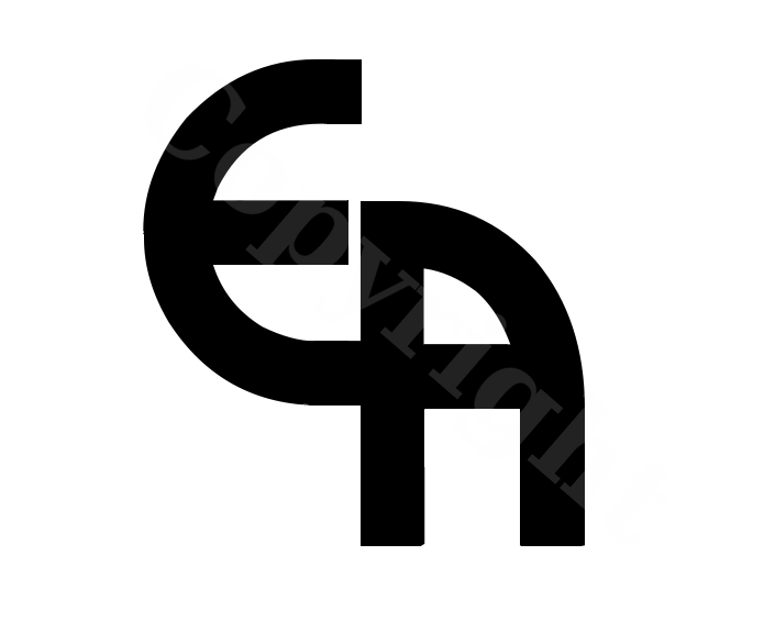
Being a fairly new start-up, they do not currently have a logo. These are the plain Jane logos I've came up with, which would be more appropriate for letterheads and such. The colors and background of the logo can be pretty much anything. They need a little tweaking but it's the basic design that I'm trying to get right.

Image

Another variation..

Image

_________________
“If you reach for the stars, you just might land on a decently sized hill.” - Stuart Hill


Top
 Post subject: Re: Created This Logo For A Client
PostPosted: Thu Sep 19, 2013 10:49 pm  (#5) 
Offline
GimpChat Member
User avatar

Joined: Aug 28, 2012
Posts: 3060
Location: Idk where I am.
I think that it's hard to tell it's an E and an A, it looks very nice! But hard to read.
Also the background it too much green in my opinion. - The color looks like you used a gradient and have a rounded white line in the middle of it I think it might throw it off a bit.

Still very nice either way! :D


:ninja

The second version is better form wise I can tell it's an e and an a much better now.
It just needs a few loose pixels erased.

Nice works! :>

_________________
Image
Reality is a lovely place...But I wouldn't wanna live there.


Top
 Post subject: Re: Created This Logo For A Client
PostPosted: Thu Sep 19, 2013 10:57 pm  (#6) 
Offline
GimpChat Founder
User avatar

Joined: May 22, 2008
Posts: 5241
Location: Gimpville
Ok, I think I've gotten rid of the extraneous pixels and other artifacts on both images.

_________________
“If you reach for the stars, you just might land on a decently sized hill.” - Stuart Hill


Top
 Post subject: Re: Created This Logo For A Client
PostPosted: Thu Sep 19, 2013 11:07 pm  (#7) 
Offline
GimpChat Member
User avatar

Joined: Jul 17, 2012
Posts: 2769
i think the question of scalability and repeatability also needs to be adressed

if this is to be the logo of a company you probably need to have it in all kinds of sizes with the same look

can you do that with an enviromap ?


Top
 Post subject: Re: Created This Logo For A Client
PostPosted: Thu Sep 19, 2013 11:08 pm  (#8) 
Offline
Administrator
User avatar

Joined: Aug 10, 2012
Posts: 14213
Location: Native to NYC living in Arizona, Gimp 2.8 - 3.0, Win 11 PC.
That looks great. :bigthup
Only issue I see is the green mesh background.
It's a bit to striking, or sharp but still works well with your text.
Maybe if you turned down the opacity of that great looking green mesh background pattern (keeping the black background), it might make the text push forward more.

_________________
Image
"A wise man learns more from a foolish question than a fool can learn from a wise answer"
Image


Top
 Post subject: Re: Created This Logo For A Client
PostPosted: Fri Sep 20, 2013 4:18 am  (#9) 
Offline
GimpChat Member
User avatar

Joined: Mar 23, 2012
Posts: 7388
Location: Göteborg at last!
Personally I like the first one. It's an excellent design.


Top
 Post subject: Re: Created This Logo For A Client
PostPosted: Fri Sep 20, 2013 5:15 am  (#10) 
Offline
GimpChat Member
User avatar

Joined: Jun 24, 2010
Posts: 504
Location: Western Vic Australia
Hi Tux , very nice as a piece of art, but I agree with all the comments. The separation/ legibility/ interpreting of letters is not clear. Printing wise, sticking with 2 colours or one colour in different density is much more cost efficient. I quite like the rounded logo. I took the liberty to show another method of letter separation, using the same hue different density. Perhaps, to make the logo more easily identified with the company name you could write in smaller letters (same hues) in a much smaller font the word "especially" above the middle of the E and "abrasives" under the legs of the A. Just a thought


Attachments:
especially abrasives.jpg
especially abrasives.jpg [ 3.98 KiB | Viewed 1856 times ]

_________________
Image
Top
 Post subject: Re: Created This Logo For A Client
PostPosted: Fri Sep 20, 2013 5:22 am  (#11) 
Offline
GimpChat Member
User avatar

Joined: Apr 07, 2010
Posts: 14182
I love the first one but it could be quite busy as a letter head. I also love the others with the water marks. Fantastic job on them both and I am sure the client will love them..

_________________
Image


Top
 Post subject: Re: Created This Logo For A Client
PostPosted: Fri Sep 20, 2013 6:44 am  (#12) 
Offline
GimpChat Member

Joined: Aug 27, 2010
Posts: 491
I've been called especially abrasive on occasion. Usually by my wife. :)

The logo looks great. If it were my business I'd be thrilled with it.


Top
 Post subject: Re: Created This Logo For A Client
PostPosted: Fri Sep 20, 2013 6:54 am  (#13) 
Offline
GimpChat Member
User avatar

Joined: Aug 30, 2012
Posts: 2174
Looks good, I do prefer the shape of the first one even if it is hard to read but agree it is to busy colour wise for a main logo possibly ok for the web page.

_________________
Image


Top
 Post subject: Re: Created This Logo For A Client
PostPosted: Fri Sep 20, 2013 7:36 am  (#14) 
Offline
GimpChat Member
User avatar

Joined: Nov 09, 2011
Posts: 726
Very nice logo!
Personally I prefer the second. I see a letter "T" in the first.
What kind of abrasive sell the company?
Abrasives are really nice textures to use. Have you thought about using one of those textures in the logo?
Also the cut separating the letter E and A might have something to do with the abrasives.
Just giving ideas, I love the logo as it is.

_________________
Image
Be patient, English is not my language.


Top
 Post subject: Re: Created This Logo For A Client
PostPosted: Fri Sep 20, 2013 8:32 am  (#15) 
Offline
GimpChat Member
User avatar

Joined: Sep 24, 2010
Posts: 12849
GnuTux wrote:
I hear what you guys are saying.

Being a fairly new start-up, they do not currently have a logo. These are the plain Jane logos I've came up with, which would be more appropriate for letterheads and such. The colors and background of the logo can be pretty much anything. They need a little tweaking but it's the basic design that I'm trying to get right.

[ Image ]

Another variation..

[ Image ]


The bottom one's the keeper; clearly the e is distinguisheable now. :)

_________________
Lyle

Psalm 109:8

Image


Top
 Post subject: Re: Created This Logo For A Client
PostPosted: Fri Sep 20, 2013 1:56 pm  (#16) 
Offline
GimpChat Founder
User avatar

Joined: May 22, 2008
Posts: 5241
Location: Gimpville
Thanks for all the great the feedback, ideas and suggestions. I'm gonna submit several versions to the client, in hopes they like one of them.

Image

Image

Image

The eCommerce site is up, the layout/styling is almost complete and the client is entering data. I'll let y'all know which logo they end up signing off on and I'll post a link to the live site when it's ready. Once they sign off on a design, I'll make a scalable vector version.

_________________
“If you reach for the stars, you just might land on a decently sized hill.” - Stuart Hill


Top
 Post subject: Re: Created This Logo For A Client
PostPosted: Fri Sep 20, 2013 3:59 pm  (#17) 
Offline
GimpChat Member
User avatar

Joined: Nov 09, 2011
Posts: 726
Nice!. Interesting those pointed edges there.

_________________
Image
Be patient, English is not my language.


Top
 Post subject: Re: Created This Logo For A Client
PostPosted: Fri Sep 20, 2013 4:21 pm  (#18) 
Offline
GimpChat Member
User avatar

Joined: Mar 19, 2013
Posts: 338
Location: the Netherlands
It mainly depends on the purpose, will it be used on their website or for printing(business cards and stuff)?
If it will be printed then I would delete the gradient and use 1-3 colors only. That way it will be usable in more products, like business cards/letterheads/website etc.
Also make sure it's usable in either a black or a white background, so it will be visible in all colors. I'd also add something to it like an element or color, something that makes this logo unique and that you can tell what kind of business it is.
(I've studied Art&Design for two years, this is what they taught me about logos :hehe )

But it looks promising! I really like how you attached the 'e' and 'a'. :mrgreen:


Top
 Post subject: Re: Created This Logo For A Client
PostPosted: Fri Sep 20, 2013 4:26 pm  (#19) 
Offline
GimpChat Member
User avatar

Joined: Jul 17, 2012
Posts: 2769
i liked the reflected text, even if it said copyright

why not use the company name for the reflection ?

also have you tried to apply anisotrpic smoothing on the logo ?
i think it would improve the logo


Top
 Post subject: Re: Created This Logo For A Client
PostPosted: Fri Sep 20, 2013 6:49 pm  (#20) 
Offline
Global Moderator
User avatar

Joined: May 16, 2010
Posts: 16175
Tux do whatever the client wants. :)


Top
Post new topic Reply to topic  [ 23 posts ]  Go to page 1, 2  Next

All times are UTC - 5 hours [ DST ]


* Login  


Powered by phpBB3 © phpBB Group