Hi Conbagui.
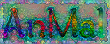
I love those colors on the letters. Great effect

I'll skip the issues with the shadows cast by the letters, as others have already commented on that too.
You have created a challenge for yourself with the different orientations that each letter has.

If I may be so bold as to make a few comments about the 'bright' spot on the floor.
The shape of the spot on the floor looks as though it originates from an overhead light source.
The shadows that the text is casting suggest the light is originating from a much lower position.
Therefore IMO the shape of the bright spot needs to extend further backwards, if that makes sense?
Also, the tile grouting is a dark color in the areas outside of the bright spot. So I don't understand why it would not be visible in the lighted areas. IMO it should be less visible outside the lighted areas and more visible within.
 Login
Login Register
 Tweets
 FAQ
FAQ Advanced Search




 i love those letters, they look a bit like polished and torch oxidised titanium. and oxidised titanium is one of my favourite things
  . unlike moko i really like the bottom-of-a-pool background, i'd love to see a few bubbles here and there too. i know you're onto the shadows, so i won't comment on that.