OK, another closer look and I now think this:
The black text is from the screenshots.
It looks like a sans-serif font which is proportional - I's and L's and 1's are narrower and take up less space than other characters.
If you try and make vertical text by putting each character on a new line, setting right-to-left justification and tweaking line spacing, you get the blue text with characters "nudged" over to the right.
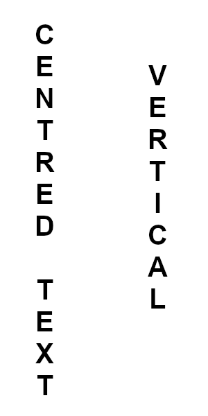
Attachment:
 01-text.jpg [ 75.93 KiB | Viewed 6061 times ]
What you need to do is:
Make the text as normal, horizontal - left-to-right - dynamic text box
Right click in the on screen text and choose Vertical right to left (upright orientation)
Then in the text tool options tweak the character spacing to make the letters closer together.
Attachment:
 02-text.jpg [ 90.6 KiB | Viewed 6061 times ]