It is currently Wed Jul 15, 2026 11:30 pm


All times are UTC - 5 hours [ DST ]


Post new topic Reply to topic  [ 17 posts ] 
Author Message
 Post subject: Top of font cut off
PostPosted: Mon Jan 01, 2018 9:39 pm  (#1) 
Offline
New Member

Joined: Jan 01, 2018
Posts: 2
GIMP Version: 2.8.14
Operating System: Windows
GIMP Experience: Intermediate Level


Hi all,

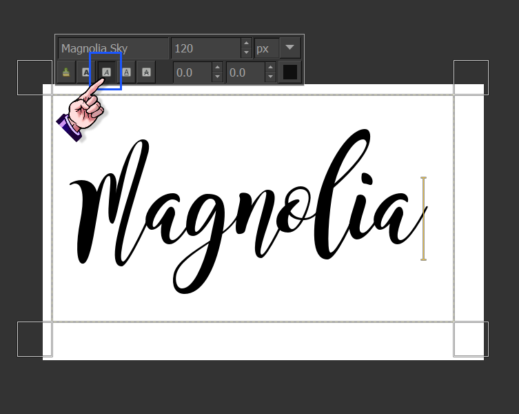
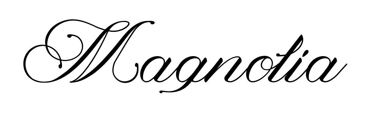
Can anyone please explain to me why this particular font just isn't working properly? The top of letters are being chopped off, despite it looking whole in Text Editor. I've tried adjusting everything I can think of with no luck. This font works perfectly fine in Illustrator - but I use Gimp more than AI and would really like to get it working properly! :)

TIA!


Attachments:
Screen Shot 2018-01-02 at 1.30.19 PM.png
Screen Shot 2018-01-02 at 1.30.19 PM.png [ 96.62 KiB | Viewed 7829 times ]
Share on Facebook Share on Twitter Share on Orkut Share on Digg Share on MySpace Share on Delicious Share on Technorati
Top
 Post subject: Re: Top of font cut off
PostPosted: Tue Jan 02, 2018 2:14 am  (#2) 
Offline
Script Coder
User avatar

Joined: Oct 25, 2010
Posts: 4812
If you do Layer>Text to path, is the path complete or is it also missing the top? And does it extends beyond the boundaries of the text layer?

_________________
Image


Top
 Post subject: Re: Top of font cut off
PostPosted: Tue Jan 02, 2018 2:25 am  (#3) 
Offline
Script Coder
User avatar

Joined: Feb 18, 2011
Posts: 4826
Location: Bendigo Vic. Australia
A quick fix could be to select Image→Fit Canvas to Layers

_________________
Image
No matter how much you push the envelope, it'll still be stationery.


Top
 Post subject: Re: Top of font cut off
PostPosted: Tue Jan 02, 2018 2:40 am  (#4) 
Offline
New Member

Joined: Jan 01, 2018
Posts: 2
It's within the boundaries of the text layer. Fit canvas to layers didn't seem to help. The path is complete though, which at least gives me a (albeit annoying) workaround for now :) Thanks graechan & ofnuts


Top
 Post subject: Re: Top of font cut off
PostPosted: Tue Jan 02, 2018 3:21 pm  (#5) 
Offline
GimpChat Member
User avatar

Joined: Aug 16, 2012
Posts: 4271
Location: Göteborg, Sweden
charmina: if you're okay with the paths workaround maybe you won't want to mess around more with this font, but you might play with the baseline and kerning and see if the font displays properly with some tweaks. It's a bit surprising that the path is okay though, it shouldn't be if it was a kerning issue.

_________________


Top
 Post subject: Re: Top of font cut off
PostPosted: Tue Jan 02, 2018 3:42 pm  (#6) 
Offline
GimpChat Member
User avatar

Joined: Apr 09, 2016
Posts: 580
Location: Sheffield UK
Glad you have a solution.
I tried every way I could with this font (with and without using text editor) in all my attempts the top was cut off.

_________________
Image


Top
 Post subject: Re: Top of font cut off
PostPosted: Tue Jan 02, 2018 9:21 pm  (#7) 
Offline
Administrator
User avatar

Joined: Aug 10, 2012
Posts: 14121
Location: Native to NYC living in Arizona, Gimp 2.8 - 3.0, Win 11 PC.
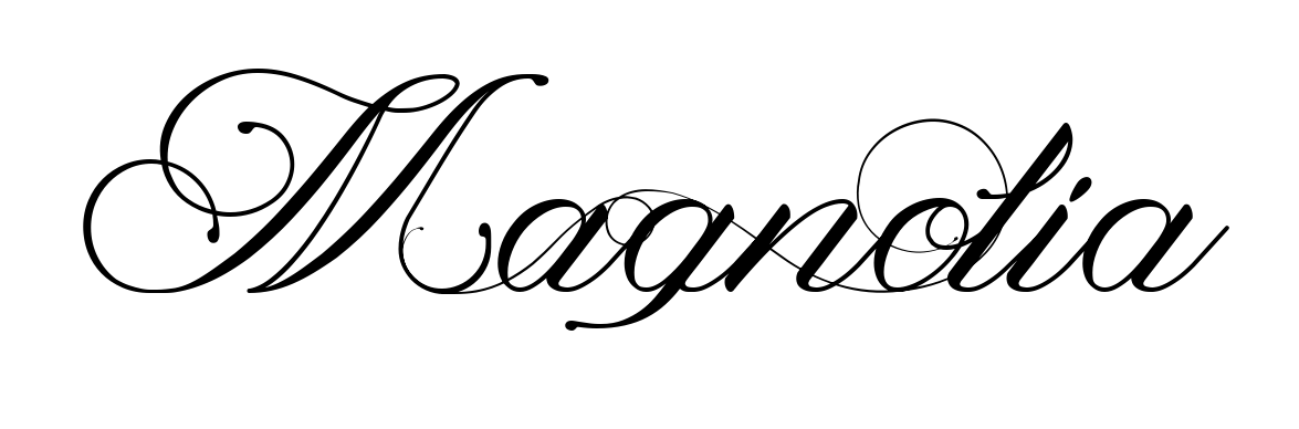
This font may have been created with a kerning issue.
In my image below.
All the letters which extend above a given point are cut off.
I've tested both the .ttf and .otf font file types in GIMP.
Both font file types, exhibit this same issue, with the same letters.

Image

The red line in the image above.
Shows the same cutoff point for all letters,
within a given point.

Note,
that this font is not cut off,
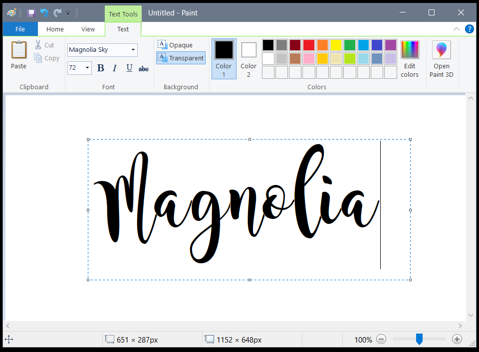
when used in MS Paint.

Image

_________________
Image
"A wise man learns more from a foolish question than a fool can learn from a wise answer"
Image


Top
 Post subject: Re: Top of font cut off
PostPosted: Tue Jan 02, 2018 11:03 pm  (#8) 
Offline
Script Coder
User avatar

Joined: Feb 18, 2011
Posts: 4826
Location: Bendigo Vic. Australia
Image

This text was created with the 'free type' plugin with kerning selected

_________________
Image
No matter how much you push the envelope, it'll still be stationery.


Top
 Post subject: Re: Top of font cut off
PostPosted: Tue Jan 02, 2018 11:30 pm  (#9) 
Offline
Administrator
User avatar

Joined: Aug 10, 2012
Posts: 14121
Location: Native to NYC living in Arizona, Gimp 2.8 - 3.0, Win 11 PC.
Graechan wrote:
[ Image ]
This text was created with the 'free type' plugin with kerning selected


That's interesting.

***

Here's this font in GIMP,
with Italic selected.
From within GIMP's onscreen text editor.
Look no cut off parts.

Image

I also tried locking the alpha channel of the text layer and painting over it.
To try and fill in the cut off parts.
This didn't work.

_________________
Image
"A wise man learns more from a foolish question than a fool can learn from a wise answer"
Image


Top
 Post subject: Re: Top of font cut off
PostPosted: Wed Jan 03, 2018 12:53 am  (#10) 
Offline
Script Coder
User avatar

Joined: Feb 18, 2011
Posts: 4826
Location: Bendigo Vic. Australia
The fonts Magnolia Lite↓
Image
and Magnolia Italic↓ from the same author are OK
Image

_________________
Image
No matter how much you push the envelope, it'll still be stationery.


Top
 Post subject: Re: Top of font cut off
PostPosted: Wed Jan 03, 2018 7:52 am  (#11) 
Offline
GimpChat Member
User avatar

Joined: Aug 08, 2016
Posts: 2843
Location: East Midlands of England
charmina I think you're just unlucky with your font choice in Gimp.

A quick inspection of the font in Font Forge shows that the author has placed the topmost control points of the offending letters outside Gimp's text rendering comfort zone.

The font was designed with the standard Em size (for ttf fonts) of 1000 and within that the ascender height was set to 750 (think capital letter height) - the default size for many fonts. The y co-ordinate of the top-most control point for the capital letter M has been set to 1209 by the author - a fair way above that 750 value.

Gimp does allow for quite a bit of wiggle room to render fonts - other programs may allow more space - but not quite enough for this particular font. The attchments below show you that Gimp is almost (but sadly not) there.

Your options as far as I can tell: Choose another font; email the author for a new version; try another graphics application and import it into Gimp...

Font Forge view of capital M control points:

Attachment:
Magnolia_font_font_info_1.jpg
Magnolia_font_font_info_1.jpg [ 189.22 KiB | Viewed 3004 times ]


Same view with capital M added so you can see where Gimp's rendering almost makes it.

Attachment:
Magnolia_font_font_info_2.jpg
Magnolia_font_font_info_2.jpg [ 170.97 KiB | Viewed 3004 times ]

_________________
Image
"Let no one steal your dreams."
Paul Cookson

Custom Font Links
2.10 Tools
Character Paths
White Bases


Top
 Post subject: Re: Top of font cut off
PostPosted: Wed Jan 03, 2018 10:12 am  (#12) 
Offline
GimpChat Member

Joined: Mar 04, 2011
Posts: 2606
Got to the same place in fontforge yesterday , but apart from scaling it could end up a lot of work and I am no expert when it comes to fontforge. This is it scaled 65%

The original (top) Magnolia Sky @ 150 pix
becomes (middle) gimp-magnolia-sky @ 150 pix note how the kerning is broken. The letters do not join together.
A bit of adjustment in Gimp (bottom) 200 pix and kerning set to -5 or -6. You could improve it a little more by selecting and adjusting individual characters, depends how keen you are.

Attachment:
font.jpg
font.jpg [ 66.03 KiB | Viewed 3000 times ]


I go with skinnyhouse, email the font author.

Font (zipped) attached as an example. shows up as gimp-magnolia.


Attachments:
Gimp-magnolia-sky.ttf.zip [42.88 KiB]
Downloaded 118 times
Top
 Post subject: Re: Top of font cut off
PostPosted: Wed Jan 03, 2018 3:42 pm  (#13) 
Offline
GimpChat Member
User avatar

Joined: Aug 08, 2016
Posts: 2843
Location: East Midlands of England
Agree with Rich - more than a little work to do to make it pleasing in Gimp - and it belongs to the author. A lot of warnings appeared when loading it into fontforge so not surprised that the kerning fell apart when transforming it.

_________________
Image
"Let no one steal your dreams."
Paul Cookson

Custom Font Links
2.10 Tools
Character Paths
White Bases


Top
 Post subject: Re: Top of font cut off
PostPosted: Wed Jan 03, 2018 5:22 pm  (#14) 
Offline
GimpChat Member
User avatar

Joined: Jan 13, 2011
Posts: 2646
Location: Poland
Thanks for the valuable information from Skinnyhouse and Rich2005.
But why is not this problem using Freetype or Tategaki-1.2.1 (http://reddog.s35.xrea.com/wiki/GIMP%E3%81%A7%E7%B8%A6%E6%9B%B8%E3%81%8D.html)?


Attachments:
Tategaki.png
Tategaki.png [ 334.48 KiB | Viewed 2976 times ]

_________________
Image
Top
 Post subject: Re: Top of font cut off
PostPosted: Thu Jan 04, 2018 2:10 am  (#15) 
Offline
Script Coder
User avatar

Joined: Feb 18, 2011
Posts: 4826
Location: Bendigo Vic. Australia
'Gimp-Magnolia-Sky' seems to work OK in scripts
Image
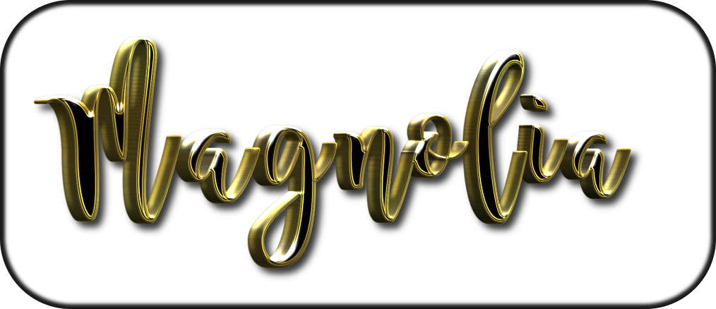
This is from 'Black Gold' :bigthup

_________________
Image
No matter how much you push the envelope, it'll still be stationery.


Top
 Post subject: Re: Top of font cut off
PostPosted: Thu Jan 04, 2018 2:19 am  (#16) 
Offline
GimpChat Member
User avatar

Joined: Mar 01, 2014
Posts: 14061
Location: Spain, Aragón
The font looks great in Black Gold. Good! thanks Graechan.

_________________
Image

Gimp 2.10.30(samj) portable _ OS Windows 10 Home_ 64bits
Don’t be afraid to start over. It’s a new chance to rebuild what you want.


Top
 Post subject: Re: Top of font cut off
PostPosted: Sun Sep 09, 2018 8:28 am  (#17) 
Offline
GimpChat Member
User avatar

Joined: Aug 08, 2016
Posts: 2843
Location: East Midlands of England
Know your limits!
Or at least in this case know the upper margin limit.

Thought I'd revisit with my Layers_From_Fonts filter update.

No such luck - nearly there is not good enough - shucks!

Attachment:
Mag_Sky_Failed_again.png
Mag_Sky_Failed_again.png [ 17.22 KiB | Viewed 2794 times ]

_________________
Image
"Let no one steal your dreams."
Paul Cookson

Custom Font Links
2.10 Tools
Character Paths
White Bases


Top
Post new topic Reply to topic  [ 17 posts ] 

All times are UTC - 5 hours [ DST ]


* Login  


Powered by phpBB3 © phpBB Group