This small update provides an option to address the appearance of very thin 'joined-up writing' custom fonts that using kerning paths.
Download, unzip and place it in your Gimp 2.10 user folder.
Attachment:
The new option shown below:
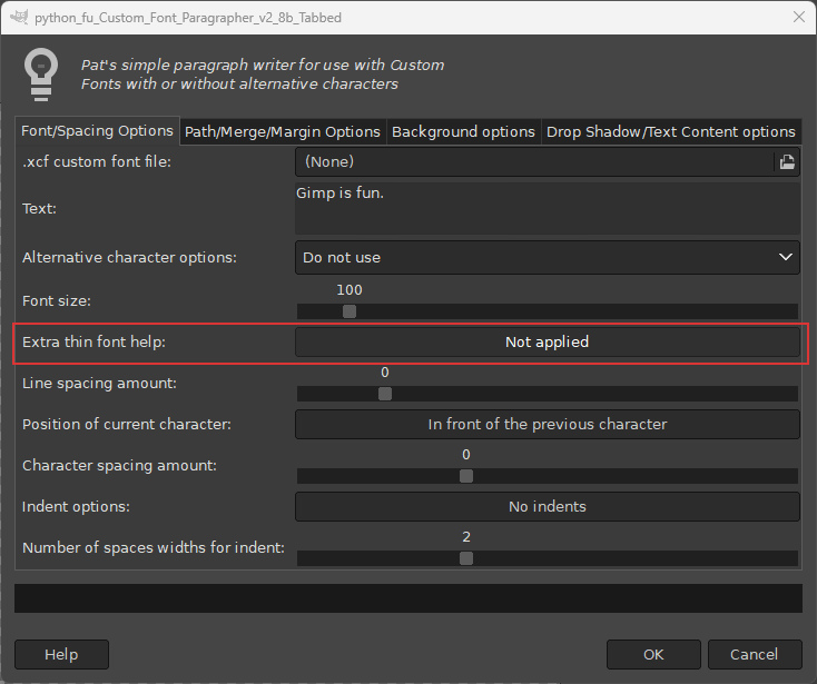
By thin custom fonts I mean those that have a stroke width (not a layer width) of 20 pixels or less.
Try using without the option. if the joining strokes look misaligned, hit the undo key and try again with the new option set to 'With scaling method'.
An example to illustrate the problem with joins circled and the improved display below.

Q: Why use very thin custom fonts?
A: Why not!
 Login
Login Register
 Tweets
 FAQ
FAQ Advanced Search