This update implements the use of kerning paths for alternative characters: It also restores the use of indents and adds a new option for displaying characters ‘behind’ previously added characters. There are also some minor changes to the language used in the tabbed dialogs.
Download the zip file, extract the plug-in and install it to your user plug-ins folder.
Attachment:
A pdf copy of this post:
Attachment:
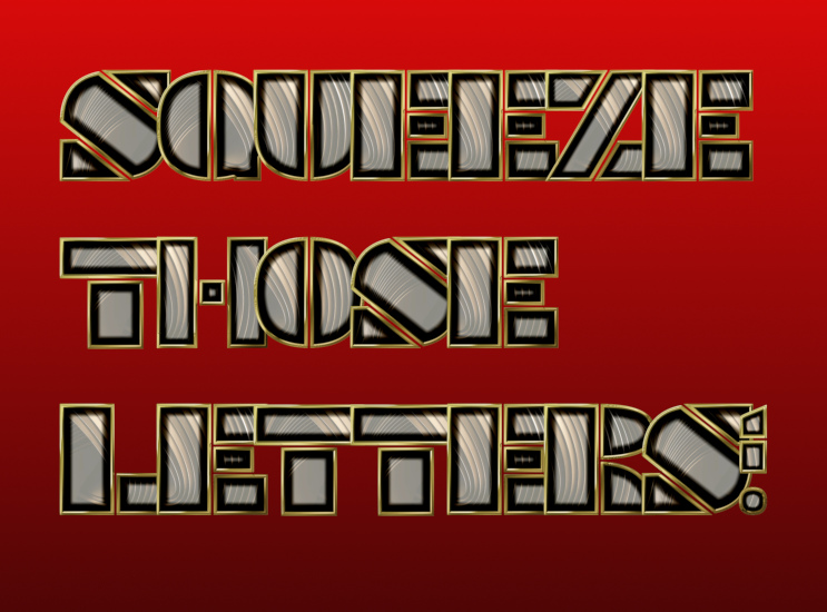
Below: Using a custom font that contains alternative characters (some circled); the alternative character kerning can be seen more clearly on the bottom line.
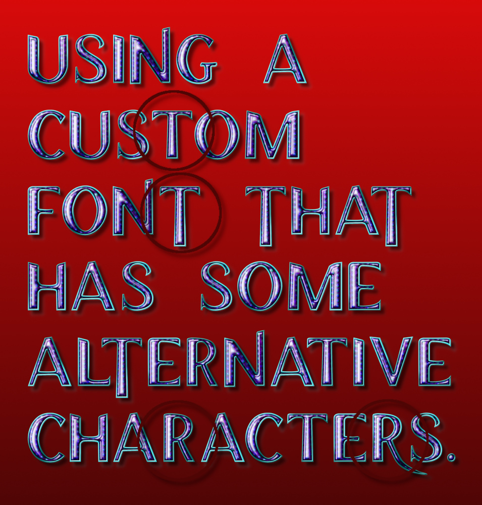
The new option, on the first tab, requires adjustment to the character spacing to become apparent.
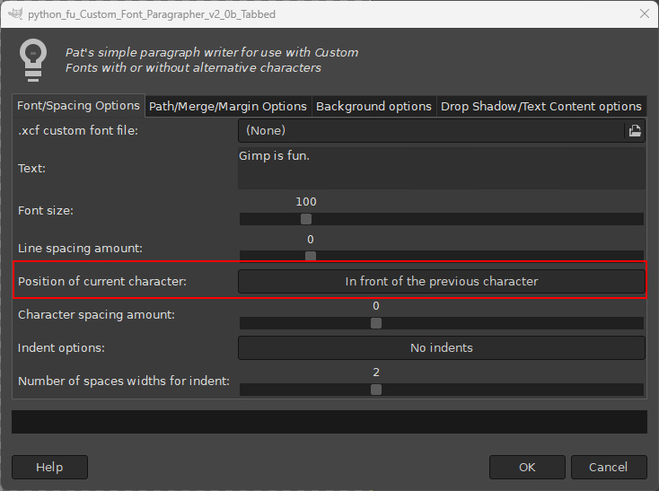
Click on the option to use ‘Behind the previous character’ and lower the ‘Character spacing amount’ option until the characters begin to over-lap.
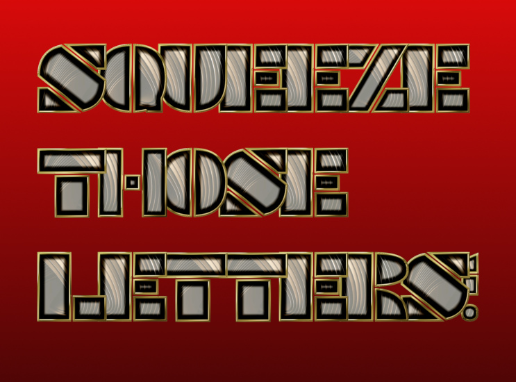
The image below shows the same character spacing with the default ‘In front of the previous character’ option.
 For those who have not used Paragrapher before here is a quick guide.
Paragrapher was originally written for our dear GimpChat friend Pat. It was intended to use custom fonts to display a paragraph or a verse or two of user text in Gimp.
Download the plug-in, unzip it and install it to your user plug-in folder.
Start up Gimp, open a new image and then call up the plug-in:
Filters>>Custom Fonts>>Using Tools>>Custom Font Paragrapher v2.0b Tabbed…Click on the ‘.xcf custom font file’ option and navigate to a folder containing the custom font you wish to use. Click on it to add it to use it in the dialog.
Replace the default text with your own text and click on ‘OK’.
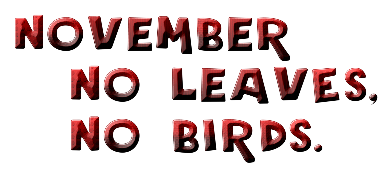
I entered some lines from a poem by Robert Hood called ‘November’.
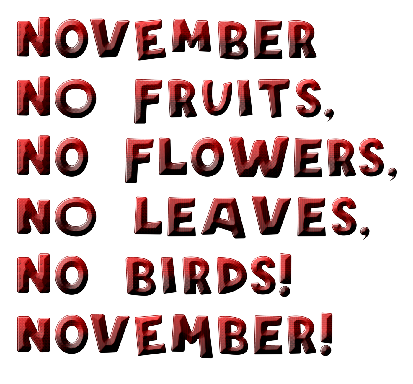
The default output is just the text displayed with the custom font style; you can cut and paste the text and add your own background or use the options on the second tab of the dialog.
You can add indents (which can be applied by hitting the ‘Enter’ key on the keyboard) with the ‘Indents option’ set to ‘Indent new paragraphs’:
Tab 2 of the filter dialog provides a number of options that affect the layout of the custom font characters in the image.
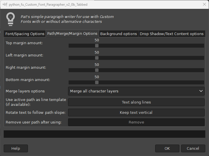
If you want to re-position or justify the lines of text then set the ‘Merge layers options’ from its drop-down menu to ‘Merge character layers into lines’.
If you need to reposition individual characters then set this option to ‘Individual character layers’.
By default the text is applied to invisible horizontal lines. You can add your own path to the image with the path tool if you need to use an alternative line guide.

There is also an option to make the characters follow the slope of the path.

Tab 3 of the filter dialog provides options for adding a coloured background layer using the currently selected foreground and background colours.
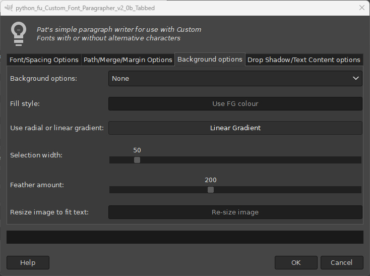
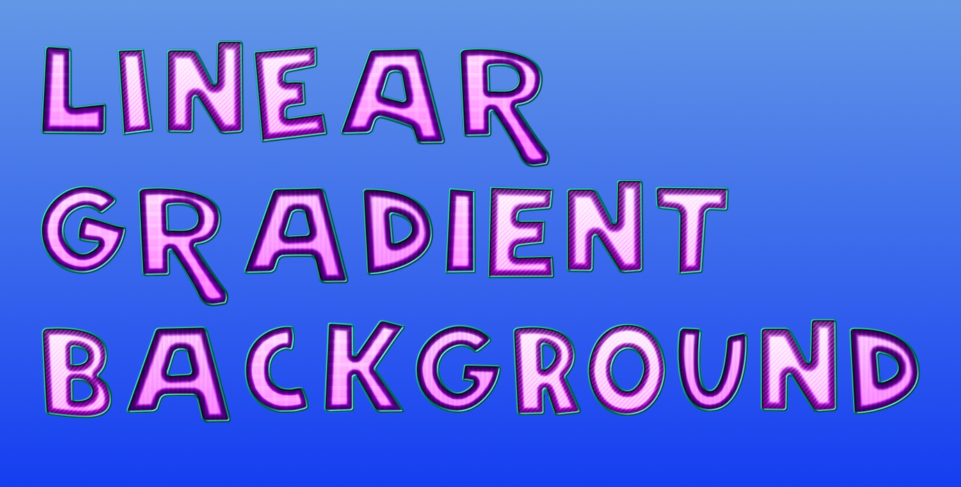
Use the drop-down menu from the ‘Background options:’ option to select a style:
A plain fill
A gradient fill
A feathered selection

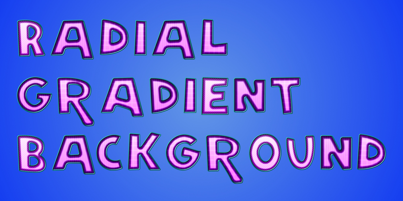
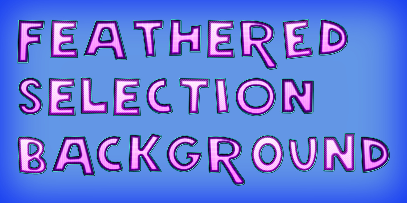
You can add a drop shadow to the custom font characters with the options on Tab 4 of the dialog:

Use the drop-down menu from the ‘Drop shadow’ option to choose a shadow style:
Use foreground colour
Use background coloured
Use a layer copy
Use black
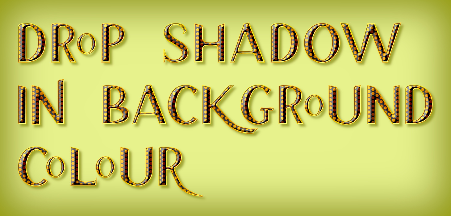


The final option on this tab offers a quick way to view a range texts.
Example Character List Option:
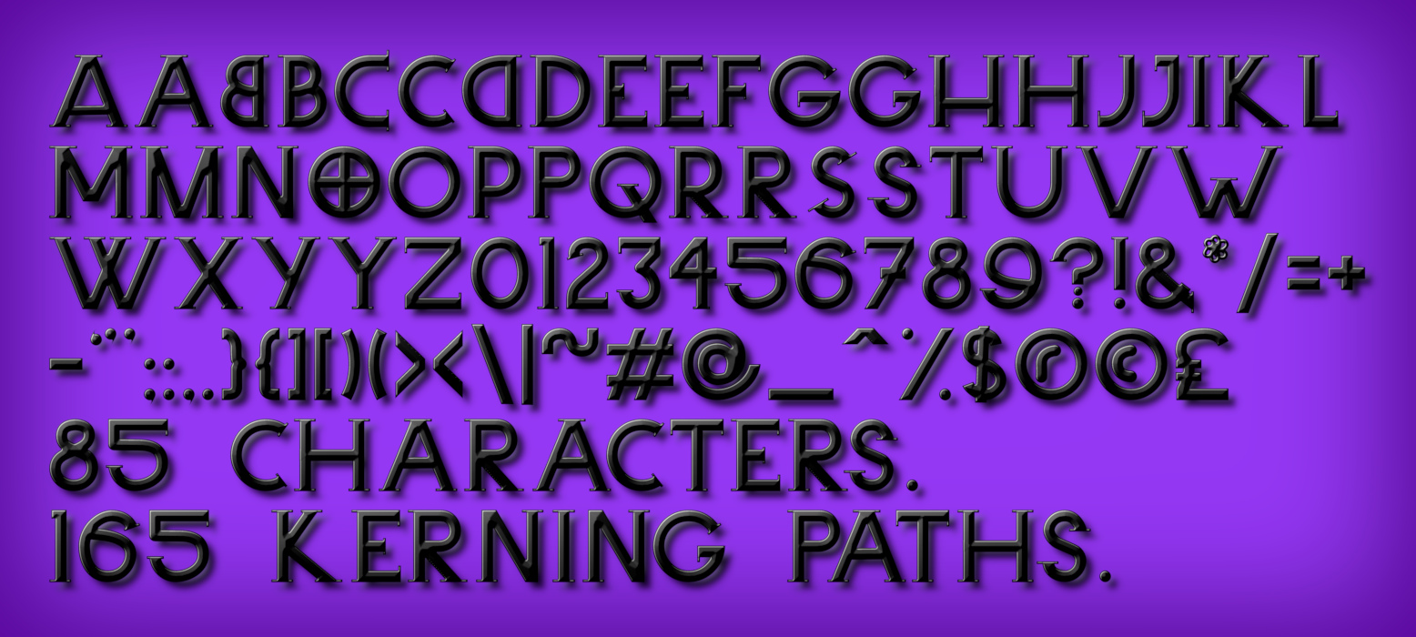
Example of randomly generated text:
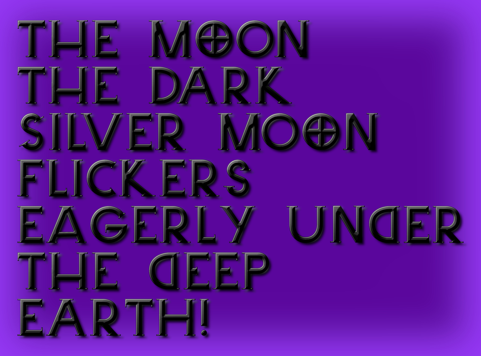
Example of a pangram:

Have fun ...
 Login
Login Register
 Tweets
 FAQ
FAQ Advanced Search