Always grateful for your support Issa.
 Optimizing the ghosting effect (Gimp 2.10)
Obviously adding ghost characters to a custom font will look better where there is enough space for the characters to ghost into.
I find that the quickest way to make an assessment of the space available is to open the custom font in Gimp and make all the layers visible. Hold down the Shift key and click on the eye symbol in the Layers tool dock.
You can see in the image below how there is only a small amount of room above the characters but there is too much space below the majority of the characters. (The underscore character is the usual low-hanging candidate – but this can easily be dealt with.)

The solution is to use Custom Font Layer Utilities to add space above to all layers and then crop the image using a selection.
Open the filter:
Custom Fonts>>Utility Tools>>Custom Font Layer Utils v1.34b TabbedUse the second tab option to enter the amount of extra spacing required. You can always run the filter again if you need more space than the maximum value allows. In my case with my original layer height of 800 pixels I added another 100pixels with the relevant option.
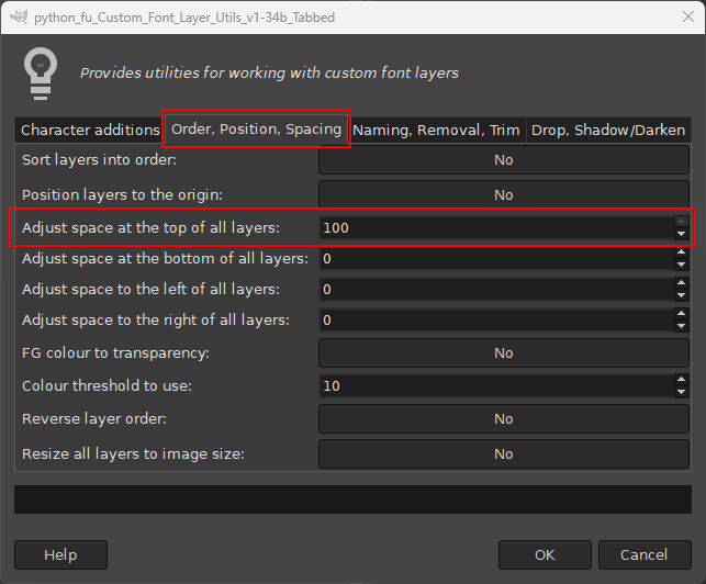
The spacing proportions look better now for ghosting.

Before removing space from the bottom of the layers we need to re-position the rogue underscore layer. I added a guideline to reference the new bottom edge for the custom font. Use the Move tool: Put the pointer over the character and drag it into the new location.
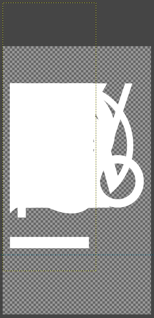
Switch to the Rectangle tool (Keypress R) and drag a selection around the layer to retain its original width.
Crop the layer to the selection:
Layer>>Crop to Selection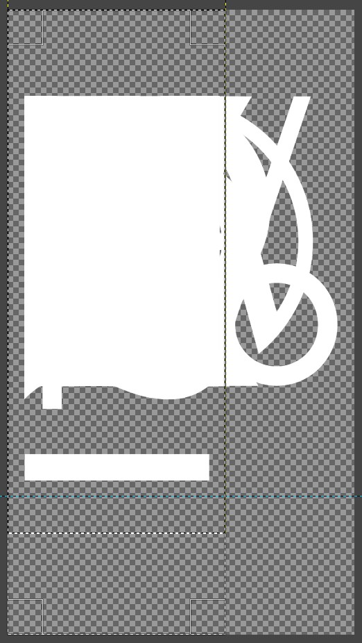
Finally use the Rectangle tool again to remove any unwanted space at the bottom of the custom font. Drag the rectangle out to define the required new size and crop with:
Image>>Crop to Selection
This will conveniently crop all the custom font layers to the height of the image.
 Login
Login Register
 Tweets
 FAQ
FAQ Advanced Search