Well... ran into a bit of a wall trying to create a new logo tonight. This is an older button I was trying to redo like the logo you guys helped me with here:
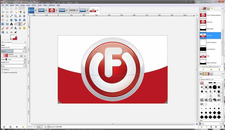
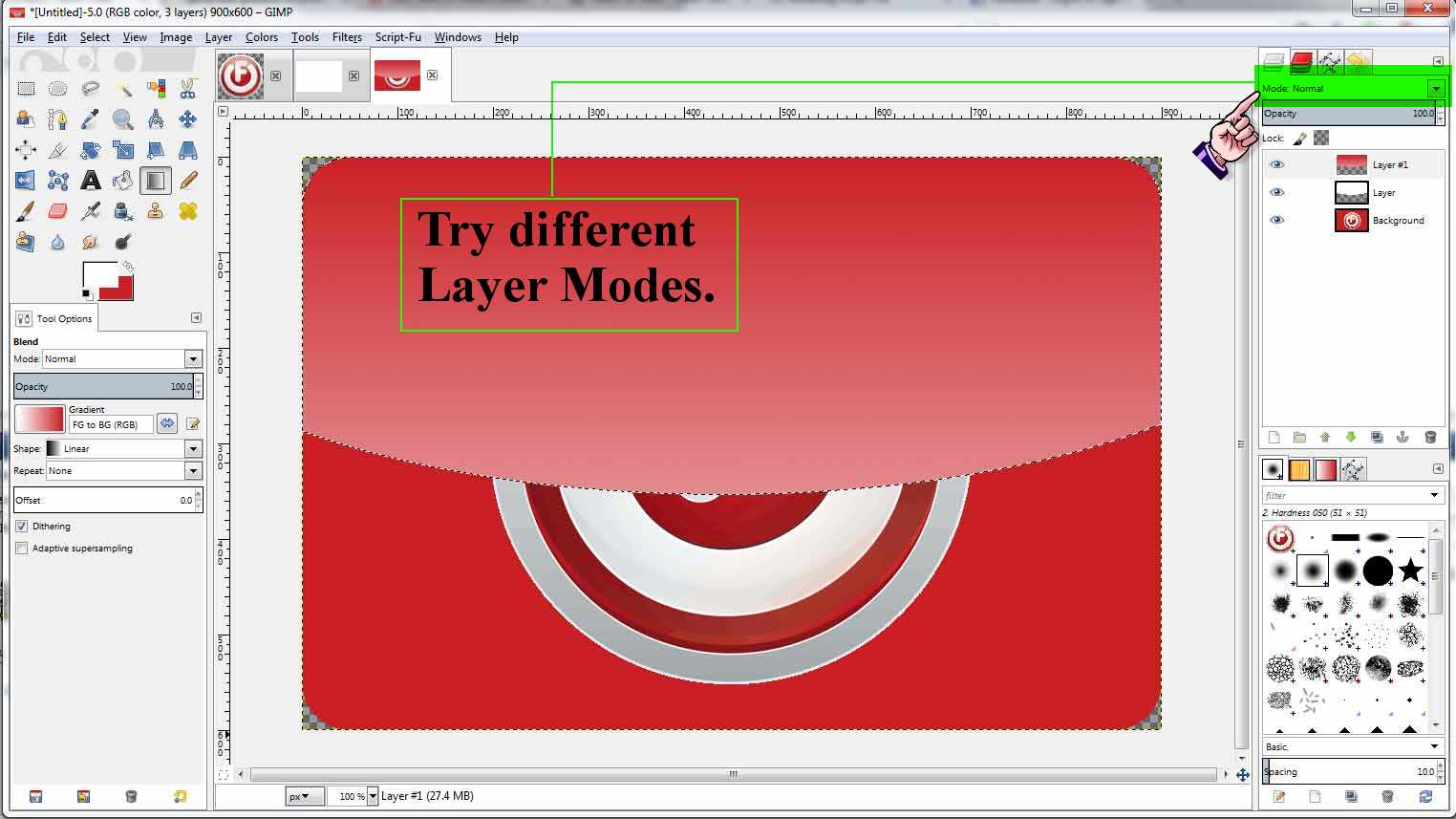
As you can see... lots of fuzziness again. The problem came when I replicated the steps Dalia outlined, and later corrected when I added the lettering. The central circular logo is a separate image I dropped onto a new layer above my base rounded rectangular red background. But that one I did in PS. Here's the steps I went through that Dalia had laid out to redo this in Gimp:
1. Select the “Rectangle Select Tool".
2. In “Tool Options” check Rounded Corners.
3. Fill with color
4. New Layer.
5. Select the "Ellipse Select Tool" and draw out a selection
6.Flood fill that selection with white.
7. Go back to original layer. Alpha to Selection > Select > Invert
8. Back to ellipse layer and “Cut”
<slipped layer scaling for these tests>
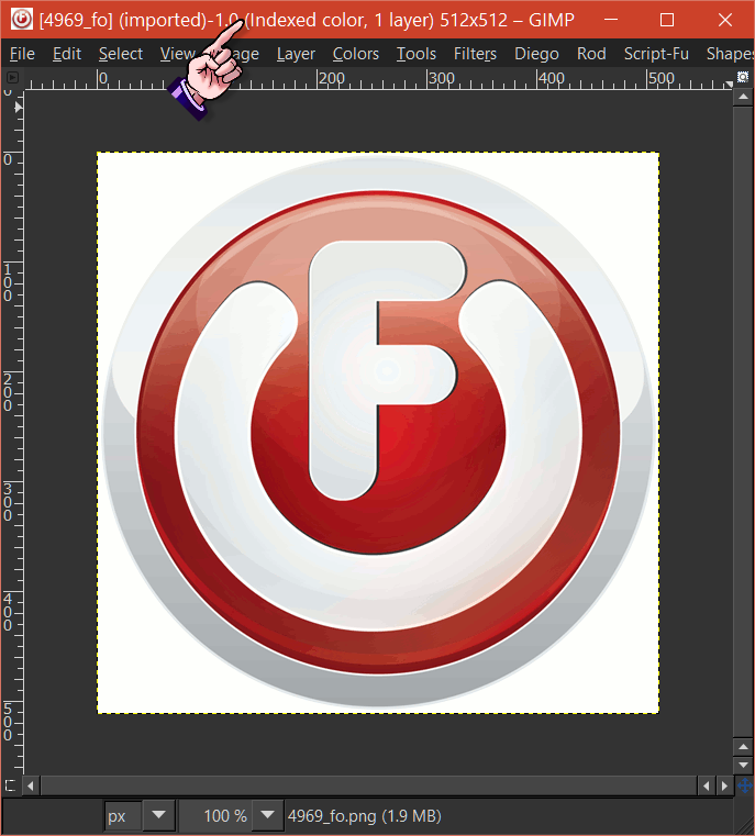
At this point I created a new layer as I had done with the lettering from the last project and pasted the cut out circle from the png logo I'm making a new button for. Here's that png (it has a white background that doesn't show up here):
The results of pasting the cut out from that into my new project:
See the problem? Then Dalia's last steps:
9. Alpha to Selection on the white layer
10. Create a New Layer > Select your “Blend Tool” with gradient of your choice
11. Apply gradient
And well, here it is in it's full glory:
At this point I realized that since the lettering in my previous logo was white, I never noticed that it hadn't been shaded at all by the gradient.
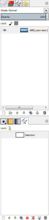
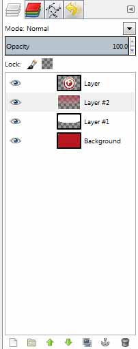
So as I had before, I end up here with 4 layers:
1. Background rounded rectangle
2. White layer for gradient
3. Layer with gradient applied
4. The logo where my lettering was in the 1st project.
But I need to apply the gradient to both the 1st base layer
and the 4th with the logo. I can see this will likely take doing something we've not covered yet

Or more correctly as these forum emojis are so tiny without zooming the page:

Latest edit: I did retry the failed attempt of pasting the logo into the base layer as I'd tried with the lettering before. But the gradient ended up covering the logo as it did with the lettering with opaque white, while for whatever reason, shading the red rounded rectangle properly.
.
 Login
 Register
 Tweets
 FAQ
 Advanced Search




 -













 Spent the day making a group of them in that style. Now I get to relax.