@Graechan:looks great !
i think the good thing about that font is that it has both round and straight edges
which again shows just chosing the right font for a specific job can be important
@EK22:everything you touch is gold, lol !
how did you get the edges of the Noise texture to have that dark shading ?
different Satin ?
it looks great !
ek22 wrote:
I like that gold though, it looks like metal. Your gradients are tight as always.
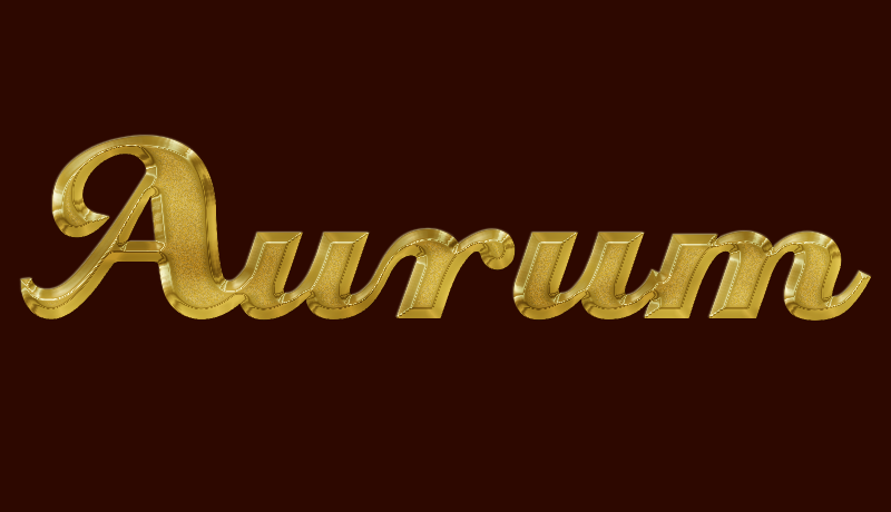
the gold i posted above is not the result from my attempts with the PS tutorial
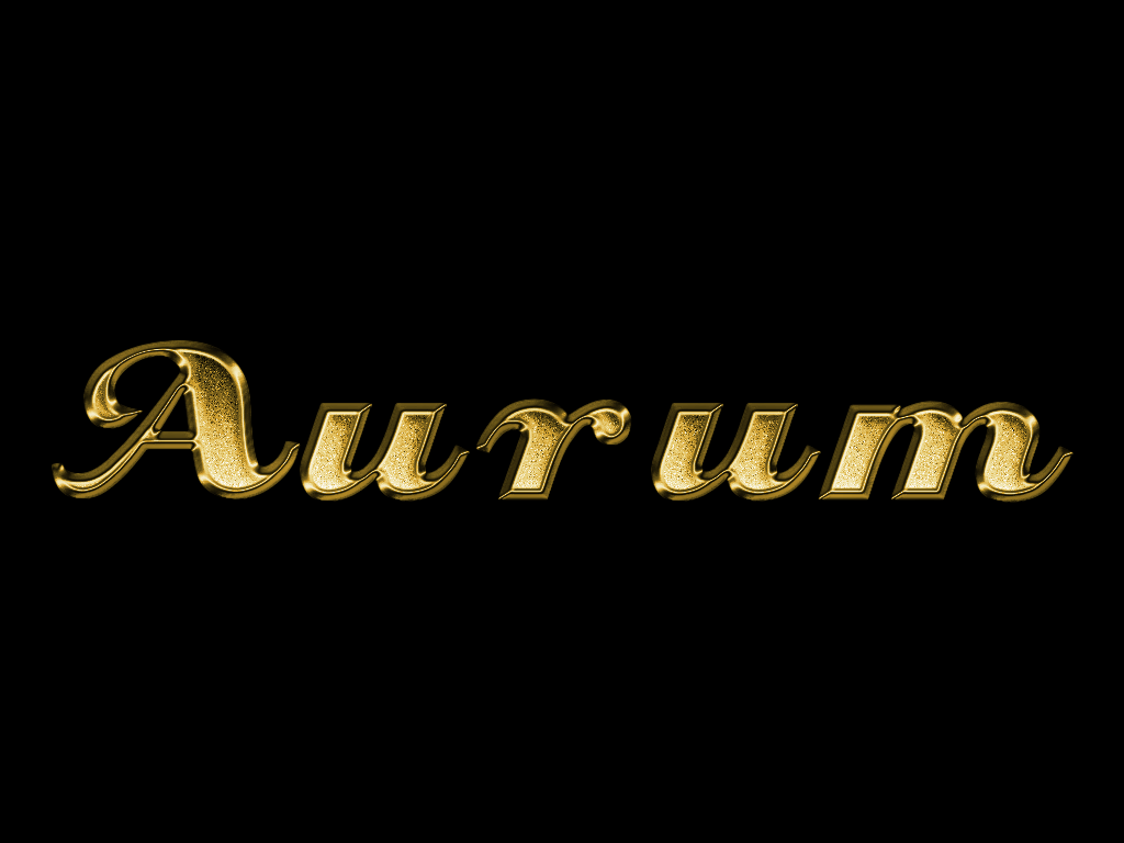
this is what it looked like:
its way too green, and in this version it has two different bevels on top of each other
i couldnt get it right, because some of the PS elements just work differently than Gimp

the second gold effect just happened when i wrote the tutorial, i wasnt even expecting it to be so good
that was just luck