Yet another reason I hate so many tutorials out there that don't bother to be a little more complete with their examples (particularly before/after images to allow one to replicate a process and more easily check results).
(In that spirit, here's my .xcf.bz2 for the below example:
https://www.dropbox.com/s/uijemk000pnih ... le.xcf.bz2 )
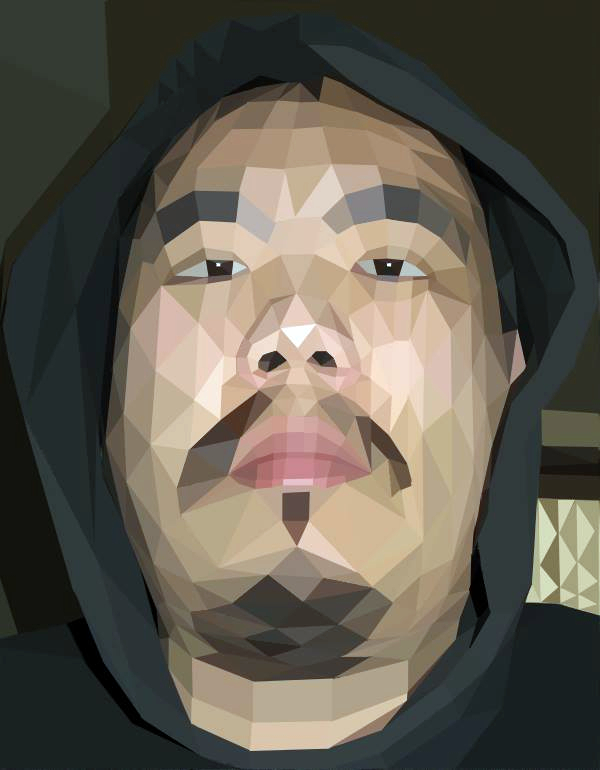
Here is an example of running that "retro" look tut on one of my images:
Attachment:
File comment: "retro" quickie
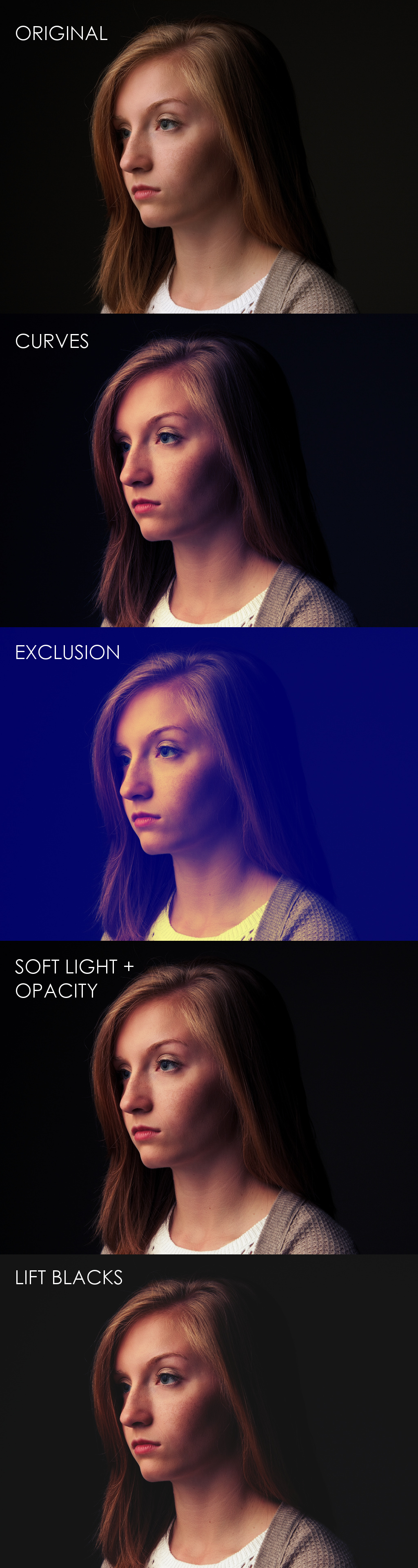 patdavid-example.jpg [ 958.34 KiB | Viewed 1843 times ]
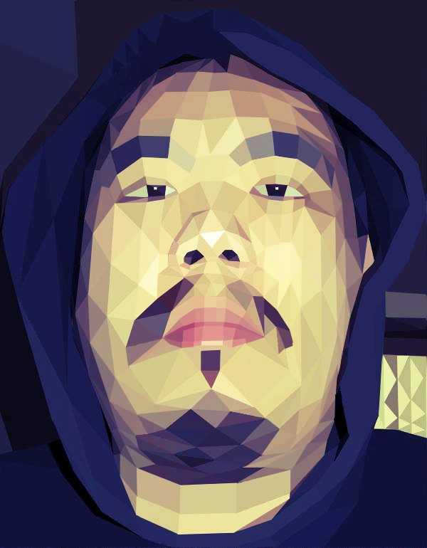
Starting with the base image, duplicate it.
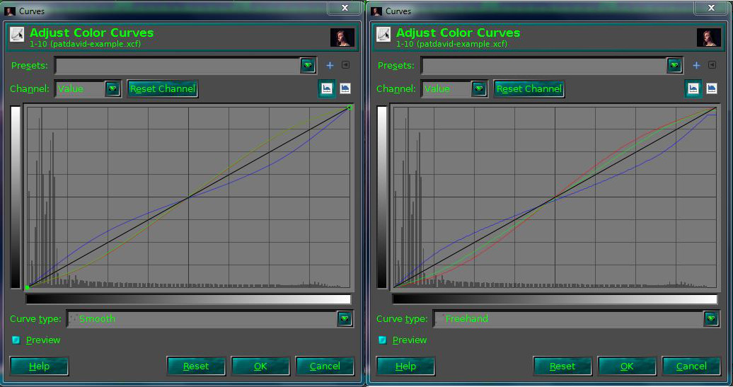
Apply yet
another orange/teal color curve ("S" curve Red/Green, inverted "S" curve Blue).
Add a new layer over it. Fill with #000066 (deep blue).
Set layer mode to "Exclusion" (I cheated and just used G'MIC for this).
Create a new layer from visible (again, I just had G'MIC output a new layer for me).
Set the new layer blend mode to "Soft Light" (or "Overlay").
Adjust opacity to taste.
A little harsh for me, and I really think you can skip the "Exclusion Blue Layer" step entirely (it's really only going to add a bit more yellow in the upper mids/highlights, and deepen the blues in the shadows).
I wouldn't really call it a "retro" effect, as that's not the impression I get looking at the results (even if they may be pretty sometimes).
Could be worse - combine this with lifting the black point to about 15-20, and BAM! instant hipster retro images!

This seems to be a ridiculously popular look at the moment (I blame the VSCO presets and Instagram.

).