Mokonafan wrote:
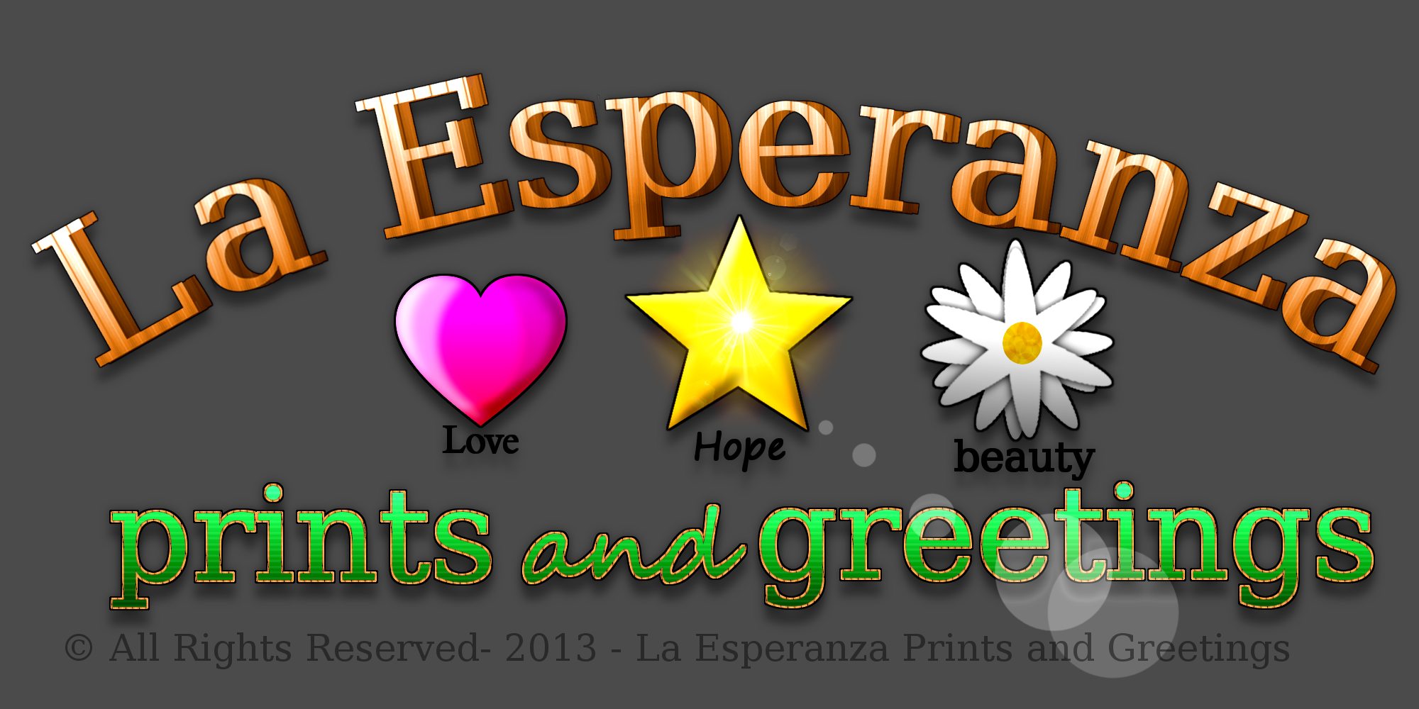
This is a logo for a hope-to-be within a while website/company where I sell my artworks (reprints).
I want an honest look at how you see it.
Try to picture it on the bottom of a card, In the corner of a print, and things like that.
I want it to be unique but I also don't want it too crowded.
You all buy things, cards and stuff, "would this catch your attention?" is what I want to know.
The Grey BG is only so you can see the flare part.
...
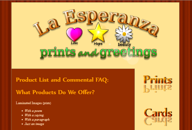
Being used as a header:
...
(I'm sorry if a ss isn't allowed in this section. :S)
Tell me what yous think!
~ God Bless ~
~ Moko
I'm not sure what an ss is.
The art itself looks good, though! As a banner, I think it works well. It's very catchy, and a good representative of your style. It fits well with the page scheme in your example, too.
As a logo, well, one question about that. How large will the logo be printed? If you're planning on placing this logo on every print, it would have to be scaled down - probably beyond the point the text would be readable. As a
logo, I'd suggest something much simpler. A logo is usually something that can be scaled down very small and still be recognizable.
Depending on the scale of this business, and how long you want to keep it going, your logo is also something you may want to consider registering as a trademark.


