Wallace wrote:
Adventure wrote:
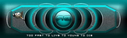
I just wanted to share with everyone my new youtube banner and get feedback please. I love the way it turned out. It could use some improvement as always I have room for getting better.
That's cool looking. Is this going to be your YouTube channel art?
Thank you Wallace. Yeah it is Wallace.
paynekj wrote:
The following is meant as constructive criticism...
Are you intending the graphic elements to be symmetrical?
I ask because if you are, there are a couple of things a bit off.
The power symbol in the middle isn't central to the surrounding circles.
The "tutorials" and "speedart" text are at different heights.
The lines across the bottom are vertical at a point to the right of center, implying that the middle of the logo is not the circular/power button.
Otherwise I quite like it.
Kevin
I was aiming for symmentrial and thank you for pointing out what I can improve on. I just got lost into designing it like "being in the moment" once I started it. Thank you Paynekj.
 Login
Login Register
 Tweets
 FAQ
FAQ Advanced Search