It is currently Sat Sep 19, 2026 11:49 am


All times are UTC - 5 hours [ DST ]


Post new topic Reply to topic  [ 4 posts ] 
Author Message
 Post subject: My new youtube banner
PostPosted: Fri Jan 23, 2015 2:25 am  (#1) 
Offline
GimpChat Member

Joined: Aug 10, 2014
Posts: 140
Location: San Antonio, Tx
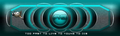
I just wanted to share with everyone my new youtube banner and get feedback please. I love the way it turned out. It could use some improvement as always I have room for getting better.


Attachments:
AWGYoutubeBanner.png
AWGYoutubeBanner.png [ 351.32 KiB | Viewed 2984 times ]

_________________
Image
Share on Facebook Share on Twitter Share on Orkut Share on Digg Share on MySpace Share on Delicious Share on Technorati
Top
 Post subject: Re: My new youtube banner
PostPosted: Fri Jan 23, 2015 3:53 am  (#2) 
Offline
Administrator
User avatar

Joined: Aug 10, 2012
Posts: 14206
Location: Native to NYC living in Arizona, Gimp 2.8 - 3.0, Win 11 PC.
Adventure wrote:
I just wanted to share with everyone my new youtube banner and get feedback please. I love the way it turned out. It could use some improvement as always I have room for getting better.

That's cool looking. Is this going to be your YouTube channel art?

_________________
Image
"A wise man learns more from a foolish question than a fool can learn from a wise answer"
Image


Top
 Post subject: Re: My new youtube banner
PostPosted: Fri Jan 23, 2015 4:27 am  (#3) 
Offline
Script Coder
User avatar

Joined: Jun 22, 2010
Posts: 1171
Location: Here and there
The following is meant as constructive criticism...

Are you intending the graphic elements to be symmetrical?

I ask because if you are, there are a couple of things a bit off.

The power symbol in the middle isn't central to the surrounding circles.

The "tutorials" and "speedart" text are at different heights.

The lines across the bottom are vertical at a point to the right of center, implying that the middle of the logo is not the circular/power button.

Otherwise I quite like it.

Kevin


Top
 Post subject: Re: My new youtube banner
PostPosted: Sat Jan 24, 2015 12:00 am  (#4) 
Offline
GimpChat Member

Joined: Aug 10, 2014
Posts: 140
Location: San Antonio, Tx
Wallace wrote:
Adventure wrote:
I just wanted to share with everyone my new youtube banner and get feedback please. I love the way it turned out. It could use some improvement as always I have room for getting better.

That's cool looking. Is this going to be your YouTube channel art?


Thank you Wallace. Yeah it is Wallace.
paynekj wrote:
The following is meant as constructive criticism...

Are you intending the graphic elements to be symmetrical?

I ask because if you are, there are a couple of things a bit off.

The power symbol in the middle isn't central to the surrounding circles.

The "tutorials" and "speedart" text are at different heights.

The lines across the bottom are vertical at a point to the right of center, implying that the middle of the logo is not the circular/power button.

Otherwise I quite like it.

Kevin


I was aiming for symmentrial and thank you for pointing out what I can improve on. I just got lost into designing it like "being in the moment" once I started it. Thank you Paynekj.

_________________
Image


Top
Post new topic Reply to topic  [ 4 posts ] 

All times are UTC - 5 hours [ DST ]


* Login  


Powered by phpBB3 © phpBB Group