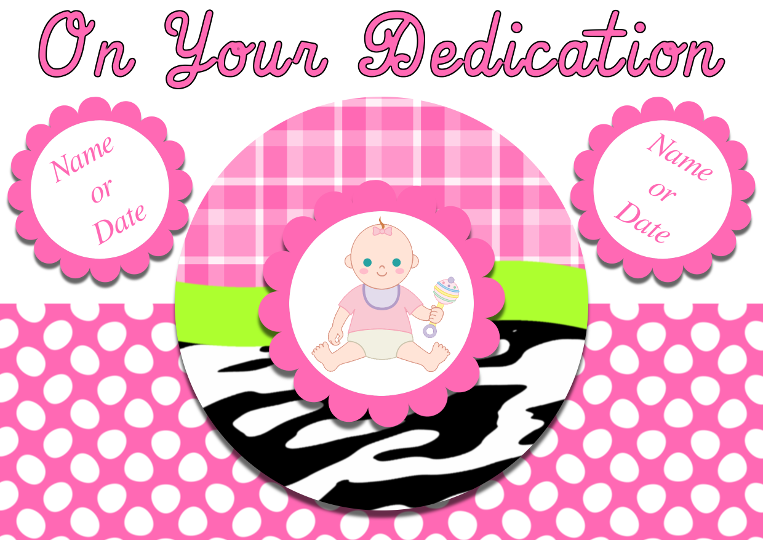
Having had the last card I designed now printed, I was impressed with the quality, colour and price so have designed another, this time for a dedication.
Pleased with the results, some things to mention though, the black around the main text seems to have pixelated where I have scaled the image down to post here, the main design is A5 @ 300px.
The only other thing to mention about is the baby picture in the middle which was obtain from here (
sweetclipart.com), the original will have an actually photo of the child.
Onto the design, the main bottlecap image was based on my own
tutorial, which is an interpretation of a design by
micki.
Also would like to mention the main pink and white background which started life as a polkadot design created using G'mic but it just seemed to much. So after trying the curve bend filter to give it a more interesting shape, didn't look right, eventually went with the ripple filter which created these wonderful abstract egg shapes. I think because they appear more random than the circles it breaks up the background and stops it being to dominant which it was before.
I am happy with the design but Odinbc suggested this colour palette and I couldn't help but explore the possibilities of the colours and design.I even managed to include the yellow that came along for the ride

What do you all think to the possible revisions.

 Login
Login Register
 Tweets
 FAQ
FAQ Advanced Search