Griatch wrote:
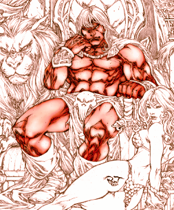
I would suggest that you go about it in the wrong way. You shouldn't colour an image like this one element at a time. This is because you cannot know what is a "realistic" colour of any individual component until you have established the light and colour tone of the entire image.
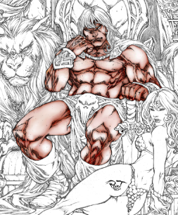
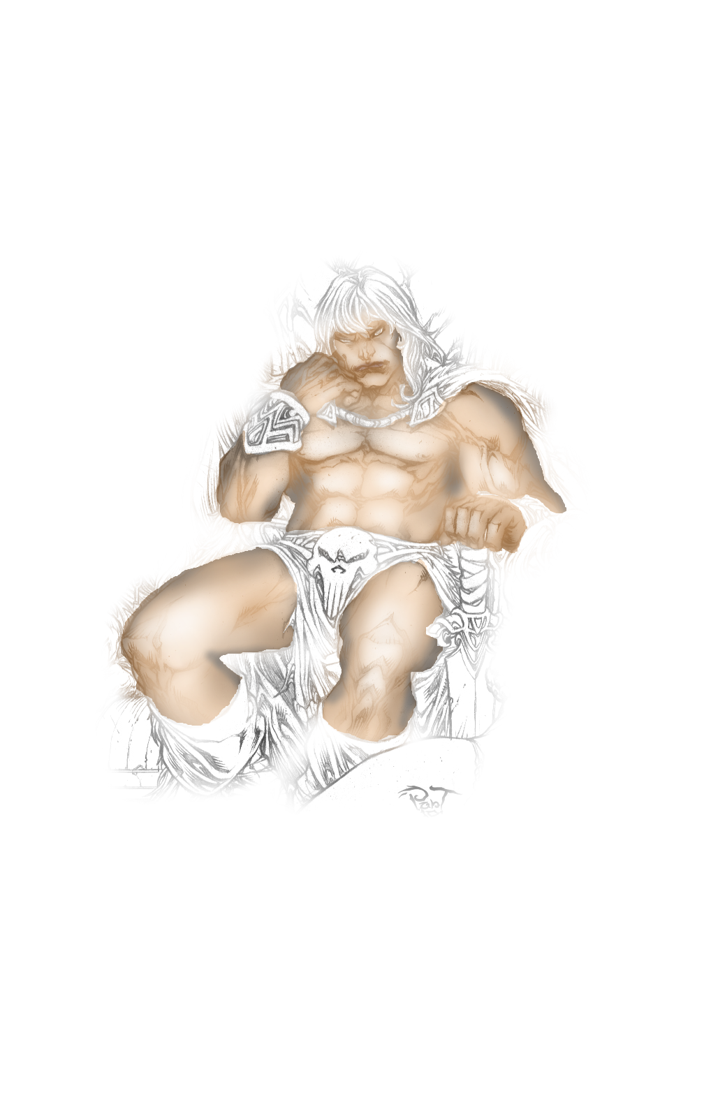
Take this example I did using a Multiply layer and some brushing (as I recall Conan is "bronze of skin"):
Now, this shading would work if the ambient light was yellowish and there were some sources of diffuse light in front of the two of them. But there is also a large flaming torch in the upper right. If this is backlight, then Conan is way too bright, and the highlights are all wrong. And maybe the torch is magically blue (or green?) of colour - then the entire scene will look very different and skin will too. And if the draperies are bright red, they will reflect red light down onto his skin as well.
To even begin to colour this you need to map out the colours of the entire image in one go. Make a Multiply layer on top of it and start to dab out the rough colour areas. Don't care about sharp boundaries. Put the basic colours of all the drapery and make careful note of all sources of light in the image (is that a moon in the background?). Only then can you have a feel for just what type of colouring the skin should have. You need to plan and tie all components of the image together at once. Never work only on one part at a time, it is a recipe for disaster in my experience.
As for working on a line drawing like this, I prefer personally to use a Multiply layer so the line art remains dark. This particular piece of line art has nearly no consistent light shading whatsoever, so you need to interpret this yourself, adding and enhancing the shadows with colour and shading so the 3D forms come across. See my example of Conans right leg/knee: In colour you can do a much smoother curve 3D shading than could be done in line art.
Another idea is to vary cool and warm colours. In my attempt above I use warm browns and yellows for the lit surfaces and cool blues and some purple to fill in the shadows. Since skin is actually a diffractive, transparent thing, this can help to liven it up. Finally, highlights can be done on a Normal-mode layer and a low-opacity brush. For highlights you of course must know well just where the lights are.
Just some ideas. Good luck!
.
Griatch
This is great food for thought Griatch, and I've given lots of thought to just this issue.
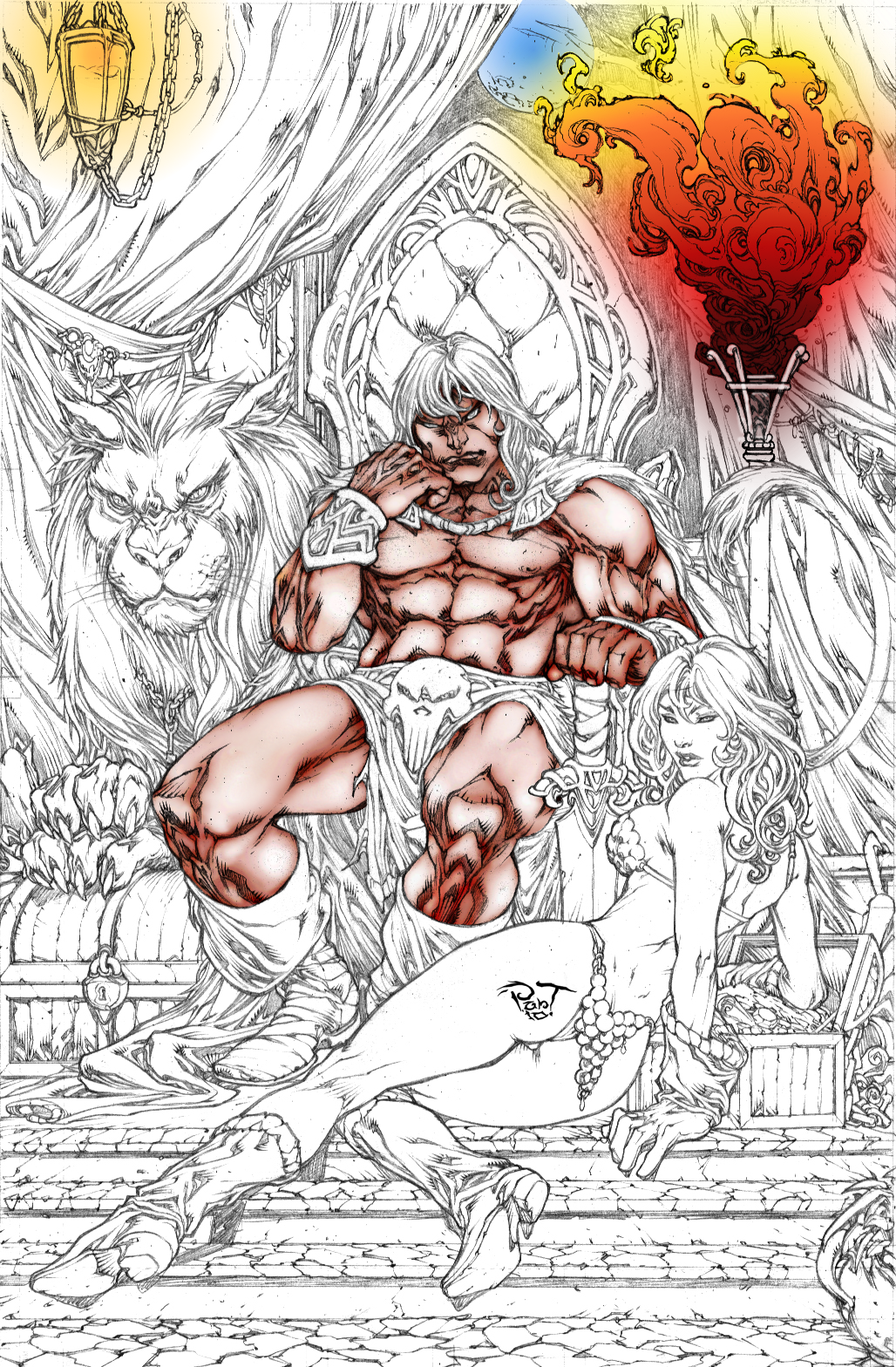
There seems to be 3 possible kinds of light sources drawn in the image. You've mentioned 2 of them, ie. torch and moon. The third looks to be a candle in a lantern, upper left.
What I gather from your post is, that I should establish these "light sources" before anything else.
The image below shows, (loosely). What I plan to do with these light sources.
Would you have any advice as to how I might use "layer modes", to help represent these light sources?
PhotoComix wrote:
Wallace wrote:
jamac4k wrote:
I got a crazy idea:
You could browse to
Illustrateurs site and download the Conan draw more interesting for you.
After, use the
Gino D's Translate into palette script in order to create a skin tone palette.
That's not crazy. I like that idea and will check it out.
Thanks!

PhotoComix wrote:
I suggest you to use the GMIC CMYK mixer (in colours)
The big difference with the usual channel mixer if that mix colors as were pigments , not as lights as does the normal channel mixer :
in RGB if you mix Cyan Red Green you get withe ,or close to , if you mix blue and yellow in CMYK you got green that is much more intuitive
Good suggestion, I would have never thought to do this. I'm not a big user of G'Mic, but I think I'll have to change this.
BTW it was a excellent "palette script" for gmic, i use the past because i believe got somehow missed
Anyway i think i may recover ,and if needed update searching in the Gmic flickr group : basically it was creating "harmonic "palettes , and the nice and original thing was that was not needed to apply the filter , was more to keep open to champion the adapt colours with the eyedropper and use on the fly
I think about now because i am using and testing gimpainter now and so i use much more the painting tool then before (alas i could not find a graphic tablet here ... ) and because maybe could fit in your workflow
I believe was one of the first "additional filter" proposed for gmic and was presented on the flickr group
...for sure i will search later (may even be that my memory failed and that filter is hidden somewhere in the gmic menu, are so many filters now that may even happen...
well i will look better later on but if you are more in hurry i should have given all data for a search (in old post of flickr GMIC group )
Thanks PhotoComix.
I'm not in a hurry, but this G'Mic filter may be of some help to be able to use it with the coloring of this image.
 Login
Login Register
 Tweets
 FAQ
FAQ Advanced Search