That's some dramatic light sources!
But what I mean is that you should map out the entire image in one go. Not only the light sources but the surfaces they hit. You can do so roughly at first, and if you work on a Multiply-mode layer you can do so very quickly.
Below is a colour-mapping a did as an example.
Attachment:
2101_conan_and_the_red_hot_sonja_by_pant-d38m54w.png
This is working on a Multiply-mode layer (starting from my previous Conan-colouring). MyPaint is a better program than GIMP for this kind of work in my opinion, since one can work much faster using something like the Modelling2 brush.
In GIMP you can work with the paintbrush and a fuzzy brush or the airbrush (whichever you are more comfortable with), but use a low opacity (in the 30% range). Set up keyboard shortcuts for changing the opacity. MyPaint allows you to adjust the lightness/darkness of the hue with a keyboard shortcut - not sure if GIMP allows that. Of course, a pressure-sensitive tablet also speeds up the process. The above example took maybe 30 minutes (it's also very rough as a result, but that is the point).
The goal with the map here is to establish some sort of balance to the painting. For example, I started out making the curtains red, but found that since Red Sonja has red hair it would disappear against the red curtains behind her - so I shifted them towards purple. If I had done each individual element separately it would be annoying to have to redo it once reaching that point. But since this is so sketchy it's cheap to just try another hue to see if that works better. Same goes with the blue of Conan's mantle and throne, they must both differ from the yellow of the lion and the colours of the curtain and Red Sonja's hair (which is also why I opted for something other than golden bracelets for Conan - it would meld into the lion's colour).
I didn't spend any more time on shading Conan here, but did a first example for Red Sonja. I had her lit from the front, so she could probably be even darker. There is nothing stopping you from imagining a fourth source of light off the edge of the image to the right if you want her to be more interestingly lit (the line art tells us nothing about such things so we are free to toy around). Also note the shadows on the ground, something not covered at all by the line drawing.
As you see the dark areas (such as the night sky in the background) are also fully filled to get a feel for just how the image will be balanced.
You could relatively easily churn out several such crude colour/shade maps to test different colour combinations and shading setups - as long as you remember to work sloppily and don't worry too much about filling the lines you should not feel too bothered about throwing away your tests and try something else.
Once I was happy with the rough mapping I would continue to further establish the shadows, increasing contrasts with deeper shadows and brighter highlights, all on a Multiply layer. I might go over the image with a Color-mode layer to help make surfaces coloured by the light sources (see the blue area of the throne behind Conan's head for an example of picking the yellow of the torch and dabbing with low opacity using a Color layer). Color mode covers the lineart though (at least to an extent), it should be used with more care.
This is still the prep work anyway. What is going to take the most time here is the detailing, such as the individual stones of the floor, the jewelry and strands of hair etc around the entire image. But by that point you'll at least have a good feel for where the image is going and you should not have to stop and ponder if a colour or shadow belongs or not.
.
Griatch
PS: I personally prefer to keep the line art intact, using primarily Multiply layers and other modes only to surfaces. But it's not the only way. If you rather aim for a style where the original line art is not visible, you can still start with the Multiply layer. You then move to a Normal-mode layer and re-paint the lines yourself (such as making the curve of Red Sonja's hip a yellow line instead of black). This can look very impressive but is a very different style and also very labour-intensive. Once can of course also try a hybrid of the two.
So what you're suggesting is that I color the entire image roughly, with whatever colors I want to use. Then work on a "Multiply layer" to get the other tones, shadows and highlighting colors?
Couldn't I in addition use the, "Gimp Lighting Effect" to Improve the lighting condition?
What about using a 3D program, such as "Blender" to adjust the lightning of the rough color draft?
 Login
Login Register
 Tweets
 FAQ
FAQ Advanced Search


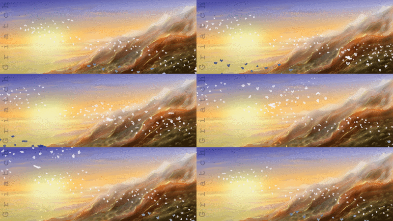





 - Although too buggy and unstable closed my gimp sometimes :-(

 Hair has shine and is affected by the colour of the light in the room. Highlight it with the colour of the light sources hitting it. Which means you have to start with the light sources ...
.png)