Now let's move onto buttons.
I have put the styling for buttons into the rc_buttons.rc file and pulled it into the gtkrc using
import "rc_buttons.rc"Buttons are styled using a set of images, one for each state of the button:
Attachment:
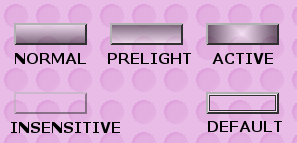 gimp_buttons.png [ 9.76 KiB | Viewed 7683 times ]
Here I have made button images that are transparent just to keep the theme modification simple again.
The code in rc_buttons.rc looks like this:
style "buttons"
{
  engine "pixmap"
  {
    image
    {
      function   = BOX
      detail   = "buttondefault"
      file      = "/buttons/button-default.png"  # used to indicate which button will be activated when the Return key is pressed
      border   = { 2, 2, 2, 2} # how much of the image should not be stretched (L, R, T, B)
      stretch   = TRUE
    }

    image
    {
      function   = BOX
      state      = NORMAL
      file      = "/buttons/button-normal.png"          # image for a button
      border   = { 2, 2, 2, 2}
      stretch   = TRUE
    }

    image
    {
      function   = BOX
      state      = PRELIGHT
      shadow   = OUT
      file      = "/buttons/button-prelight.png"      # image for a hovered-over button
      border   = { 2, 2, 2, 2}
      stretch   = TRUE
    }

    image
    {
      function   = BOX
      state      = PRELIGHT
      shadow   = IN
      file      = "/buttons/button-active-prelight.png"  # Don't know
      border   = { 2, 2, 2, 2}
      stretch   = TRUE
    }

    image
    {
      function   = BOX
      state      = INSENSITIVE
      file      = "/buttons/button-inactive.png"    # image for an inactive (i.e. disabled) button
      border   = { 2, 2, 2, 2}
      stretch   = TRUE
    }

    image
    {
      function   = BOX
      state      = ACTIVE
      file      = "/buttons/button-active.png"      # Image for button when pressed
      border   = { 2, 2, 2, 2}
      stretch   = TRUE
    }
  }
}
So for each of the states of the buttons, there is an image file defined. Note that there is one state I haven't created an image file for: button-active-prelight.png as I don't know of any circumstance where it is possible for this state to be reached.
You can see that I have defined the borders to be 2,2,2,2 because that is how much bevelled edge each button image has and I don't want those to be stretched.
I have also modified the button_default.png from the version in the theme I have supplied to make it possible to see when it is being used:
Attachment:
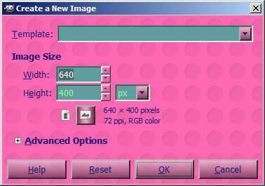 button_file_new.png [ 23.08 KiB | Viewed 7683 times ]
You can see the OK button has extra detail because the button-default image is being applied as well as the button-normal image.
If you have a look at Warrior's
Teal Appeal theme you can see the buttons can be much more elaborate than I have done here.
You will also see that buttons are used in many places - for the tools in the toolbox, for the colour patches on the colour picker etc. and can be individually styled if you can find the right combination for the style application:
class "GtkButton" style "buttons"
Only want to style the buttons on the toolbox?:
widget_class "*Tool*Button*" style "buttons"
Only want to style the buttons on dialog windows?:
widget_class "*Dialog*Button*" style "buttons"
Kevin
 Login
Login Register
 Tweets
 FAQ
FAQ Advanced Search