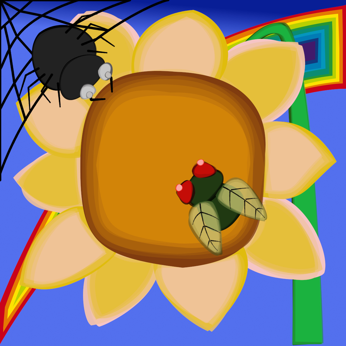
This update adds a user taper amount option.
Attachment:
Download, unzip and install to your Gimp 2.10 user plug-ins folder.
The earlier guides for versions 0.1c and 0.1d are still relevant to this update
Link to Wibbler 0.1cLink to Wibbler 0.1dA pdf version of this version guide:
Attachment:
 StepByStep_Guide.pdf [1.86 MiB]
Downloaded 106 times
StepByStep_Guide.pdf [1.86 MiB]
Downloaded 106 times
Wibbler Step by Step OptionsWibbler takes a copy of a path and tries its best to make just small changes to the shape of a path before stroking it with the line tool or the currently selected brush.
Although it is really intended for use with custom font paths this is a step by step guide to the options most suitable for use when working with images.
Tab 1 Wibble and Stroke Options: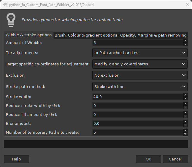
This first set of examples use the line tool which is generally the quicker way of stroking a path.
Option1: Amount of WibbleUse this to alter the range of changes that Wibbler makes to the control points that make up a path.
It works with option 2 which ties the amount of adjustment to the ‘Path anchor handles’, by default, to change the existing angle of the path as it crosses a control point anchor.
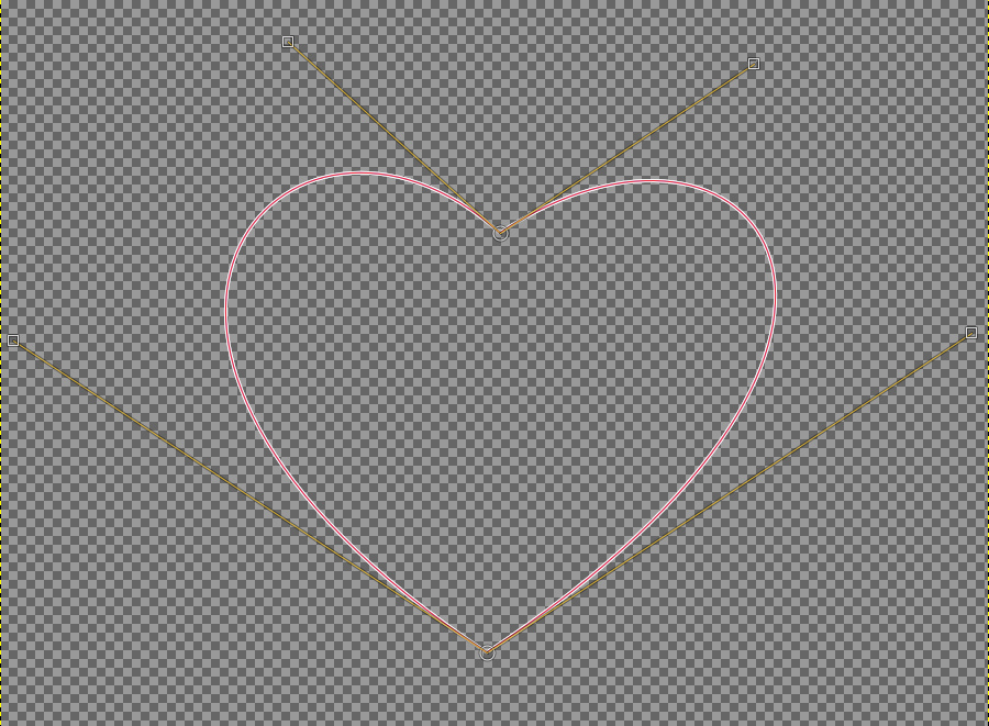
A single path with a value of zero (i.e. no adjustments) for this option:
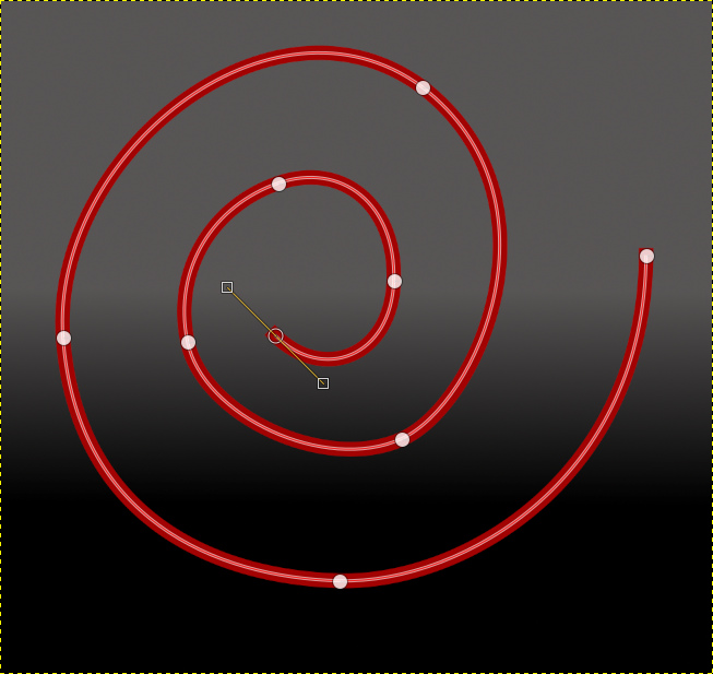
Using a value of 20 for option 1:
 Option 2: Tie adjustments:
Setting this option to ‘Path anchors’ will make adjustments within the wibble range to the anchor positions while trying to maintain the original angle of the path at the anchor points.
Using a value of 20 for the amount of wibble applied to the path anchors:

Setting this option to ‘Path handles and anchors’ will add more variety and offers more potential for smallish changes in the direction of the path more.
Using a value of 20 for the amount of wibble applied to the path handles and anchors:
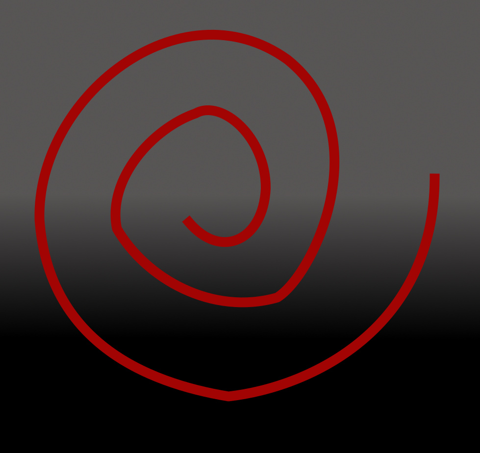
It can be difficult to see the changes made with a single path; the filter was, in fact, designed to be used with multiple paths and multiple colours taken from a gradient.
Jump straight down to option 10 on Tab 1
Option 10: Number of temporary paths to createThis option provides the opportunity to add light and shade to the lines used in images.
The default setting for colour uses the current gradient in the order that they appear.
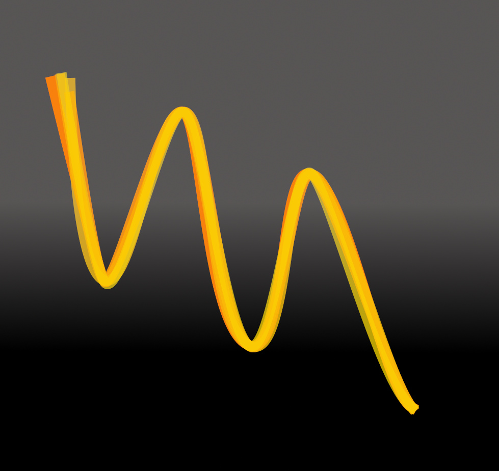
The image below uses a wibble factor of 20 with adjustments tied to anchor handles and with 5 temporary paths:
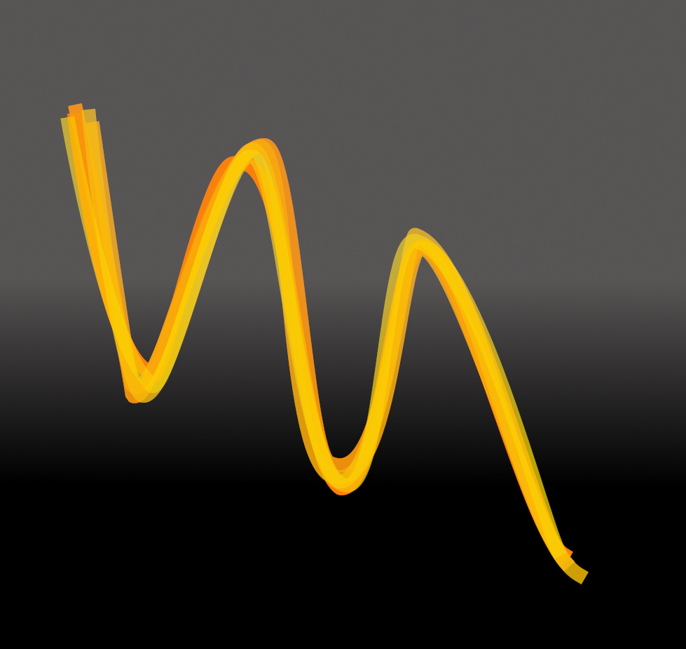
And for comparison, the next image uses adjustments tied to both anchors and handles.
Options 6 and 7 affect the width of the path or stroke.
Option 6: Stroke width This sets the initial width of the stroke.
 Option 7: Reduce stroke width by (%)
This reduces the initial width for each subsequent temporary path by the entered amount.
 Option 8: Reduce fill width (%)
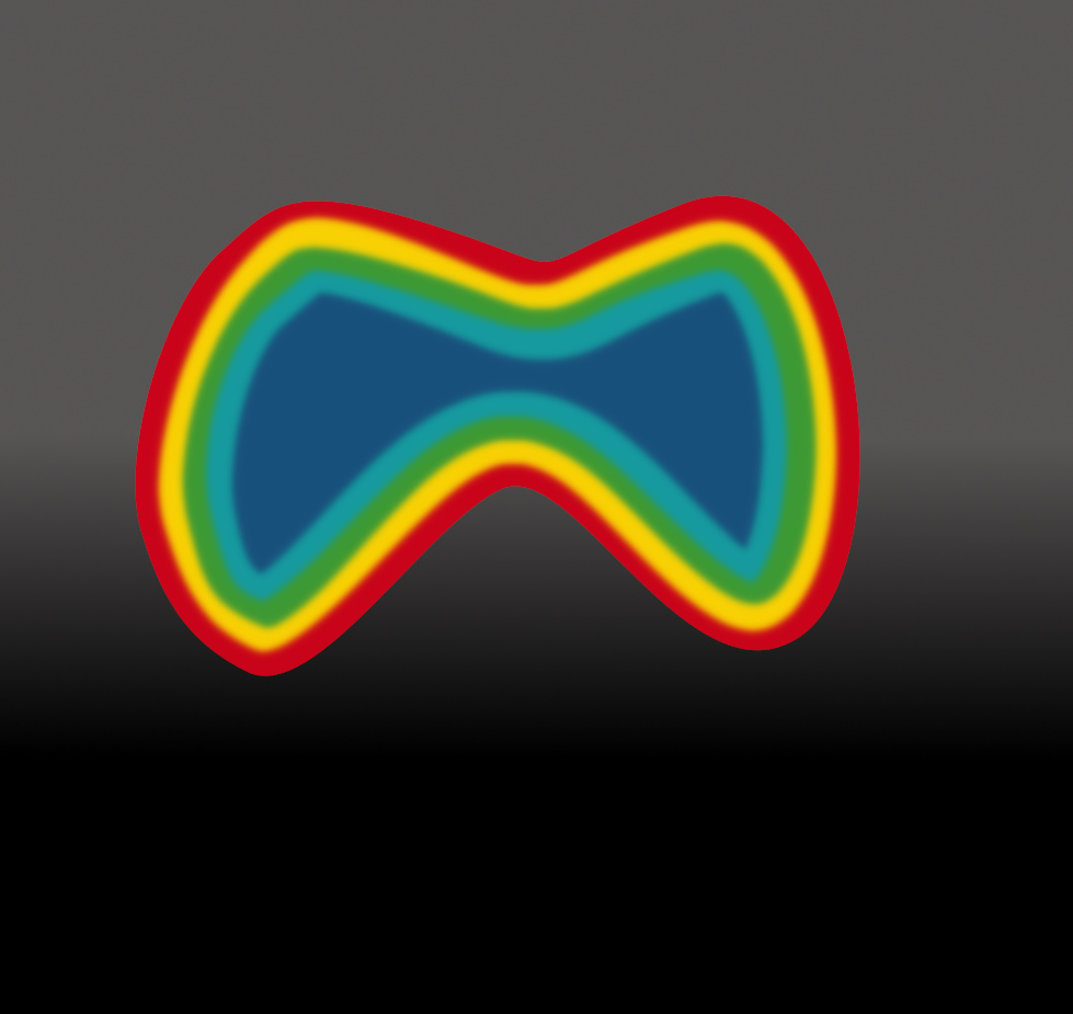
Like option 7, this option reduces the size of the filled area with colours from the current gradient when the drop down item on Option 9: ‘Apply to:’ on Tab 3 is set to ‘All paths with fill’ (if the path has been closed).
 Option 9: Blur amount
Adds a blur to subsequent layers.
Options 3 and 4 on Tab 1 are intended for use with custom font paths to fine tune the way that variations are applied to character paths.
Tab 2 Brush, Colour & Gradient Options: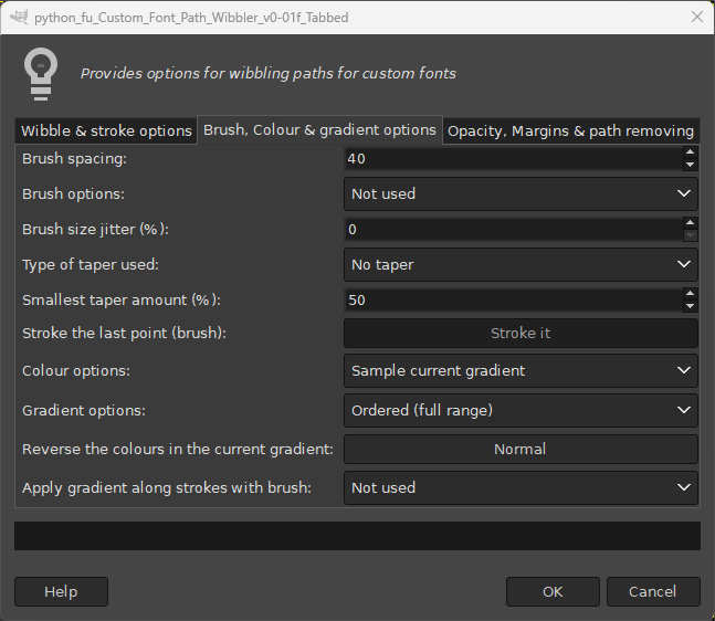
The brush options on this tab obviously require that
option 5 on Tab 1, ‘Stroke path method’, is set to ‘Stroke with current brush’.
Animated or pipe brushes can be used to stroke a path but for image work an ordinary brush is probably the most obvious choice to apply colour. The following examples use a spoke shaped brush:

The brush size is set to match the stroke width (Tab 1: Option 6).

Option 1 Brush spacing
Use a small value for the spacing to create a continuous stroke along a path. Here a value of 4 was used; smaller values produce a nicer effect but take longer to complete with multiple paths.
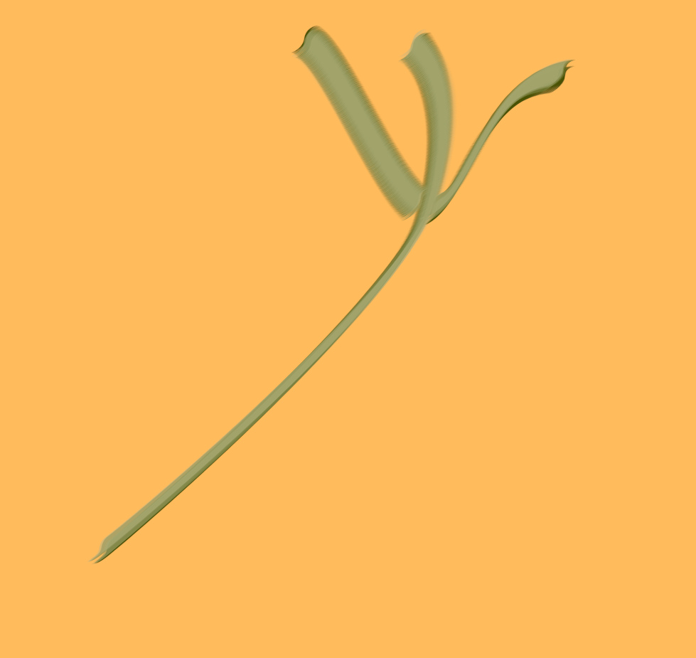
Option 2 Brush options
Initially set to ‘Not used’:
Option 2 Brush options: Track brush direction
This forces the brush to follow the direction of the path slope.
 Option 2 Brush options: Random brush angle
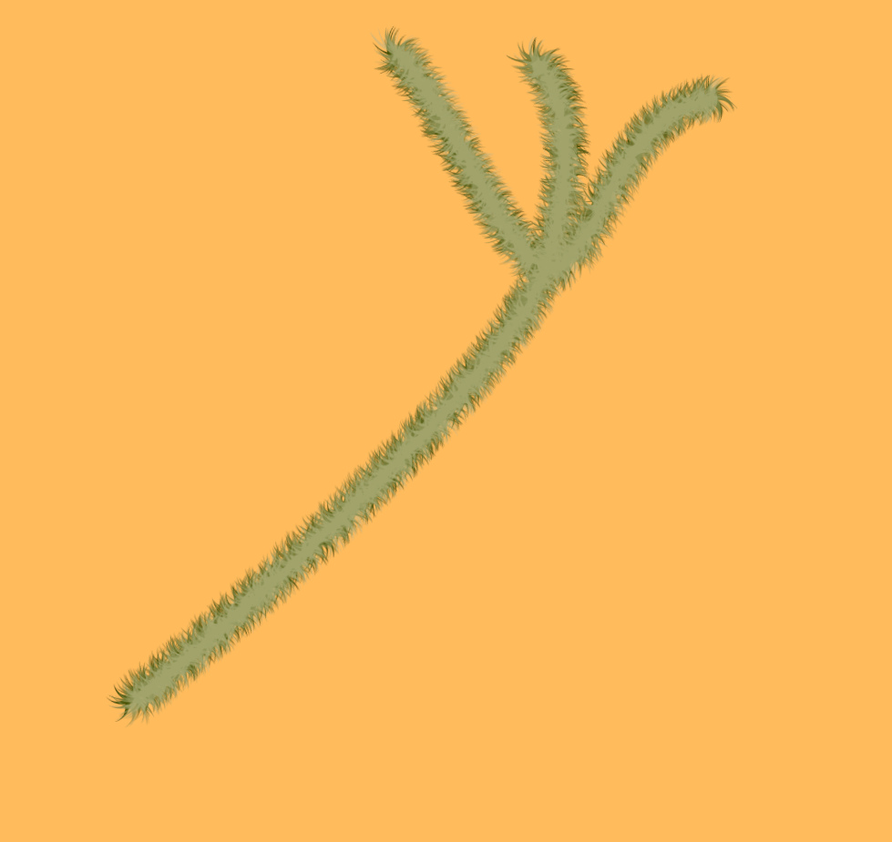 Option 3 Brush size jitter (%):
This option adds a random amount of change to the size of the brush as set by the stroke width on Tab 1. It can be used to exaggerate the effect of the brush option.
 Option 4 Type of taper used:
This option is initially set to ‘No taper’.
Type of taper used: thick to thin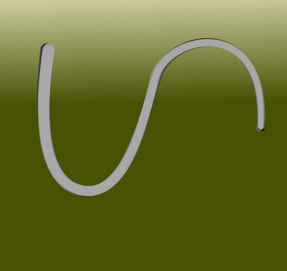 Type of taper used: thin to thick
 Type of taper used: start thin - to thick - end thin
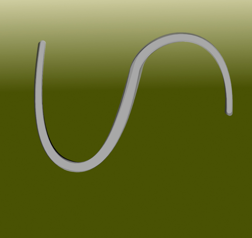 Type of taper used: start thick - to thin - end thickOption 5 Smallest taper amount (%)
 sets the size of the taper at its smallest point.
Taper examples (Taper amount 1 to no taper using a stroke width of 40.0)

Option 6 Stroke the last point (brush) is intended for use with custom font paths.
Use of colour optionsOption 7 Colour Options:Set to ‘Use foreground colour’ or ‘Use background colour’ when only a single path is required. This may be useful when applying an ink line effect to parts of an image.

The most useful (default) option is ‘Sample current gradient’ which, when used with multiple paths, gives access to light and shading effects for lines and provides a way of adding colour and tone to filled areas.
Option 8 Gradient options:As a general rule, use one of the ‘ordered’ options from the drop down list with ‘All paths with no fill’. Use a darker foreground colour with a lighter background colour for the default ‘custom’ gradient to add light and shading. The ordered options sample the gradient in the order that they appear.
The example below uses a ’Stroke width’ of 100.0, a ‘Reduce stroke width’ of 50, ‘Brush spacing’ of 20 and a brush option set to ‘Random brush angle’ with a watercolour brush.
Restrict the range of colours used by selecting one of the other ‘Ordered’ options – ‘mid-range’, ‘1st half’ or ‘2nd half’.
The example below used the ‘Ordered (2nd half) option, which, for this gradient, sampled colours from the lighter shades end of this custom gradient.

When using ‘All paths with fill’ the choice of gradient option is much more subjective – taking the colours used in the gradient and the style of the image into consideration.
The images below use a ‘Reduce fill amount’ value of 8 and a value of 10 for the ‘Number of temporary paths’.
Using a gradient option with ‘Ordered (full range)’:

Using a gradient option with ‘Random (full range)’:

Using a rainbow type gradient and a gradient option with ‘Ordered (full range)’:

Using the same gradient with the gradient option set to ‘Random (full range)’:
 Option 9 Reverse the colours in the current gradient:
 Simply reverses the colours of the current gradient before stroking.
Option 10 is intended for use with custom font character paths.
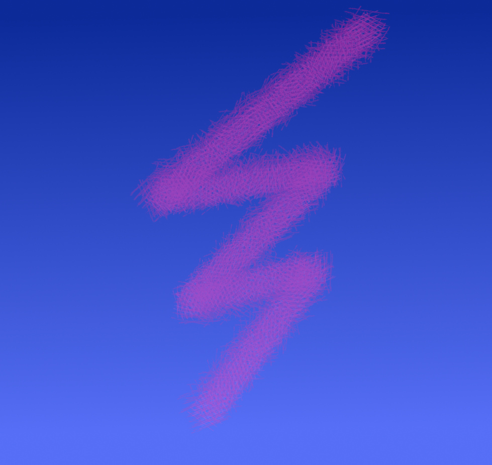
Tab 3: Opacity, Margins & path removing Option 1 Base opacity
This sets the opacity value for all subsequent layers when the next option is set to ‘Use base opacity’. In the example below the base opacity has been set to 20.
 Option 2 Opacity options
The default option decreases the opacity setting for subsequent layers in the range of 50 to 100 percent opacity.
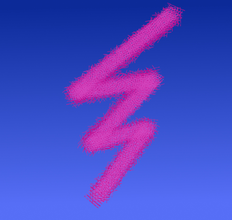
The third option from the drop-down list increases opacity in the range of 50-100 percent.

The last option from this list uses a random amount of opacity for each subsequent path.
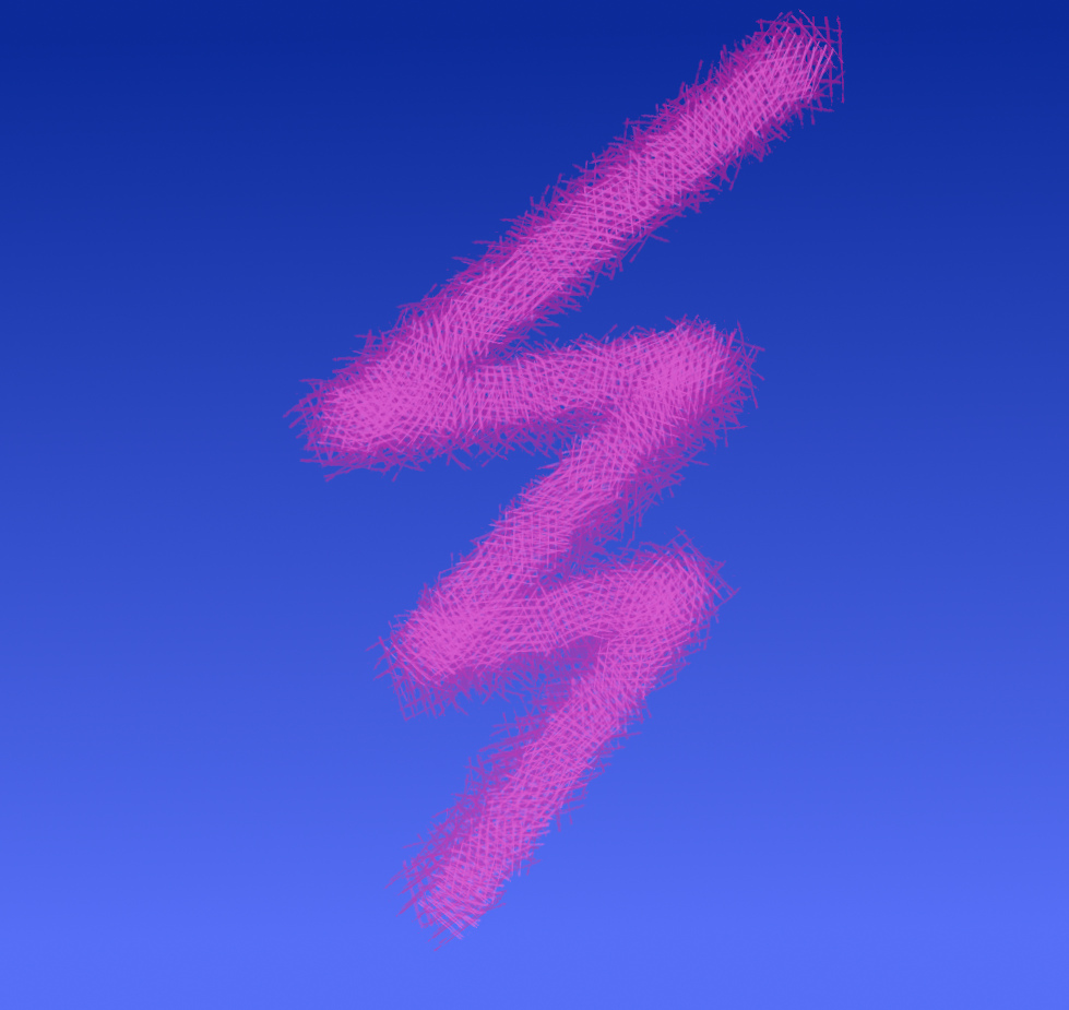
Options 3 – 7 on this tab are for use with character paths.
Option 8 Remove paths after stroking: This can also be set to ‘Keep paths’ which provides the opportunity to re-apply the filter on top of the existing layer.
Option 9 Apply filterWhen working with images, rather than custom font character paths, use the ‘
To all paths with fill’ or ‘
To all paths with no fill’ options.
Using ‘no fill’ forces the filter to stroke the paths without filling any closed areas.

Whereas ‘with fill’ will always fill closed areas.
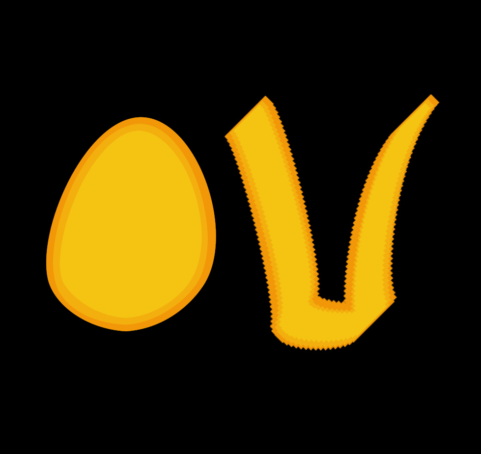
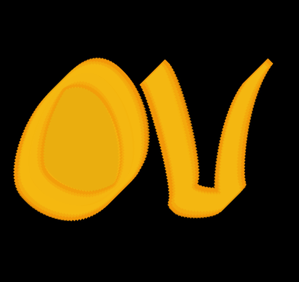
You can of course run the filter twice and combine the two options:
 Option 10: Layer visibility when using all paths
This can be set to display all layers or only the top (current) layer when running the filter.
Have fun...
 Login
Login Register
 Tweets
 FAQ
FAQ Advanced Search
















 You can do it Issa!
 Wow Issa...

 well, to be honest only a time.