odinbc: thank you!
molly: thank you! i like them too, though i had problems with the green background.
he4rty: thanks! i tried that too and i post the result here, but i knew already before i tried that i wouldn't really like it. the thing is, when you turn the rounded end outwards the flower looses movement. it looks more static and also more compact. it did look a bit better when i inverted the gradient too, though, that colour scheme seemed to go better with the character of the inverted flower.
esper: arrange the paisleys by hand, oh heavens what a thought! i'm far too lazy for anything like that! i made a .ppm brush of the paisley and rendered the background in gimpressionist. the reason there are colour differences in the background is that it's built on a gradient that goes from a very brownish green or greenish brown to a cold dark green. and that doesn't bother me one bit

. what really bugs me is that 1) the topmost paisley breaks the pattern because we see all of it. 2) the background pattern is a bit too empty around the centre, we should see more parts of paisleys in the middle circle.
here's an edited version of the flower where i hid parts of the topmost paisley so it wouldn't break the pattern, the gradient layer isinverted as well:
Attachment:
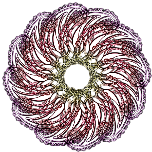 abandonded paisley flower edit1.png [ 757.71 KiB | Viewed 2780 times ]
and here's an inverted variety of the flower:
Attachment:
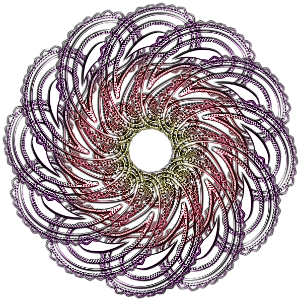 abandonded paisley flower inverted.png [ 764.29 KiB | Viewed 2780 times ]
now i'll try to make a perfect background render with a busier centre!
 Login
Login Register
 Tweets
 FAQ
FAQ Advanced Search














 . i just burned a tin of soup again today...



 your freezer must be the most decorative one in town! how does this diet affect you, i wonder? no side effects?