It is currently Sun Nov 08, 2026 8:23 am


All times are UTC - 5 hours [ DST ]


Post new topic Reply to topic  [ 9 posts ] 
Author Message
 Post subject: Girl's night out.
PostPosted: Sat May 11, 2013 1:19 pm  (#1) 
Offline
GimpChat Member

Joined: Dec 27, 2012
Posts: 393
Location: England
Image

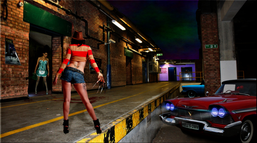
This is my latest competition for Dark Art Challenges over at Deviantart. I wanted to add some extra characters to this one, but couldn't find much in the way of female versions of the classic horror film stars.
There's a big prize on offer this time so I'll keep my fingers crossed and see how I do
Thoughts and comments are always welcome and here's a link to the bigger version. http://fav.me/d64w856

_________________
Image

DeviantArt gallery


Share on Facebook Share on Twitter Share on Orkut Share on Digg Share on MySpace Share on Delicious Share on Technorati
Top
 Post subject: Re: Girl's night out.
PostPosted: Sat May 11, 2013 1:29 pm  (#2) 
Offline
GimpChat Member
User avatar

Joined: Jul 17, 2012
Posts: 2769
okay, so i see Freddy and that car is Christine, i guess ?

who is the girl in the green white rubber maiden outfit ?

how about adding Magenta from the Rocky Horror Picture Show ?
its not exactly horror, but would fit your theme

and maybe some hellhounds on a leash ?
that should be easy to find

what about ghosts ? easy to make too, especially good for pics of not so good qaulity i guess

oh and the sky needs a lightning of course ;)

i would put Zuul from Ghostbusters in the door - i mean she is the gatekeeper (and sexy too)
http://www.youtube.com/watch?v=Rt3GdkjyRRA

overall i like it so far, but the piece lacks something spectactular

oh and the shadow of the Freddy girl is the wrong way


Top
 Post subject: Re: Girl's night out.
PostPosted: Sun May 12, 2013 4:37 am  (#3) 
Offline
GimpChat Member

Joined: Dec 27, 2012
Posts: 393
Location: England
Thanks, Esper, some good ideas there.
There's only a few days to the competition deadline so I will make as many improvements as I can in the time left.
The car is Christine and the girl in the green dress is pretty much the only image I could find of a female waving a chainsaw around. She is not a character from any film that I am aware of.
I like the idea of Zuul standing in the doorway. I will have to see if there are any images of her available at Deviantart as one of the challenge rules is that only D A stock is allowed.
Thanks for the advice.

_________________
Image

DeviantArt gallery


Top
 Post subject: Re: Girl's night out.
PostPosted: Sun May 12, 2013 11:35 am  (#4) 
Offline
GimpChat Member
User avatar

Joined: Jul 17, 2012
Posts: 2769
i didnt realize maiden girl was carrying a chainsaw...its very hard to see


Top
 Post subject: Re: Girl's night out.
PostPosted: Sun May 12, 2013 12:54 pm  (#5) 
Offline
GimpChat Member
User avatar

Joined: Jun 25, 2011
Posts: 914
Location: Mount Olive, North Carolina
Looks pretty good so far. But there's a few things about the lighting that seem off to me. The biggest would be the girl in front - she has a shadow, but it looks to be in the wrong direction. The shading on her body suggests a light source to our right - about where the headlights are. Why doesn't Christine cast a shadow? The whole front of the scene also seems unusually bright.

The girl in the back looks blended in pretty well, but the girl in front looks like she's floating above the scene. I think adjusting the light would help with that. The car looks good, I just think you're missing an opportunity to do something with the lights.


Top
 Post subject: Re: Girl's night out.
PostPosted: Sun May 12, 2013 8:04 pm  (#6) 
Offline
GimpChat Member
User avatar

Joined: Jan 20, 2012
Posts: 583
I have to agree, the way the characters and the way the background feels don't match. Its good don't get me wrong, but they lighting doesn't necessarily match and that adds a choppy flow to the image.

_________________


"In the face of adversity, there's three things: fly, freeze or fight; We're choosing to fight..."- Guy Boucher, Tampa Bay Lighting Head Coach


Top
 Post subject: Re: Girl's night out.
PostPosted: Sun May 12, 2013 9:49 pm  (#7) 
Offline
Script Coder
User avatar

Joined: Feb 18, 2011
Posts: 4826
Location: Bendigo Vic. Australia
Those ladies would scare the hell out of me

_________________
Image
No matter how much you push the envelope, it'll still be stationery.


Top
 Post subject: Re: Girl's night out.
PostPosted: Mon May 13, 2013 8:30 am  (#8) 
Offline
GimpChat Member
User avatar

Joined: Aug 16, 2012
Posts: 4271
Location: Göteborg, Sweden
caz: scary ladies :). everyone else has commented on the light and shadows so i'm not gonna bring it up again. i really like the atmosphere you've created, once you get the light-and-shadow thing fixed this will be a really great picture.
i thought of helena bonham carter's character in "sweeney todd", surely she must have some fans on deviantart!

_________________


Top
 Post subject: Re: Girl's night out.
PostPosted: Mon May 13, 2013 12:31 pm  (#9) 
Offline
GimpChat Member

Joined: Dec 27, 2012
Posts: 393
Location: England
Thanks everyone for the comments, they really are appreciated. It's this kind of feedback that helps me to understand where I'm going wrong and how to put it right.

merrak wrote:
Looks pretty good so far. But there's a few things about the lighting that seem off to me. The biggest would be the girl in front - she has a shadow, but it looks to be in the wrong direction. The shading on her body suggests a light source to our right - about where the headlights are. Why doesn't Christine cast a shadow? The whole front of the scene also seems unusually bright.


Esper pointed out the same thing about the direction of Freddy's sister's shadow. It's weird but for all the time I spent looking at the image I never figured out that the shadow should go in the opposite direction. Now that the shading on her body has been pointed out it's as clear as day that the shadow falls the wrong way. I live and learn.
There's a shadow to the under side of Christine, but as to adding one that falls in a certain direction I've no idea which way it should go.

ZWard117 wrote:
I have to agree, the way the characters and the way the background feels don't match. Its good don't get me wrong, but they lighting doesn't necessarily match and that adds a choppy flow to the image.


I was never particularly happy with the lighting, specially on the girl in the foreground. I'm learning that it's the hardest thing to get right and the most important.
All the really great works I see at DA hit the lighting spot on, which is something I've yet to achieve.

Graechan wrote:
Those ladies would scare the hell out of me


Me too, trouble is I think most guys would stand there like a rabbit transfixed by a headlight glare if the girls walked toward them, only realising too late that they should run.

AnMal wrote:
caz: scary ladies :). everyone else has commented on the light and shadows so i'm not gonna bring it up again. i really like the atmosphere you've created, once you get the light-and-shadow thing fixed this will be a really great picture.
i thought of helena bonham carter's character in "sweeney todd", surely she must have some fans on deviantart!


My original idea was to have characters from the classic 80s horror flicks, Halloween, Friday the Thirteenth, that kind of thing, but I do think it's a good idea to broaden the idea to take in more recent characters, not least because of the trouble I'm having finding suitable stock images.

It's too late to make any changes to the image I've entered into the competition, but I am going to keep working on this one and see if I can crack the lighting issues.
Thanks again for all the advice.

_________________
Image

DeviantArt gallery


Top
Post new topic Reply to topic  [ 9 posts ] 

All times are UTC - 5 hours [ DST ]


* Login  


Powered by phpBB3 © phpBB Group