It is currently Wed Jul 15, 2026 7:46 am


All times are UTC - 5 hours [ DST ]


Post new topic Reply to topic  [ 5 posts ] 

Which to continue ?
WIP 1 0%  0%  [ 0 ]
WIP 2 0%  0%  [ 0 ]
WIP 3 50%  50%  [ 2 ]
not sure i like all 25%  25%  [ 1 ]
not sure are all awful 25%  25%  [ 1 ]
Total votes : 4
Author Message
 Post subject: WIP
PostPosted: Mon Nov 04, 2013 5:25 pm  (#1) 
Offline
GimpChat Member

Joined: Apr 12, 2010
Posts: 5870
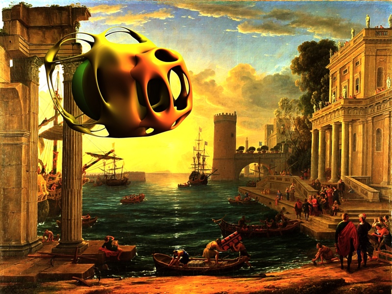
WIP and with a lot of work still to do with gimp to complete the composition :
first the "spaceship" need passengers to seems a spaceship ,
and some smoke in the back will help
then the head of the man with the red robe, to the lower right , has to be turn in the opposite direction ...

Not too happy with light, it seems i can chose any type of frontal light, with various angles, intensity and so on BUT..damn here the light should come from the back and i can't see how...

WIP 1

Image

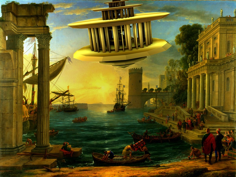
Almost same problems to solve here ...
more i fear the object doesn't look big and faraway, but little and close, to correct maybe i should overlay the clouds (so it may look behind the clouds)

WIP 2

Image

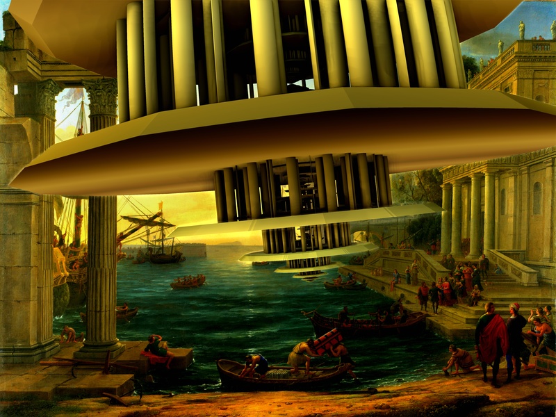
WIP 3

well instead then try to overlay the clouds to make seems the floating object far but big...here i tried to make directly big
Still some heads has to be turned respect to the original and i should add passengers looking down from the temple but it seems the closer
Image


As for the BG is from Pierre Lorrain (french, i believe from 17th century but i should control)

_________________
My 3D Gallery on Deviantart http://photocomix2.deviantart.com/
Main gallery http://www.flickriver.com/photos/photocomix-mandala/
Mandala and simmetry http://www.flickriver.com/photos/photocomix_mandala/

Image

Mrs Wilbress


Share on Facebook Share on Twitter Share on Orkut Share on Digg Share on MySpace Share on Delicious Share on Technorati
Top
 Post subject: Re: WIP
PostPosted: Mon Nov 04, 2013 5:35 pm  (#2) 
Offline
GimpChat Member
User avatar

Joined: Aug 16, 2012
Posts: 4271
Location: Göteborg, Sweden
photo comix: W O W! i really liked all of these! you could only choose one option so i voted for 3, but i have some comments: 1. the first spaceship would look better in an underwater setting. i'd love to see it again, in different colours, under the sea. 2. number 2 is better in some ways than number 3. it matches the background picture better and has a better angle. i guess it looks more "natural". it lacks that certain something that number 3 has though. 3. i liked number 3 best because of how the spaceship comes crashing into the middle of things. other people might think this makes the picture messy or unrestful or something - i just happened to like it.

_________________


Top
 Post subject: Re: WIP
PostPosted: Mon Nov 04, 2013 5:50 pm  (#3) 
Offline
GimpChat Member
User avatar

Joined: Apr 07, 2010
Posts: 14182
Fantastic. Those colors are unbelievable. I don't know how you get them so vibrant.

_________________
Image


Top
 Post subject: Re: WIP
PostPosted: Mon Nov 04, 2013 7:28 pm  (#4) 
Offline
GimpChat Member

Joined: Apr 12, 2010
Posts: 5870
AnMal wrote:
photo comix: W O W! i really liked all of these! you could only choose one option so i voted for 3, but i have some comments: 1. the first spaceship would look better in an underwater setting. i'd love to see it again, in different colours, under the sea.


:jumpclap :hi5 What a good idea ! :yes

2. number 2 is better in some ways than number 3. it matches the background picture better and has a better angle. i guess it looks more "natural". it lacks that certain something that number 3 has though. 3. i liked number 3 best because of how the spaceship comes crashing into the middle of things. other people might think this makes the picture messy or unrestful or something - i just happened to like it.


I think 2 would look more natural if was coming from BEHIND the background, as partially covered some clouds, and fog
i like sharp , but is too sharp; if is far ,( and should seem far to appear huge ) can't look so sharper of what closer .
Maybe i could do with gimp, pasting the bg as new top and using a layermask

3 maybe is the more spectacular and that requiring less postwork (in any case i believe a few passengers should be added, and some heads in the BG paint differently rotated

You are right about the angle of 2 vs 3 ,no idea why but was more tricky then usual modify the angle

molly wrote:
Fantastic. Those colors are unbelievable. I don't know how you get them so vibrant.


:tyspin :yes

PS in the meanwhile i could not resist to try a new , even if related idea
viewtopic.php?f=11&t=8924&start=0

_________________
My 3D Gallery on Deviantart http://photocomix2.deviantart.com/
Main gallery http://www.flickriver.com/photos/photocomix-mandala/
Mandala and simmetry http://www.flickriver.com/photos/photocomix_mandala/

Image

Mrs Wilbress


Top
 Post subject: Re: WIP
PostPosted: Mon Nov 04, 2013 10:49 pm  (#5) 
Offline
GimpChat Member
User avatar

Joined: Apr 08, 2010
Posts: 5420
Location: Northwest Ohio
I love the coloring in #1, but I think I like #3 best as it is like the spaceship is landing...or maybe crashing!


Top
Post new topic Reply to topic  [ 5 posts ] 

All times are UTC - 5 hours [ DST ]


* Login  


Powered by phpBB3 © phpBB Group