AnMal wrote:
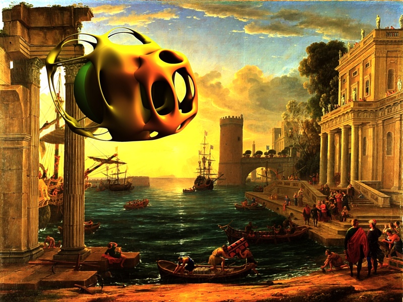
photo comix: W O W! i really liked all of these! you could only choose one option so i voted for 3, but i have some comments: 1. the first spaceship would look better in an underwater setting. i'd love to see it again, in different colours, under the sea.


What a good idea !

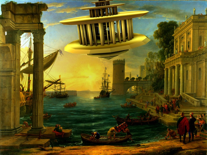
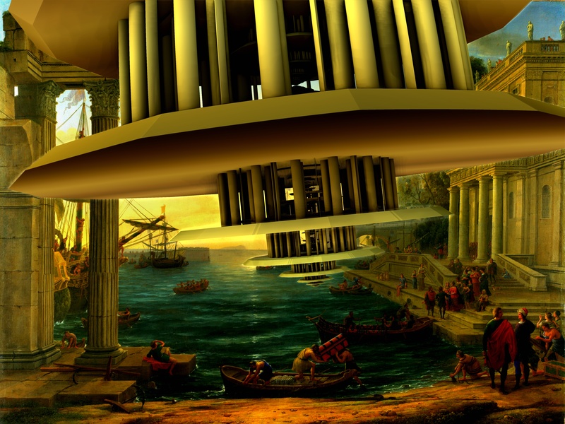
2. number 2 is better in some ways than number 3. it matches the background picture better and has a better angle. i guess it looks more "natural". it lacks that certain something that number 3 has though. 3. i liked number 3 best because of how the spaceship comes crashing into the middle of things. other people might think this makes the picture messy or unrestful or something - i just happened to like it.
I think 2 would look more natural if was coming from BEHIND the background, as partially covered some clouds, and fog
i like sharp , but is too sharp; if is far ,( and should seem far to appear huge ) can't look so sharper of what closer .
Maybe i could do with gimp, pasting the bg as new top and using a layermask
3 maybe is the more spectacular and that requiring less postwork (in any case i believe a few passengers should be added, and some heads in the BG paint differently rotated
You are right about the angle of 2 vs 3 ,no idea why but was more tricky then usual modify the angle
molly wrote:
Fantastic. Those colors are unbelievable. I don't know how you get them so vibrant.

PS in the meanwhile i could not resist to try a new , even if related idea
viewtopic.php?f=11&t=8924&start=0 Login
Login Register
 Tweets
 FAQ
FAQ Advanced Search