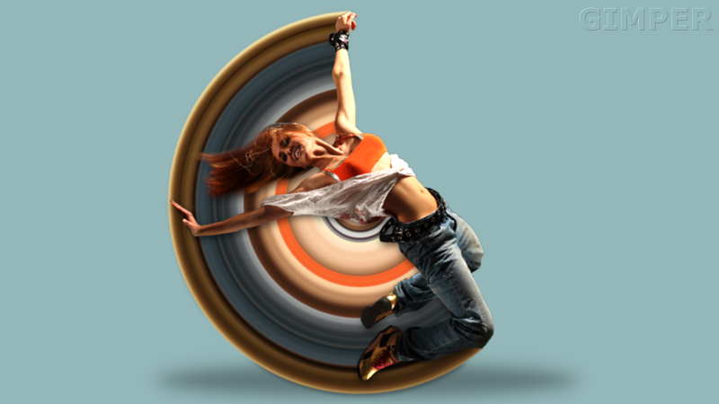
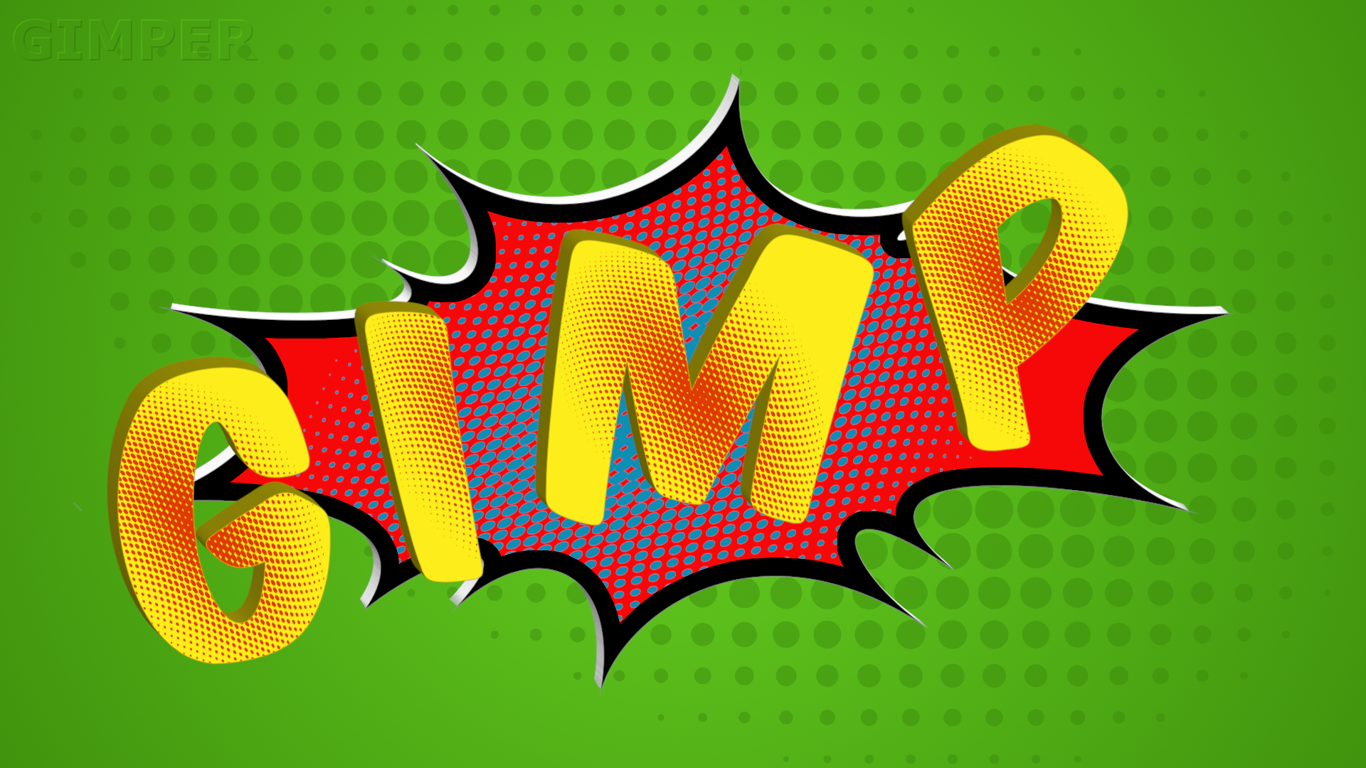
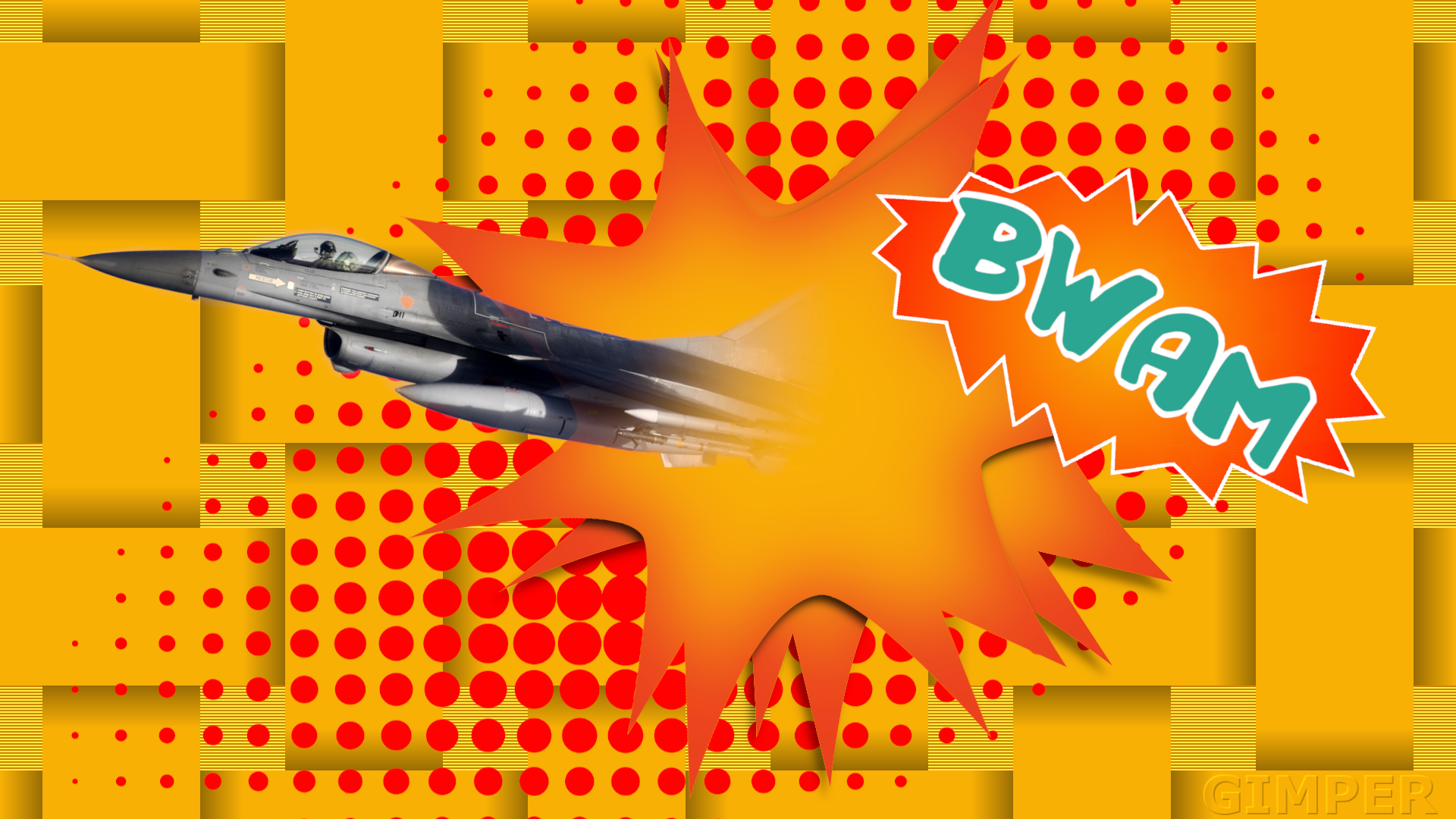
The fighter: "Barriers are meant to be broken!" Is that it? Looks very "comic book"-ish.

Those sharp "petals" on the starry splash is a real biiiittersweet experience to work with, aren't they?
They often look bent towards the viewer. I'd try and lighten the shadows at the very tip of each "petal" to maybe lower this effect. In real life, if you had such an object and put it down on a table, the very tips would be casting a much lesser shadow than the meatier bits farther in. Just like a thin twig on a tree will cast a much lesser shadow than a big fat branch the size of an elephant's leg.
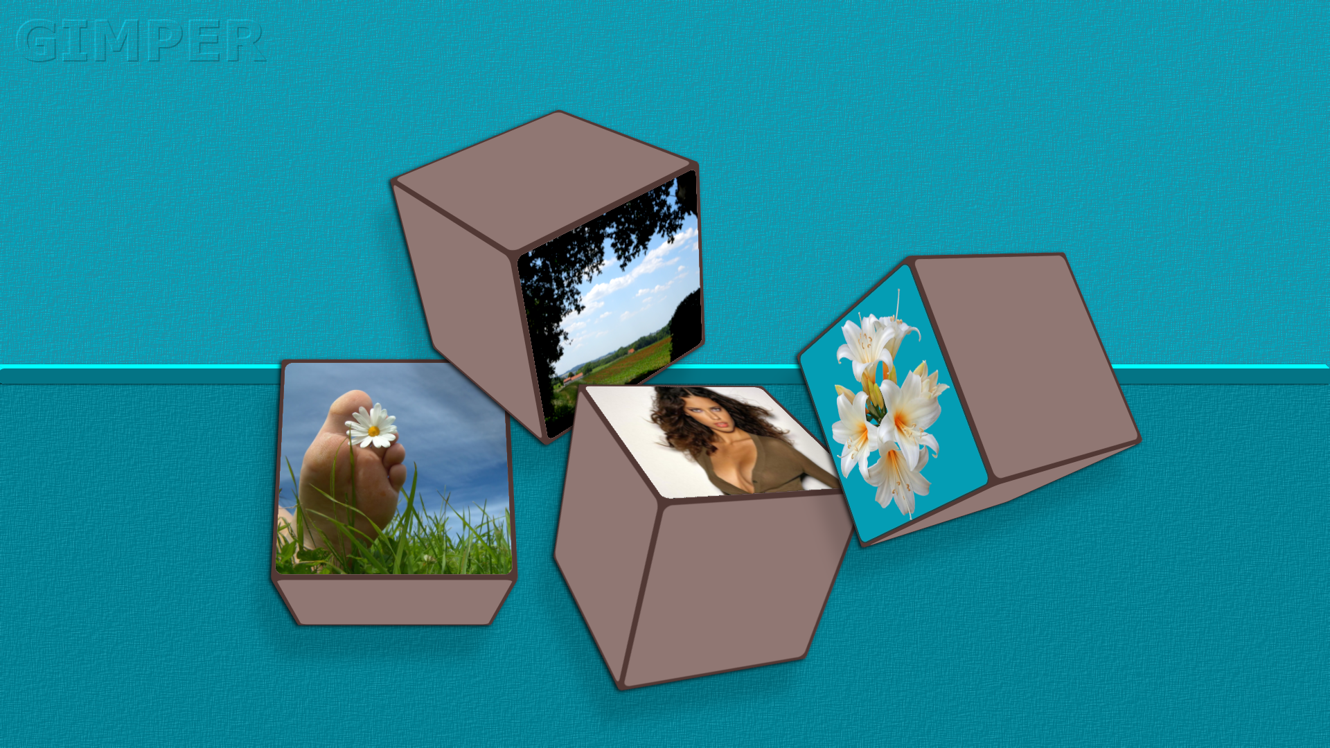
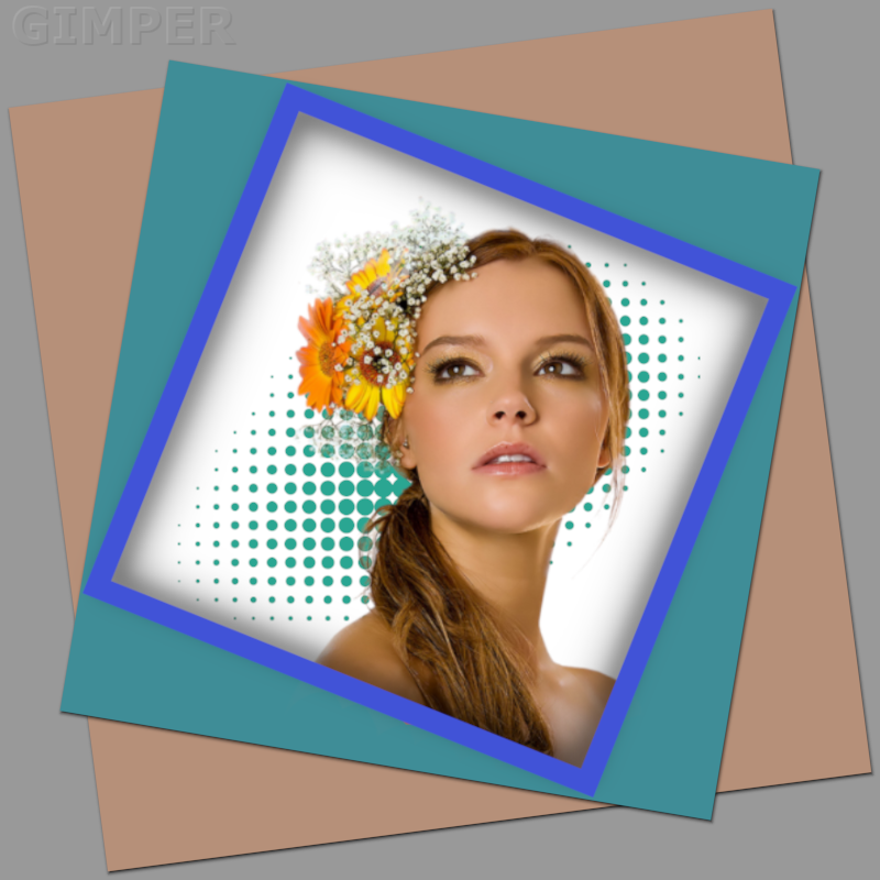
Girl image: The frame in front of the girl is casting a shadow onto the background, presumably behind her, but she doesn't do the same. Logically there would be a shadow from her, too, unless there is magic involved. I don't count the green pattern a "shadow".

Also, in my opinion, she looks positioned a little too far to the right, so the image sort of "tilts" over a little. I'd try rotating the frames the other way and position her also to the left a bit, where the white "gap" in the frames right next to her head thus would be on the left side of her head (from our point of view). That would make room for the flowers. Perhaps you tried that already and ran into other problems, I don't know. Just a feeling about how it looks to me.
On the fighter image it balances okay with the text on the right. Her picture doesn't have something like that.
You might also consider playing with by how much the added shadows fall into the hole in the frame. Considering her image, where the shadows are mainly on her left side, i.e., the light is coming from her right (=our left), means that logically your shadows should mimic this fact also and be slightly less prominent on the right side of that hole (light shining into the hole from our left, means the shadow must be narrower there).
And watch out for the shadow from the frame on her shoulder vs. how that same shadow falls on the background. The objects (frame-girl-background) are on different planes in three dimensions, and this affects how the shadows fall.
Just my 2¢, it's your image...
Generally speaking, very nice colors, especially on that girl image. Nice skin tone frame with the other colors breaking into the picture. I almost wish she would have the same green color eyes, and a blue flower in her hair, then the colors would be very related to one another.
 Login
 Register
 Tweets
 FAQ
 Advanced Search












 manipulation Gimper